Step 3) Create the user task matrix – PART 4

“I can do this all day” says Captain America, while getting beaten up by the villain, Johann Schmidt / Red Skull. Comes in a curt reply of the villain, “Yes, but I am tight on schedule!” :).

Got the point? How many times, you are going to do the same things all over again? How many days in a week? How many days a year – doing same things, keeping your anxiety in check, pardoning mistakes and delivering the expected results.

Imagine the massive amount of data that goes into an airplane pilot’s memory when he/she sees the plane cockpit.

Airbus_A380_cockpit

Airbus_A380_cockpit

Through training, through books/manual support and with the help of telecommunication crew, the pilots learn to fly the plane and ensure the safety of everyone on-board. Imagine the number of tasks the pilots do in a 14-hour flight – e.g. to put the plane in ‘auto-pilot’ mode is also a task :).

With great interfaces, systems and controls, comes a great responsibility for the pilots :).

It is an interesting subject to read how pilots use the controls and how do they communicate to the ground control systems in case of emergency situations. More curious readers can pick up  ‘Outliers: The Story of Success’ by Malcolm Gladwell to understand the erroneous situation that lands the pilots into crashes. It’s a digression, but a worthy one.

Okay, let’s do a recap.

In the first post of the user task matrix we saw how important it is to ‘know’ someone. Not on the surface, but real deep.

In post #2, we saw different examples that lead to gathering user insights – real life case studies that made some products a success, and some a failure.

The last post summarized all the points in how to go about gathering your user data – what to look for, how to probe, defining goals and tasks and understanding the user aspirations.

What’s next?

Walk to the whiteboard with your design team and arrive towards creating the user task matrix.

Take a look at a sample user task matrix:

User Goal: Booking an airline ticket
How many times the user performs this task (Frequency): Never, Rare, Multiple

Task Matrix for "Booking a Ticket"

Task Matrix for “Booking a Ticket”

Supplement this task matrix with numbers – e.g. assume that there are 10000 casual tourists, 500 travel agents and 100 frequent fliers.

A different design direction will emerge if the numbers are like these: 10000 casual tourists, 10000 travel agents and 5000 frequent fliers.

The task matrix will help you to find what is the critical part of the user experience – things that should not be compromised. If you look at the above task matrix (booking a ticket) the most important task that emerges is ‘searching travel routes’. From all the user journeys this part of the solution has to be crafted very carefully.

Your task matrix also determines the emphasis your design solution would be – e.g. if the travel guide will not be used by 2 out of 3 users, would the travel guide be ‘discoverable’ or will it be shown as an explicit link (secondary menu) or will be included as a part of ‘self-help’.

Imagine another user goal – troubleshoot a ticket booking problem on the website.  Lets break up this goal into tasks. Your user study may produce the following task matrix:

Task Matrix - Troubleshooting

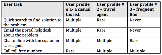
Task Matrix – Troubleshooting

When you encounter situations like these, apply the numbers. Sit with the business analysis team, portal development team and CxOs of the organization to share your task matrix – your data might change the course of customer experience.

Let’s say that the airline company wants to keep the cost of Helpdesk calls to the minimum or reduce Helpdesk calls’ cost to 25%.

You have done your math (number of users, their task frequencies and all). As a designer you have to achieve the balance – how to justify the users immediate and latent needs vis-à-vis the organizational goal.

The task matrix will tell you half the picture – what users do. Get the other story too – what business wants.

In this situation, your design solution could be to have an intelligent search and directory-wise listing of help topics. If the users do not find solution with search and listing, expose the customer help channels in the following order: 1) Email your problem to the Helpdesk 2) Online chat with the customer agent 3) Toll-free number with wait times.

I visit travel websites often. Two websites that recently caught my attention are Superfly and Joobili.

Superfly

Superfly

Superfly simplifies the travel experience – archiving your past travel data, consolidating travel miles and giving great travel options and rewards.

Joobili

Joobili

Joobili steers away from the conventional travel approach – booking flights and hotels. It presents the places you can visit in a given timeframe, e.g. if you are in London it will tell you great places to visit – related to arts, music, sports, shopping, etc. For any tourist, this site offers plenty of places to explore.

Examples like these make you think about the overall business goal, the user aspirations and chosen design strategy. I assume that the task matrix for these websites must have opened a new directions for the stakeholders – i.e.. aggregate the travel experience of different airlines (Superfly) and leave aside the booking aspect and concentrate on the places & events in cities (Joobili).

There are some variations to the task matrix, in terms of representation. Consider this version of a task matrix, for a causal tourist user:

Task Matrix - different representation for a Casual Tourist user

Task Matrix – different representation for a Casual Tourist user

The severity ratings of the task-matrix can be further explained as:

Severity Ratings

Severity Ratings

As said earlier, the task matrix brings in the clarity and puts you on the path to design. Keep this task matrix as a yardstick if the design solution is deviating from the requirements.

  • Design for the lowest common denominator – the most frequent user with the most basic needs, who has the least sophisticated level of taste, sensibility, or opinion among a group of people. Keep in mind that these users are bound to fail in performing the tasks; they will need support and training.
  • Design for an intermediate skilled user – users that learn to adjust with the system by learning but fall short of performing complex tasks without aid.
  • Design for the expert user too – who uses shortcuts and jumps over the lines to finish the task in a fast track.

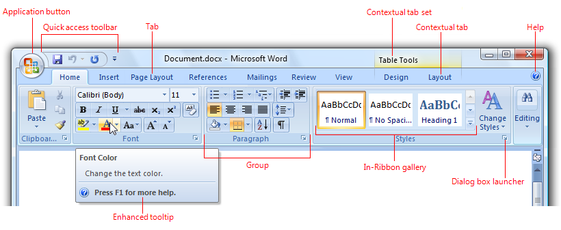
Look at the ‘ribbon’ options offered by Microsoft Word. Is it helping the users or is it overwhelming? Think about the task matrix for a tool like Microsoft Word.

Microsoft Word

Microsoft Word

Imagine some one in real-life saying “I do this all day” and does a specific task, e.g. creating Chapati / Roti (Indian bread) in a street-side restaurant.

Watch this video: Making Chapati very fast – India. Thanks Florian Bachmann for this video.

That sums up the STEP 3 of creating user task matrix.

In coming posts, we will see how to start sketching on the paper, conceptualizing your digital products, keeping in mind the target devices.

Step 3) Create the user task matrix – PART 3

“This appears to be a great plan. Unfortunately, we do not have time & budget to do this. You know, we are running against the time. Moreover, what you intend to find, we already know it, right?” are the sentiments echoed by majority of the stakeholders who are in no mood to green-light the user research.

“What’s wrong with a phone call with users?” the designers fight back. This draws a blank response :). Working with constraints opens up new possibilities.

Forrester Research too understood the constraints of user experience designers in conducting user research and they have published a whitepaper based on this – “Low-Cost User Research And Usability Testing Techniques”by Vidya L. Drego, Andrew McInnes, Harley Manning, and Rachel Zinser.

It starts with an interesting premise – ‘User research and testing don’t need to break the bank’ – it goes on to elaborate on low-cost user research techniques like desk research, connecting with online users, talking to subject matter experts, conducting user experience reviews, creating quick paper prototypes and testing with ‘surrogate users’, etc.

There are many techniques (time saving, deep probing, activities driven, etc) which will get you to the roots of user needs. Rotterdam University of Applied Sciences has come up with a toolkit – created by Bas Leurs, Peter Conradie, Joel Laumans, Rosalieke Verboom.

Here is the URL: http://project.cmd.hro.nl/cmi/hci/toolkit/index2.php.

Rotterdam University of Applied Sciences UX Toolkit

Rotterdam University of Applied Sciences UX Toolkit

Do not get overwhelmed by this list – the ‘Research & analysis’ step. You have to always be in ‘improvisation’ mode :).

I go through the predicament of ‘no-budget’ many a times in my projects. I use combination of different techniques – conducting user experience review, analyzing the web traffic, creating the competitive benchmarking matrix, quick paper prototyping and creating a case to quantify business benefits.

Whatever your technique is or combination of techniques used, you have to discover the following things:

1. How many users are currently using the product? Understand the volumetric data – how many users will be impacted with design changes.

2. What are the different types of users using the product? E.g. The HR executive might be accessing the corporate portal to get CVs of prospective employees. The potential employees might be interested in ‘careers’ section of the website. An investor might directly go to ‘news’ section of the portal. Understand the width and depth of users.

3. When do they use this product? E.g. Luke Wroblewski presents a great insight in his book ‘Mobile First’ on three scenarios in which users access their mobiles –

  1. Micro tasking: e.g. scenarios like the latest football /basketball match score that I want to know, which is updated every minute.
  2. I need to find something urgent local info – e.g. where is the nearest ATM? Where can I find drive-in restaurants?
  3. I am bored – I have to kill time and not sure what to do, may be play a game, or watch a video or look at the photos on my phone, or listen to a song while I am standing in a queue.

4. How do they use the product? Why do they use the product? – Is it being used the way it should be or the users have ‘re-engineered’ the product / tailor made the product to their daily usage? E.g. the immensely popular story in product design was washing machine being used to churn ‘lassi’ – the buttermilk in Punjab. Perhaps, it is stretching your imagination about the product’s intended usage. Great insights can open up a new product design idea altogether. LinkedIn, which started off as business networking site is now being used by recruitment site by many companies.

5. The previous point actually brings us to a very important question – What do the users really want to do? What are their goals? – e .g. if you are designing a bike, the overall user goal could be safety while driving. Another goal could be easy troubleshooting of the bike. If you are designing a restaurant app for mobile, one of the user goals could get the table booked. For airline booking, the user goal could be booking a seat. If we break this goal into smaller steps i.e. user tasks the tasks could be booking a seat of user preference, checking in online, download the flight boarding pass, etc.

6. What are the users’ immediate needs? – In some cases, users use the product in spite of the pain points – the product might cause them discomfort, it might irritate them a bit, perhaps leading them to anger management issues :). These users may have found a way to ‘deal with it’ – compromising the product shortcoming and using it in different way that impacts the efficiency. E.g. Android phone users missed the screen capture functionality on the mobile, when the mobile OS was launched – they had to actually capture the screenshot by clicking a photo of the phone screen. In later releases of Android OS, Google introduced the screen capture functionality with hardware controls (power button + volume down buttons pressed together).Designers will notice these kinds of issues when they meet the users, looking at the product usage and incorporate these changes in the new product release.

Flexible Straw

Flexible Straw

Another example is of the flexible straw, which was invented by Joseph Friedman – he saw his daughter having a tough time with the straight straw while drinking. He created corrugations in the paper straw using a screw and made a prototype of it, patented it and made a career out of it. The flexible straw is one of the distinguished products that finds itself in the list of ‘Design for All’ products list – a product that is used by many people, as possible without the need for adaptation.

7.  What are users’ specific needs? E.g. Most ecommerce websites in India have adopted the model of ‘cash-on-delivery’, which was made popular by Flipkart. Unlike US, you do not have to pay upfront on the website to buy.  Specific needs always go hand in hand with the culture of the target users, the ‘context’ in which users interact with the product – e.g. What’s the use if the user is not able to print a photo from the photo-blogging application on iPad? Users will abandon the product immediately.

8.  The user aspirations: “read between the lines” i.e. users’ hidden needs– There are some things that the users won’t disclose in your conversations. You need to be probed deeper. Buying a car or bike might elevate the ‘status’ of the user. Perhaps the product can enhance the ‘socio-economic’ image of the user.  Some people will buy a certain brand that sets them apart from the mass. There are always mass products and class products. Some products always exude desirability – think of all Apple products. The reason Apple products are popular is not only because of their finesse in industrial design & user experience – there is a factor of “I want to get it because it’s the best thing to have” which is attached to all its products.

Cadbury Bournville

Cadbury Bournville

Marketing professionals rely on this aspect to position their product. In India, Cadbury’s Bournville is positioned very intelligently – their tag line says “You don’t buy a Bournville you earn it

LML Vespa

LML Vespa

In 1980s, LML Vespa (now Vespa India) introduced one significant feature to its scooter, which its archrival company, Bajaj Auto could not. Guess what that product feature could be :)? It was single-key operation. Yes, one key for all the users tasks – starting the scooter, unlocking the front and side compartments, removing the spare tire from the back, etc – all with just one key. The Bajaj scooters had at least 3 keys to do all those operations. That’s a great insight that was captured in user research, which was ‘discovered’ as aspiration and perhaps as the pain point of users too.

9.  Do users’ say what they mean and do they mean what they say? – Re-iterating one of the quotes in earlier post “A wise car hears one word and understands two” 🙂 – a designer has to carefully observe the circumstances / contexts in which users give inputs. Users may say something which they do not necessarily mean to use / buy / aspire to buy.

Xerox Star

Xerox Star

Bill Moggridge, in his book ‘Designing Interactions’ summarizes the user research done by Xerox before it launched Star: User interviews were conducted on Star’s predecessor machine Alto and Smalltalk to sense if people will buy a machine which had superior experience as compared to cheap and inferior hardware. Star was launched and IBM PC was launched after Star – IBM was cheap and had inferior experience. But, the users opted for IBM PC. Time, context and needs of the users change over time.

10. Of course, there will be people like Agent J in ‘Men In Black‘, who puts on the dark glasses and says “I make this thing look good”, adding value to the product than its original use :). That line comes at 0:55 in the movie.

Men In Black trailer