The Marathon Drive

“The miles is the goal” says Ryan Bingham (George Clooney) in the movie “Up In The Air”. He is talking about the frequent flier miles he aggregates on living life out of a suitcase, as he travels across the states in air. When I say “the miles is the goal”, I am on the ground and I refer it to the miles I accumulate for my monthly runs :).

I owe it to my elder brother Yogesh, who inspired me to take up running as a sport. I was never a runner, per se. The two sports that I played in my school days were tennis and soccer. And it does involve running, lots of it. These sports took up a back seat when the academics came into forefront, reducing the once passionate sports to once-in-a-blue-moon events.

I took up running after I bid goodbye to the Midwest weather and landed up in a cheerful spring in Texas. Running was completely new to me. I started off by walking, and then to brisk jog – discovering that my shoes, my sheen and heels were not in the right shape to get me running.  The greatest challenge for the first two weeks was to run a distance of 0.25 miles (0.4 kilometer).

Last year, I went on a month-long trip to Pune (India), my home town. One day, on an early morning run, I was stopped by a very old man. I had seen him run the previous day. He asked me if I was training for the international marathon (held in Pune every December). I said I was not. He said “You should try. I am hoping to better to my record for 10K race. My age is 73”.

Last month, I ran the half marathon distance (13.1 miles = 21 kilometers) in 2 hours 1 minutes 33 seconds. Series of long and short runs helped me to achieve this milestone.

Every month, my target is complete 100 miles. Depending upon the time I have, my travel and weather outside, I plan runs and reach the goal. I am often asked by my family members when will I be able to complete a marathon. I don’t know. It took me a year to complete the half marathon distance. Perhaps, soon.

Two books have helped me understand different aspects of running. The book “Born to Run” by  Christopher McDougall is a non-technical, non step-by-step guide and yet an informative read about human origins of running to the latest ultra-marathon species called Tarahumara Indians. “Running with the mind of meditation” by Sakyong Mipham offers another compelling view of running practiced in conjunction with meditation.

Nike+ app is a good way to record your running activities. Its fairly accurate, comes on Android and iOS devices. I would love to connect with fellow runners. If you are using Nike+ app, can add me to your friends list.

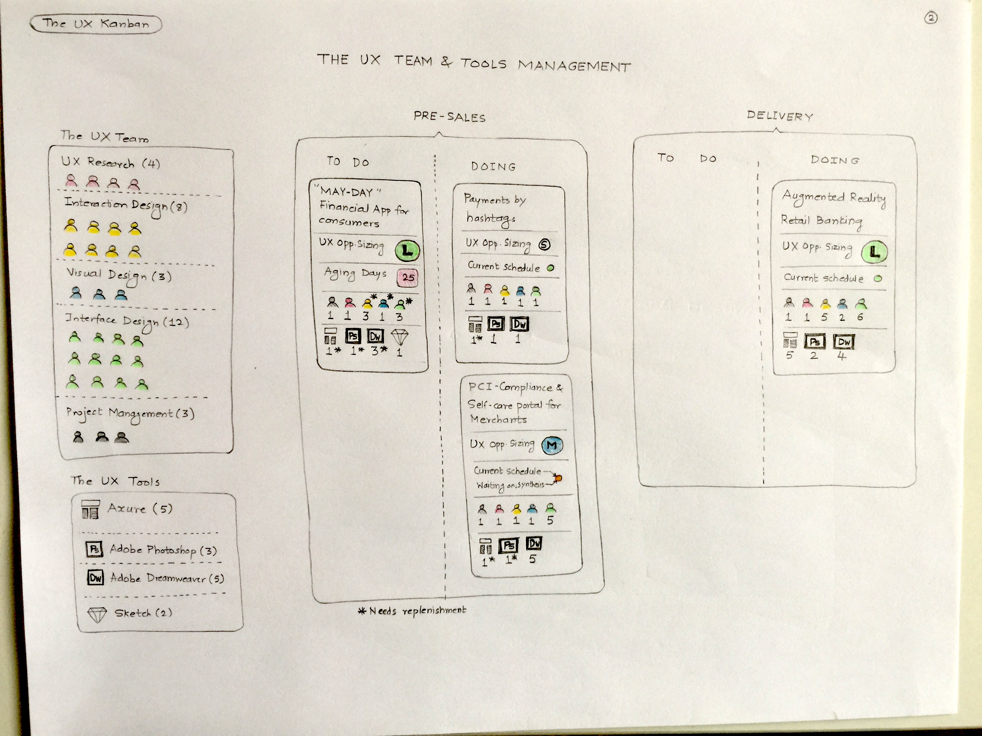
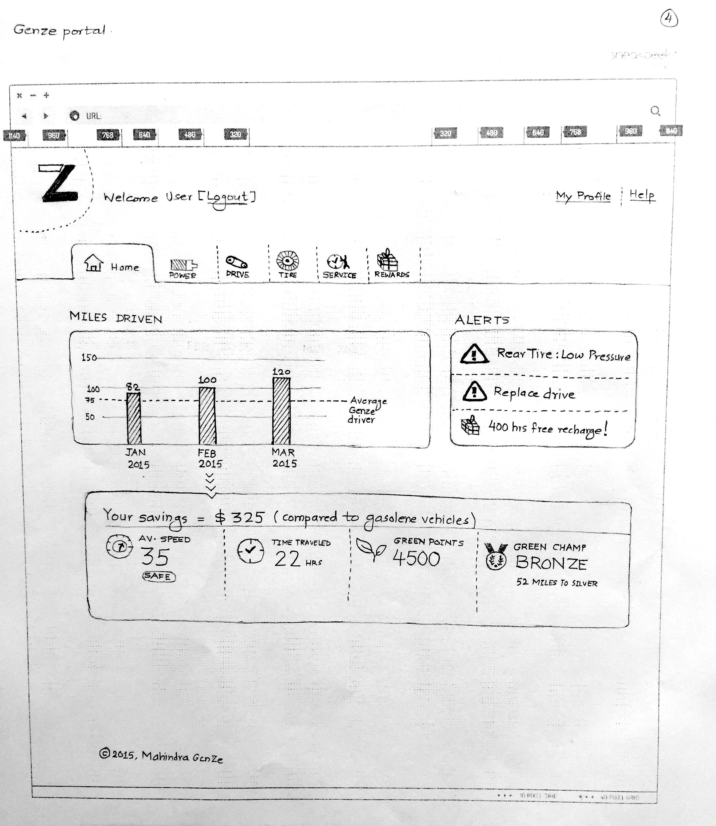
Based on the app usage, I have created a concept for a running app. I am sure it will undergo iterations, I am presenting the first draft.

Running App Concept - Page1

Running App Concept – Page1

Running App Concept - Page2

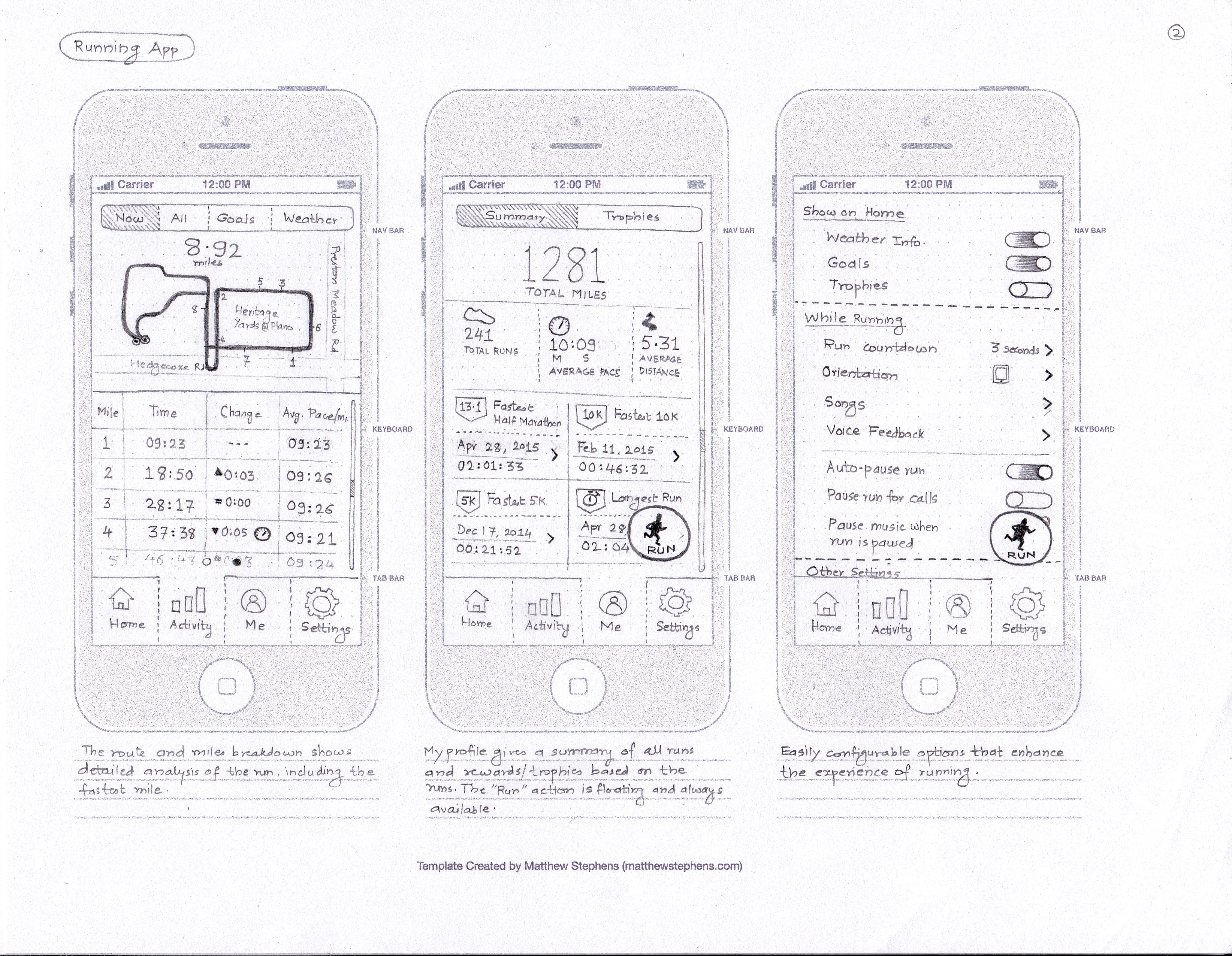
Running App Concept – Page2


The UX Kanban

In some organizations, the user experience (UX) team is seen as a problem child. It has merits, brilliant minds and capable hands. But, it has its own ways of working.

In a typical services company, the UX team works in a horizontal mode – providing consultancy to every business unit. In product companies, the UX team may be divided according to the product portfolios. Regardless of size and nature of business, one thing is common that managing the UX team takes a toll on the CxOs of the organization. The pressures of billability, team members’ utilization and investment of tools are the commonplace problems. Of course, there is no panacea (the cure-all medicine) to these problems.

Many tools, methodologies have been attempted to “civilize” the team. One of them is Kanban.

Kanban literally means ‘signpost’, a just-in-time production system designed by Taiichi Ohno at Toyota. Kanban is a system to control the logistical chain from a production point of view, and is not an inventory control system.

In simple words, Kanban means to produce only when there is a demand. It helps organizations to be leaner, productive and have faster turnarounds. There is ample material available on the net to read and watch videos on Kanban system.

I took the Kanban approach and applied to the typical UX team scenarios. The first sketch shows a Kanban dashboard of projects in UX portfolio. It has visual cues and legends that helps the UX managers / leads to focus on what is important from delivery and sales point-of-view.

The overall view

The overall view

The second sketch depicts the Kanban system from the team and tools perspective – how many designers we need to hire, what tools we need to purchase.

The team and tools view

The team and tools view

The third sketch shows the Kanban cards the UX team members would receive as work queues. They will get a precise description of what needs to be delivered, how and when.

The UX delivery view

The UX delivery view

If you tie these three sketches together, it could lead you to a system of UX team management – a web tool or an iPad app (if you visualize). Who does not want some structure to the maverick team :)?

Audiobooks

If you have read the Tolkien classic ‘The Hobbit’, chances are that you have seen the Hobbit movies too. Would you head to an audiobook that narrates the book? If you do, would you buy a book from an audiobook company?

The digital publishing industry is made up of e-books and audiobooks. They complement, not compete with the traditional books. Audiobooks offer different kind of experience – you can hear the books on the walk, on the drive, while cooking or any other activities that do not ‘demand’ attention.

I recently reviewed an audiobook application and bought an audiobook. The app experience was underwhelming and I was amazed to see the difference of treatments to the Android app vis-a-vis the iPhone app. So, here is my design concept that will give an enhanced experience of an audiobook app.

Audiobook Mindmap

Audiobook Mindmap

Audiobook Concept Page 1

Audiobook Concept Page 1

Audiobook Concept Page 2

Audiobook Concept Page 2

The Electric Generation

We are indebted to the scientific society of the 1900s who invented technologies we take for granted.

One of the inventors happens to be Nikola Tesla. Elon Musk is redefining the electric cars through his venture Tesla Motors. Major automobile manufacturers have taken their steps building electric cars – Nissan, Chevrolet, Toyota. Those who are genuinely interested in understanding the electric car history can read about Better Place (started by Shai Agassi, now closed) and watch the documentary “Revenge of the Electric Car” on Netflix.

While the electric cars’ evolution is on, it has not stopped the automobile world to leverage their technology to the most ubiquitous form of transportation in most countries – the bike. One of the companies that is manufacturing an electric bike in US happens to be Mahindra, naming its electric bike as “GenZe”. If you happen to be in Bay Area or Los Angeles, chances are that you might have seen that bike on the road.

I designed a mobile app concept for GenZe. The users of the mobile app are students, pizza delivery guys. The idea of the app was simple – know the bike’s essential parameters before turning the engine on. 100+ parameters of the bike are up in the cloud. There are sensors on the bike that give crucial data about the bike’s mechanics, electrical, tire pressure, etc.

The iOS and Android app offer the similar experience, with one exception. Android phones have a desktop widget of the App – no need to launch the app. There is also a micro-website that gives detailed analysis of bike’s usage.

GenZe iPhone app

GenZe iPhone app

GenZe iPhone app

GenZe iPhone app

GenZe Android app

GenZe Android app

GenZe Micro Website

GenZe Micro Website

The travel bug

Raise your hand if you love to travel :). Both for work and pleasure.

Being a designer has taken me to new places like US, UK, Malaysia and India. I love to travel.

Its easy to travel in India, my native country. The modes of transport are easy to understand and arrange. Same is the case with UK – great country for public transit. Malaysia is good too. It is in US where I struggled with – by using public transit. The fault was entirely mine.

I was in California after a good gap of 7 years. I should have started driving the car in US by now. It was my second visit to the country, longer than the previous one. The right-to-left wheel transition was a bit baffling to me, initially. I tried driving once and then gave up the thought. I relied on friends to tag along in their cars on weekend outings and sometimes choosing the VTA trains to roam around.

Weekend agenda was simple – explore new places. The downside of using the public transit was time – a simple journey from San Jose (CA) to Gilroy (CA) is a 40 min drive. A public transit journey (combining train and bus) taken around 2 hrs.

Back then, we did not have smartphones. The iPhone was 1yr old. Google was touted to release its first Android device. There was no blazing internet on the phone that we have now. No question of maps on phone.  It was July 2008.

On one of the weekend trips back to home, I missed a bus. Me and my friend waited for the next bus to come, which did not arrive as per schedule. The printed bus time-table at the stop told a grim story of weekend bus gaps. There were relatively less number of buses plying on the roads on weekends.

I thought, we are in the one of the most advanced places on earth, i.e. California. How come we do not have any service / tool / application that helps me travel with public transport? Mobile apps were just beginning to appear on devices. What I was thinking as a concept was a mashup of public transit data, mobile phone capabilities and real time information.

In 2009, I sketched a concept – a public transit app that any tourist, or any city dweller can use to travel. The app is called ‘Ghumiyo’ – a slang in Hindi language, which translated means “travel”. Notice the template I used 🙂 – The Nexus One and the HTC Sense skin used as the Android launcher. 

Here is the app I designed:

Ghumiyo_1

Ghumiyo_1

Ghumiyo_2

Ghumiyo_2

Ghumiyo_3

Ghumiyo_3

Ghumiyo_4

Ghumiyo_4

Ghumiyo_5

Ghumiyo_5

Fast forward to today – I now live in Texas and I drive a car :).

Those cricketing ideas…..

At the moment, India is the ICC Cricket World Cup Champion defending its title in the 2015 edition. As I write, India has started off the defense campaign by a win over Pakistan. Online media, social networks and messengers are loaded with anecdotes, videos, game analysis, predictions and player trivia.

Indians are passionate about two things – Cricket and Bollywood. I have grown up on other sports in India too – tennis and football (soccer). But when it comes to the World Cup of cricket, other sports take a backseat. This will be the first time in 20 years, Indian cricket team will be playing without Sachin Tendulkar. He had been a regular figure in last 5 world cups, garnering maximum accolades to the team.

Over the years, the data visualization aspect of the game has improved. Nowadays, a cricket match analysis is replete with infographics and tools like wagon wheel, projection deliveries, momentum, hawk-eye, snickometer, etc.

There are multiple cameras that capture the action on the pitch and ground through different angles and get the granular data. From the sports data scientists’ point of view, the golden age of sports data (or rather cricketing data) is about to come. We now hear about the video analytics tools deployed by respective cricket teams to gauge the weakness and strengths of players.

Four years ago, I worked on two concepts related to cricket. One is the cricket scorecard and second is an iPad application.

I wanted to change the way cricket scorecards were presented to the users on television and websites. I wanted to give a new feel to it. This was my humble creation as I was just entering into the world of infographics design. Now, I look back and wonder at these designs and think they can be designed better :).

Scorecard - 1

Scorecard – 1

Scorecard - 2

Scorecard – 2

Scorecard - 3

Scorecard – 3

The second concept I did was a Twitter based cricket application called “IndiTalk!”. The premise is simple – talk, talk and talk about cricket. iPad was just launched, back then. The app UI bears good resemblance to the first generation iPad apps. This app, if designed today will probably have a different character to it.

IndiTalk_1

IndiTalk_1

IndiTalk_2

IndiTalk_2

IndiTalk_3

IndiTalk_3

Design for food

Let’s step away a while from the telecom domain :). I am going to present sketches I did for a pizza restaurant in Pune (India), Greens & Olives.

A brief history of Greens & Olives (G&O) should be told here. G&O was started in a place that was perceived as jinxed. The earlier occupant was a restaurant too. Before that, there was a retail outlet. The locality is brimming with 70+ restaurants. Moving to an already crowded competitive space was necessity. G&O decided that the food menu will be vegetarian, no liquor will be served. With odds stacked against it, it was going to be swimming with the sharks for G&O.

In the last two years Aditya Nilangekar, Pavan Iyengar and their team has excelled in creating G&O an exciting restaurant in Aundh, Pune.

Food and ambience is great. Chef’s recommendations are superb too.

The mobile app I designed complements the customer experience G&O team has created in 2 years. The iOS app and Android apps are being designed.

Here are the sketches of the mobile app (mind map and app UI):

Mindmap

Mindmap

Mobile App Concept - Page 1

Mobile App Concept – Page 1

Mobile App Concept - Page 2

Mobile App Concept – Page 2

If you are living in Pune, head to Aundh. Here is the address (opens a new Google Maps window) – Opposite Tangent Furniture Mall, Nagras road, Aundh Pune, Maharashtra. Call: +91 20 3267 3030

Time is the essence

Bill Gates wrote a book called “Business @ The Speed of Thought”. I don’t remember exactly when I read that book, but it did impart me the sense of urgency one needs in business, and in design.

Fast forward to recent times when I was working in an agile software development project. User stories are the holy grail for design & development. People revolved around stories, epics, acceptance criteria and got the work done in sprints.

In one of my projects for a telecom operator, I was designing the reports module. I sketched two explorations of the UI.

Here is how the UI is supposed to work – It is a progressive disclosure (step wise reveal).

1) On the page, only Data Source choice is seen first. User starts with a selection of data source.

2) Report selector is then shown to the user. User chooses a report name.

3) The page shows up the report columns to build the query.

4) The user clicks “Generate Report” button and the report is shown to the user.

Exploration #1

Exploration #1

Exploration #1

Exploration #2

Exploration #2

Exploration #2

Notice the differences in the approach – in Exploration#1 report column selection can be done by drag-n-drop of column names. In Exploration#2, there are additional filters for reports, “Save as Favorite” action to the report, contextual data presented to the user as “related reports”.

Exploration#2 was finally chosen by the development team.

Time to create these two explorations, discuss and select was 1 hour.

Time is the essence.

“We want new concepts”

How often you hear these words from the bean counters? No need to dwell on the count. Just get the work done :).

The example I am presenting here is an enterprise dashboard application of a telecom operator. Dashboard gives a summary view of its enterprise customers – what contracts are expiring, no. of sales opportunities, escalations, ticketing reports, etc. It also gives the ability to dive down and see the granular details of enterprise customer data.

This was a legacy application created by mashups – typical scenario of multiple heads managing volumes of data with disparate technology platforms talking to each other. End result was a ‘patch-work’ application that suffered experience issues of the data (incomplete data, irrelevant data) and performance.

Imagine I am the user, a sales executive. If I log in to the dashboard application I see partial data on the CSAT, sluggish data on the contracts that are expiring and incomplete data on the new opportunities.

If I am a program manager and want to see escalations of a particular customer, selection of 1 year ticketing records would generate 11 million table rows. This would slow down the performance and hamper the user experience. Now imagine this scenario both in the web browser on your computer and on an iPad native application.

You might be thinking now, where are the user experience issues? Hang on to that thought.

This is what you are told –

1) You cannot contact users.

2) You can play around with the existing application. But remember, don’t break it.

3) We know user experience is not the problem. The real issues are data binding and performance.

4) “We want new concepts”.

Here is the concept #1 – Zoomable Interface

Zoomable Interface - 1

Zoomable Interface – 1

Zoomable Interface - 2

Zoomable Interface – 2

Zoomable Interface - 3

Zoomable Interface – 3

Zoomable Interface - 4

Zoomable Interface – 4

Zoomable Interface - 5

Zoomable Interface – 5

Zoomable Interface - 6

Zoomable Interface – 6

Zoomable Interface - 7

Zoomable Interface – 7

Here is the concept #2 – Spider Chart Interface

Spider Chart Interface - 1

Spider Chart Interface – 1

Spider Chart Interface - 2

Spider Chart Interface – 2

Spider Chart Interface - 3

Spider Chart Interface – 3

Spider Chart Interface - 4

Spider Chart Interface – 4

Here is the concept #3 – Data Visualization Interface (not a fully designed user journey).

Data Visualization Interface - 1

Data Visualization Interface – 1

Data Visualization Interface - 2

Data Visualization Interface – 2

Data Visualization Interface - 3

Data Visualization Interface – 3

So what concept was finally chosen? None. The development team cited issues related to time and tweaked the existing UI. Even the low hanging fruits in the UI turned out be sore.

Infographics : Day 1 @ TechMahindra

Pune is a city in Western India, often referred to as Oxford of the East. In lies Pune, the growth roots of many software organizations that have survived all the booms and busts of western markets. One of them is TechMahindra, which has offices in as many as 3 locations in Pune. The office that I am talking about is in the heart of the city, on the bustling Karve Road.

TechMahindra has always been inspiring designers like me to express their “solution mindset” to the problems no one cares about.

I took in my stride the necessity to design my own solutions that will help me on the job – two examples have already been shared through the blog posts – the Elevators infographics and the RUS infographic.

To a new employee, the first day in Karve Road office is memorable in many ways. The credit goes to the architecture of the connected TechMahindra buildings – the Sharda Center and Annex. The day starts with “no parking” in the designated office parking to accidentally landing up in parking by stairs, losing the way from Sharda Center to Annex and vice versa during lunch time, the orientation program on first day, etc are all too much too imbibe on the joining day.

I created an infographic – 4 column fold-out that explains the various activities that happen on 1st day in TechMahindra. There is a visual path that directs the reader / user to understand what they are supposed to do.

I submitted this design to the HR in 2013.

First Page of the Infographic Brochure

First Page of the Infographic Brochure

First Fold of the Infographic Brochure

First Fold of the Infographic Brochure

Second Fold of the Infographic Brochure

Second Fold of the Infographic Brochure

Third Fold of the Infographic Brochure

Third Fold of the Infographic Brochure

Closure of the Infographic Brochure

Closure of the Infographic Brochure