Infographics : Day 1 @ TechMahindra

Pune is a city in Western India, often referred to as Oxford of the East. In lies Pune, the growth roots of many software organizations that have survived all the booms and busts of western markets. One of them is TechMahindra, which has offices in as many as 3 locations in Pune. The office that I am talking about is in the heart of the city, on the bustling Karve Road.

TechMahindra has always been inspiring designers like me to express their “solution mindset” to the problems no one cares about.

I took in my stride the necessity to design my own solutions that will help me on the job – two examples have already been shared through the blog posts – the Elevators infographics and the RUS infographic.

To a new employee, the first day in Karve Road office is memorable in many ways. The credit goes to the architecture of the connected TechMahindra buildings – the Sharda Center and Annex. The day starts with “no parking” in the designated office parking to accidentally landing up in parking by stairs, losing the way from Sharda Center to Annex and vice versa during lunch time, the orientation program on first day, etc are all too much too imbibe on the joining day.

I created an infographic – 4 column fold-out that explains the various activities that happen on 1st day in TechMahindra. There is a visual path that directs the reader / user to understand what they are supposed to do.

I submitted this design to the HR in 2013.

First Page of the Infographic Brochure

First Page of the Infographic Brochure

First Fold of the Infographic Brochure

First Fold of the Infographic Brochure

Second Fold of the Infographic Brochure

Second Fold of the Infographic Brochure

Third Fold of the Infographic Brochure

Third Fold of the Infographic Brochure

Closure of the Infographic Brochure

Closure of the Infographic Brochure

Step 2) Create the information architecture – PART 4

“Your story may not have a such a happy beginning. But that does not make you who you are. It is the rest of the story whom you chose to be!” echoes the Soothsayer to the Dragon Warrior Po, in Kung Fu Panda 2.

We all marvel at the way story is being told in a movie, right? How the story is played is nothing but ‘structure’ of the movie.

Start > Flashback > Resume Story > Story moves forward > Dream Sequence > Resume (Audience yawns :D) > Story moves forward  > Climax > The End.

This structure – how a movie is presented to the audience, can be loosely interpreted as information architecture (IA).

You may have visited thousands of sites – look at this site too, there is a defined structure to the overall site – You have main navigation on the top (Home, About, Workshop). The content is posted every week – it carries a date stamp. You can always go and browse the old content using ‘Recent posts’ or jump directly to any topic using ‘tag cloud’. This all is a result of layout + content + information architecture.

How does one create the information architecture of a digital product / service?

  1. Get the ecosystem on paper.
  2. Get the user task flow.
  3. Visualize the ‘paths’ of links and link hierarchy – how the user will navigate the product using different paths.
  • Think of flexibility: Can user achieve the same goal using 2 or 3 different paths?
  • Think of ease of use: Can user intuitively choose the link to pursue a specific task?
  • Think of user efficiency: Can user complete the given task in less time?
  • Think of shortest & longest paths: Will the user browse ‘sitemap’ or directory structure or use the search utility on the website?

If you start thinking on these lines, you will visualize the structure of your digital product. That’s when you have finally created the information architecture.

Here are some examples of information architecture of websites / dashboards:

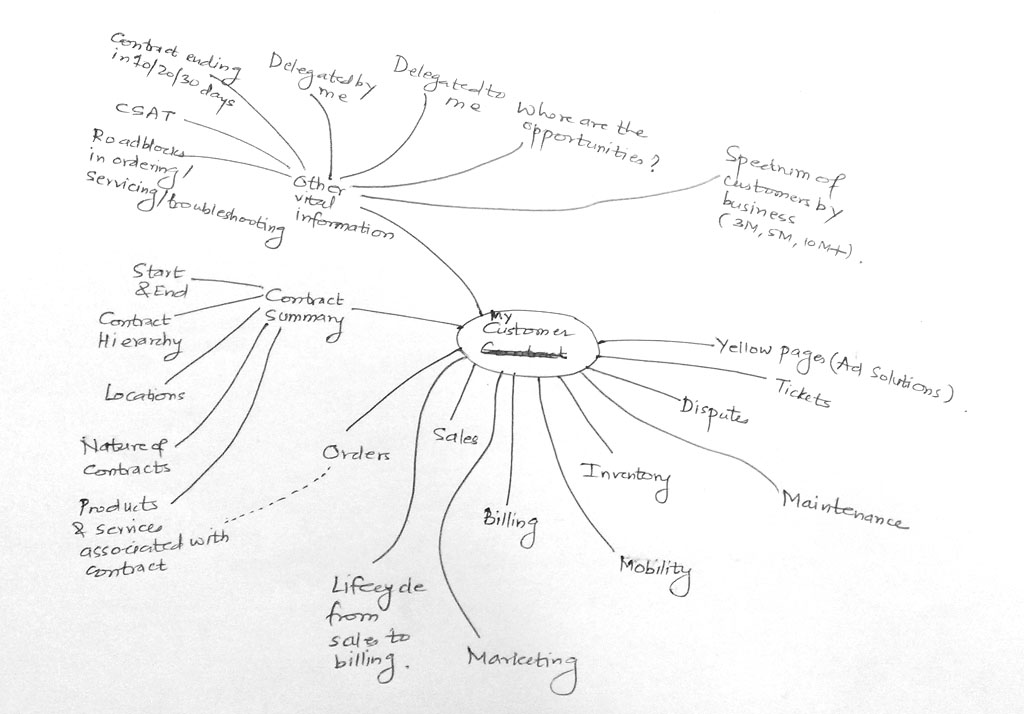
Example 1: Enterprise Dashboard

We start of with the ecosystem view of the dashboard.

Ecosystem View

Ecosystem View

The following image depicts how the user flow would be:

User flow

User flow

The third image shows the overall information architecture of the dashboard – depicting the ‘content’ heads, the paths / links, the hierarchy of the paths with respect to each other.
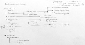
IA Dashboard

IA Dashboard

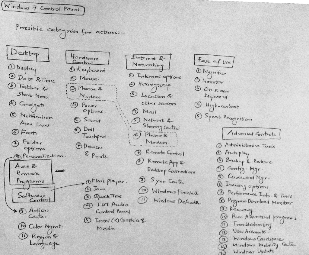
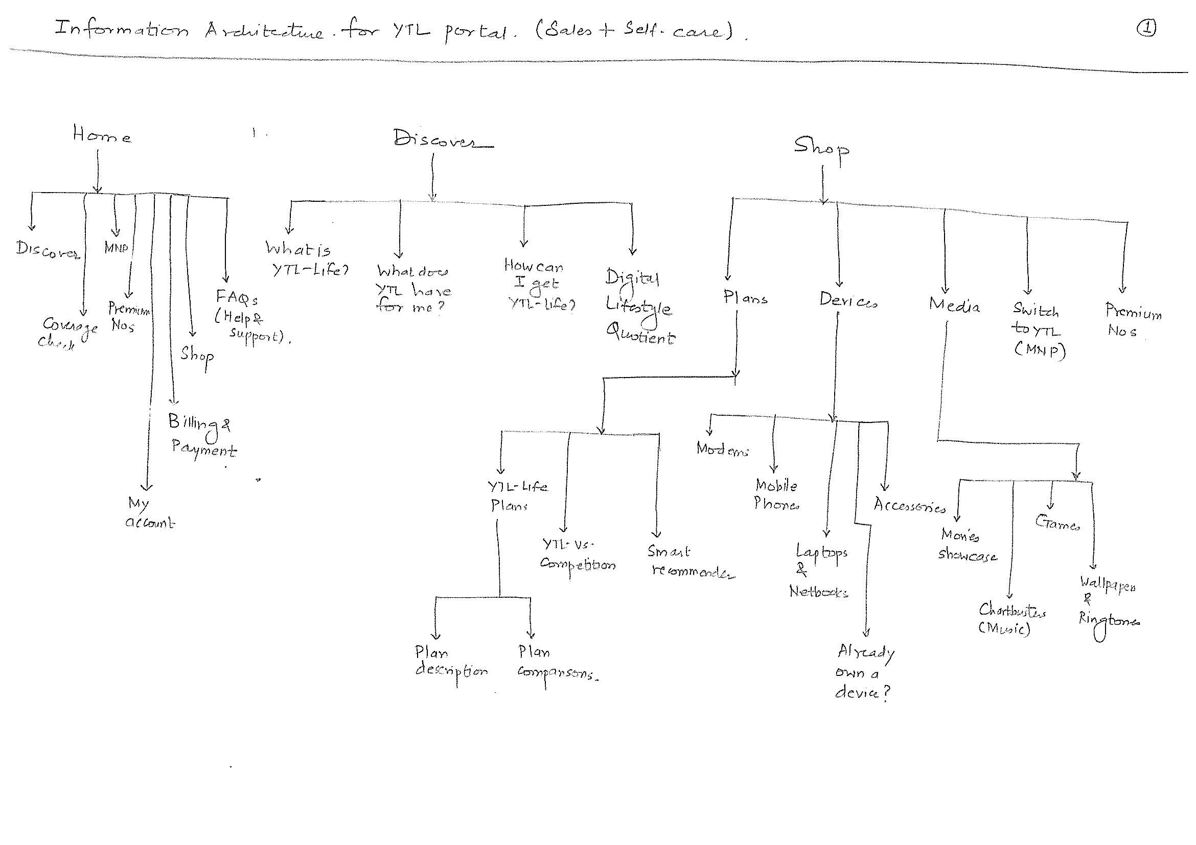
Example 2: Windows 7 Control Panel redesign

This is an attempt to redesign the Windows 7 Control Panel. The first image shows a mash-up of a mind map or decomposition of an action in Windows desktop.

Windows 7 Control Panel Mind Map

Windows 7 Control Panel Mind Map

Windows 7 Control Panel IA

Windows 7 Control Panel IA

The second image is nothing but a raw depiction of IA (the very first draft). The IA always gets improvised with the time.

It is basically a ‘bucketing’ exercise done to arrange most closely associated elements in one category. Exercises like these are often carried out with ‘users’ who are inexperienced designers – they arrange the data elements they perceive to be intuitive. This activity is commonly known as card sorting. Card sorting is a quick way to put a structure around your data elements. The elements are written on cards or post-it notes and arranged in ‘buckets’ or categories defined by the users.

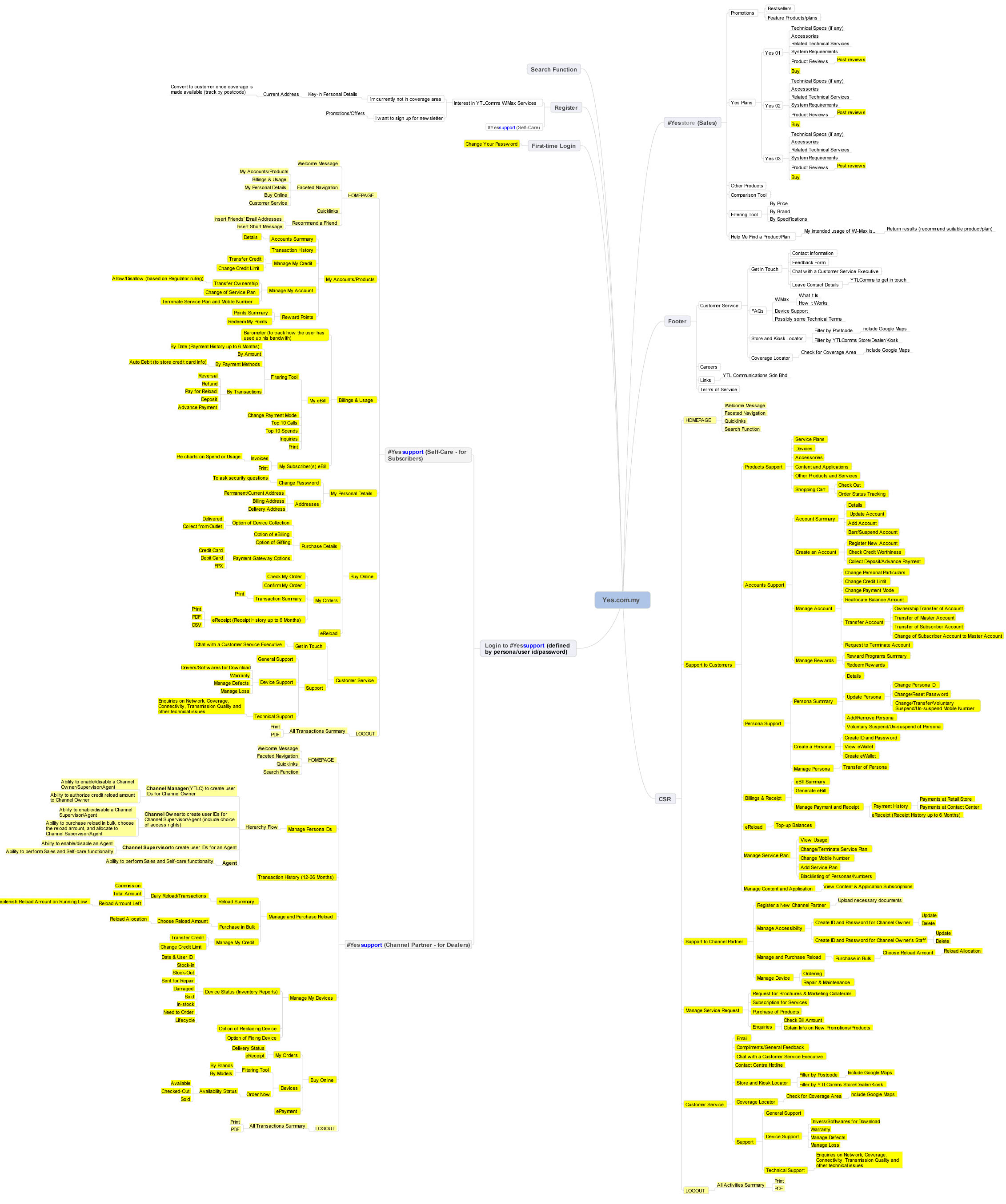
Example 3: IA for a 4G telecom launch portal

4G Telecom Portal IA

4G Telecom Portal IA

4G Telecom Portal IA

4G Telecom Portal IA

4G Telecom Portal IA

4G Telecom Portal IA

4G Telecom Portal IA

4G Telecom Portal IA

The final version of the IA looked like this (designed in Mindjet Mindmanager):

Final IA - 4G Telecom Portal

Final IA – 4G Telecom Portal

So, how does one know whether the IA designed works or not?

Consider the following example:

Let’s assume that your digital product (e.g. an e-commerce site) is designed & launched with fanfare, perhaps with a brand ambassador. The hype generated excites the early adopters; users get registered in great numbers. But the users do not become buyers. Why? Over the months, user registration starts dropping. The stakeholders get the jitters. How can they overcome this?

Well, there is no unique solution to this – assuming that the branding has been great part of the website and there is a trust & safety sentiment of the buyer with the site too. There could be a possibility that the underlying IA of the website is not working.

How can one say this confidently? Yes, you can.

Look at the web analytics data – the click throughs of the user recorded in quantitative data form. Look at the web logs. You will see how users are coming to the website, what paths users are taking to reach to specific content, how they are exiting the website, how much time they are spending on the website.

Get your website dissected completely with web analytics data. You may have a look at the most popular web analytics products – Google Analytics.

The web analytics data will only tell you – what is happening? It is up to the designer to figure out ‘why’ it is happening. So looking at IA will only tell you the half story.

Got the story?

Step 2) Create the information architecture – PART 3

Let’s move away a bit, from the digital world.

What comes to your mind when you come across some daily displays of information, like these?

Nutrition Facts

Nutrition Facts

Nutrition Facts

Nutrition Facts

Pure data treatment, right? What can one do with this type of data presentation – is the nutritional information indicative enough to tell you what’s good for your health?

We need to dig more to make of sense of the data. How about these pictures?

Menu

Menu

Food Menu

Food Menu

Well, the data in these pictures are easy to read. Why? Because there are some “heads” that hold specific data. i.e. categories that classify the data into different buckets. The information that you deduce from the menu card is what type of restaurant it is (the variety of food it offers, the price range, whether it suits your next date :), etc.). Only when you step in the restaurant, eat the food and get out, you have ‘experienced’ the restaurant and you are knowledgeable to praise or rant the restaurant.

Every day you are exposed to vast amount of information. Crucial are also the circumstances / contexts in which you consume the information. And at that time, the entire onus of delivering the information rests on the designer :).

Imagine you are driving your car and you have a flat tire. Never in your life you have had flat tire (there is always the first time for everything :D) and never have you ever serviced your car before. So, human tendency is to pick up the phone and call service center. Self-starters will pick up the ‘car manual’ and put up the spare tire and drive back home. I am narrating a true story, not an inspired one :). One of my friends encountered the flat tire situation in US, he could not deduce how to change the tire from the car manual. He found out that the spare tire was smaller than the regular tire, he felt he was duped by the car seller :). Anyways, he got back to the car manual and could not change the tire. Here is what the car manual looked like:

Car Manual

Car Manual

If you are curious about what happened to the car, here it is what happened: I changed the spare tire of my friend’s car and we reached home safely. If the book was designed intuitively, my friend could have done the job on his own and won himself some credibility :).

The point is that every printed word that you come across may be uniquely represented – it conveys some meaning (in isolation or together with other words), is part of a big ‘category’ – a common bucket of words / data combined together to make some sense.

Information architecture is a structure that holds the data together.  It is a set of data elements that define the hierarchy of data (what data sits on the top, what at the next level and so on, image a tree structure). It is a structure that defines the relationships between the data – e.g. in an electronic store catalogue there will be list of individual items available for sale. The store may also display products that can be sold as “combo” with other products. Or products that were bought by customers after purchasing a product (“Customers who bought this also bought….”).

It is up to the designer to establish the relationships between the data. The designer visualizes the ecosystem, gets the user and stakeholder data – now he/she has to construct a ‘structure’ which will become the IA (that will translate user ‘needs’ to user journeys). This structure will help the end user to consume the content, ‘see’ what is available, and help him/her to reach specific information using controls offered by the design – e.g. on an e-commerce site, the user will use category-wise listing or search utility to find the desired product.

Information architecture alone does not solve the issue of non-intuitive interfaces. It is ONE of the elements that define the interface. The content, the visual treatment also play an important part in the overall design.

At this point, it will be good if you read the  ‘Elements of user experience’ created by Jesse James Garret. He explains the ‘elements’ in a better way – the different stages that make up the entire user experience aspect of any digital product. In this representation, you will find information architecture placed at the center of the system, a third step from surface to strategy.

So all said and done, how does one actually create information architecture?

Let’s do that in our next and final post on IA.

Step 1) Understand the ecosystem – PART 2

“A wise car hears one word and understands two” is a line quoted by one of the characters in Cars 2 movie.

A designer precisely does that 🙂 and comes up with his/her ‘mental model’ of the ecosystem using a visualization technique.

Mind map is a visualization technique that was introduced by Tony Buzan (http://www.tonybuzan.com/). Google “mindmap” and you will get loads of links that explain how to create a mind map. A very detailed explanation of this can be found on Wikipedia: https://en.wikipedia.org/wiki/Mind_map

Mind you, mind map is just one of the techniques of visualization. There are entity-relationship diagrams, time-series data, statistical distributions, maps, hierarchy diagrams, etc. You can use any or combinations of these techniques to create your view of the ecosystem. As discussed in the last post, I am comfortable with mind maps. Sometimes, I create infographics to depict my understanding of the ecosystem.

An advanced mind can refer to Edward Tufte’s books (www.edwardtufte.com) for deeper understanding of visualization methods.

To express the ecosystem in a graphical form, one need not be a great artist. Content is an important as the treatment. The ecosystem infographic is generally designed over a period of time – fine tuned every day as you (designer) get deeper insights on what is happening, who is influencing what, etc.

Engage with stakeholders, development teams, book their calendars. Set up some lock-down sessions with them :). Encourage them to express their wishful thinking using whiteboards. White-boarding activity is a sort-of ice-breaking ceremony between designers and stakeholders, which define the course of product/service design. Sessions like white-boarding activities need to be orchestrated professionally. Stakeholders are short on time and attention – pick their brains that will help you understand what and how they envision the product.

Some examples of the white boarding activities that I participated are shown below:

Whiteboard Sample 1
Whiteboard_1_NEW

Whiteboard Sample 2
Whiteboard_3_NEW

Whiteboard Sample 3
Whiteboard_4_NEW

Whiteboard Sample 4
Whiteboard_5_NEW

In your ‘lock-down’ sessions and white boarding activities perhaps, you may discover key information that is not documented anywhere. Record like a dicta-phone and act like a Sherlock :).

Last year I participated in one of the stakeholder workshops to understand the business requirements. The business goal was to transform the legacy desktop application (serving 13 US geographical states’ telecom professionals) into a portal based solution.

I quickly sketched the following (an infographic) that captured the essence of that meeting:
Migration_NEW

On the left is depiction of PMO (present mode of operation) = old vendor’s engagement model with cost.

On the right is FMO (future mode of operation) = my development team’s engagement model with cost.

The picture was clear to me – My development team had to deliver a tough assignment at a very low cost in a less timeframe. We were at loss. As indicated by the management, we delivered in spite of all the constraints.

While I was on a teleconference call with one of the stakeholders for another project, I quickly drew the following, took a picture of it and shared with him in the call:
eM_NEW
The overall goal of the system design was captured correctly. In the call, we nailed down the granularities of processes represented by numbers.

Lets go back to our earlier thread – the mind map.

Mind-map is your view, how you see things and their relationships with other elements. It’s your ‘mental model’. A mind map starts with a goal (e.g. “reduce the no. of help-desk calls for the company”). This goal could be further broken down into sub-goals and sub-sub goals. Imagine a tree structure with the centralized goal radiating out branches (that represents sub-goals) that reach wide. Every sub-goal paves way for a sub-sub goal and so on. I think Buzan explains this better than me :). Copy-pasting the following 10 steps from Wikipedia, hope this helps.

Buzan suggests the following guidelines for creating mind maps:

  1. Start in the center with an image of the topic, using at least 3 colors.
  2. Use images, symbols, codes, and dimensions throughout your mind map.
  3. Select key words and print using upper or lower case letters.
  4. Each word/image is best alone and sitting on its own line.
  5. The lines should be connected, starting from the central image. The central lines are thicker, organic and thinner as they radiate out from the centre.
  6. Make the lines the same length as the word/image they support.
  7. Use multiple colors throughout the mind map, for visual stimulation and also to encode or group.
  8. Develop your own personal style of mind mapping.
  9. Use emphasis and show associations in your mind map.
  10. Keep the mind map clear by using radial hierarchy, numerical order or outlines to embrace your branches.

This list is itself more concise than a prose version of the same information and the mind map of these guidelines is itself intended to be more memorable and quicker to scan than either the prose or the list.

Too much of information overload? Don’t worry, have a look at the following mind-map I created for a financial software company:
InnovationCulture_2_NEW

Here are some additional mind maps I created for various enterprise portal dashboard assignments:
MigrationPortal_MMAP_NEW

EnterpriseApp_NEW

Practice the mind mapping technique or any other visualization technique that you are comfortable with. Do it on paper first. Spend some time with your visualization, talk to people, refine your visualization based on insights gathered. There is a digital tool too to create mind maps, Mindjet Mindmanager (http://www.mindjet.com).

That brings me my tools for paper prototyping. Here are they:

  1. An A5 size notebook (plain paper). I use notebooks by Nightingale (http://www.nightingale.co.in/Social_Stationery/Hand_Book.htm) – good paper & packaging quality).
  2. Stock of A4 papers
  3. 0.7mm mechanical pencil (I am currently using Camlin Klick Pro pencil – http://www.ithinkstore.com/camlin-klick-pro-0-7mm-mechenical-pencil-pack-of-10-pencils.html) Why 0.7mm? Because you can get thicker lines on paper prototypes :).
  4. Color pencils (any make, no preference).
  5. Eraser (Staedler – http://www.staedtler.com/en/products/pencils-accessories/erasers/tradition-526-t-eraser/#id=250&tx_solr[page]=1)
  6. Post-it notes (3M, of course)

This 1st step (understanding the ecosystem) is a crucial one. This is the foundation of your building. Plan it well.

Get the picture?

Step 1) Understand the ecosystem – PART 1

Regardless of the steps involved in creating the paper prototypes, an important point to understand is that one has to think visually. We are taught to think in a structured way, question and get answers in a logical way, conditioned to rationalize everything. That’s good. But you have to use imagination too – things that may defy the conventions and make you connect the dots. It’s okay if there are some things that remain unexplained, things that you cannot make connections with. Like all mysterious things, let the discovery awe you in the design process, while designing the product / service. You are not going to get all the answers at one go.

Whenever in doubt, bank upon your imagination and visualize those aspects that make things ‘believable’. When you understand the ecosystem, knowledge is as important as imagination.

Ecosystem could be a vast sea and probably you might be designing a very small yet significant part of it. E.g. In a financial institution like Citibank or HSBC, your design goal could be to optimize the online self-help documentation that will minimize the helpdesk telephone calls (eventually reducing the cost to the company). If you are new to finance domain, you are lucky. You could be in a position to imbibe the best knowledge of the finance world and design solution accordingly.

User experience designers often say that they design technology-agnostic and domain-agnostic solutions, i.e. whether is a life science project or a telecom project or any educational project, their design process & deliverables will remain the same. Regardless of the organization & the market segment, they work ‘horizontally’. However, there is no harm in being a little vertical about the domain. Having deeper insights about technology, undefined rules, sensing the interplay between different stakeholders will always help you.  We call this horizontal and vertical approach as the “T” approach – the alphabet signifying the horizontal direction designer undertakes project-wise (across all departments of the organization) and the vertical direction signifies the direction designer seeks domain-wise (deep probing a specific area). Team up with a systems engineer, a marketing expert, or corporate communications or public relations manager and get those great insights.

This T-approach will help you understand the ecosystem. Understanding is not just asking questions to stakeholders and users. Nor it is just about doing contextual inquiries of the users. It is also about sensing things. It is not reading and deducing the written material. It is also about ‘reading between the lines’. A designer already has the gift to imbibe things, a keen eye and attentive ear, an imaginative mind and visual thinking. To understand the ecosystem is to commission all the senses and orchestrate the data, information and the insights that one gathers from all the customer touch-points.

Remember Sherlock Holmes? Have you read ‘Tinker Tailor Soldier Spy’? Have you seen the Jason Bourne trilogy of movies? Its all the detective and spy stuff, which might excite one – all the protagonists of these fictions think and act differently. Their ‘view’ of the problem at hand and the ecosystem is what makes them successful.

So what is actually an ecosystem? It is the designer’s view of how he/she looks at the things that influence the design. This will tell the designer how certain things work. Who makes them work? What happens if a certain parameter is missed out? What will happen if the output is overshot? Will users abandon the ship if a certain task is vaguely defined?

There are many questions that one comes across in designer’s mind. As discussed earlier, there might be answers to few. For unanswered questions, it’s good to use your imagination. Some questions might be answered during the later stages of design (prototype iterations or user testing).

As a designer, you either facilitate or make a disruptive change to the system with your designs. Most designers take the pleasure in breaking the system by being in the system. That’s what ‘T-approach’ is all about.

In the next post, let’s look at some examples of mind-maps that define the ecosystem.