Step 2) Create the information architecture – PART 2

“Gentleman, you had my curiosity. Now you have my attention”, says Leonardo DiCaprio in the movie ‘Django Unchained’.

Drawing parallels – the data just brings in curiosity. The information grabs the attention. What is this all talk about information architecture? What is see is what you get, right? But, what you see is different from what you perceive. Creating information architecture (IA) is a path towards understanding the ‘data’, making sense of the data, the ability to slice & dice the data and make relationships with the data.

Data, in its raw form, e.g. “Today’s temperature is 31 degrees Celsius”, does not really add any value. However, if we impart some additional meaning to the data, e.g. “The daily temperature has risen by 4 degree Celsius over last 2 days”, then it becomes information. Why? Because there is a reference point with the data, there is something preceding/succeeding with the current data and there is a relationship with different data points.

When we stack many data points, we get information. When we stack many deep insights from information, we become ‘knowledgeable’ :).

Let’s go back to our 5 examples discussed in the last post.

1) Things Organized Neatly

Every time I look at this site, it creates a ‘wow’ factor in my mind. Things that seem so nondescript are arranged in a visual form that communicates the shredded ecosystem in tiny parts. My view of this website (what I liked, what makes this website great is depicted below):

Things Organized Neatly

Things Organized Neatly

2) Flipkart

I have been user of this website since 2008. I was one of those Indian buyers who did not trust sharing my credit / debit card information online. Flipkart knew this well and brought in the “cash on delivery” model, which has now become the Indian e-commerce norm. They started with books and now sell almost every lifestyle product. Today, their speedy shipping time marvels many Indian customers, and I am one of them.  Here is how I view Flipkart:

Flipkart

Flipkart

3) Wikipedia’s content on Pune

I am an immigrant to Pune (India), with origins in the pre-Independence industrial town called Kirloskarwadi. I grew up with the internet age and have witnessed web migrate from 0.0 to 1.0 to 2.0 and beyond. Similarly, I have been a resident of Pune for the last 18 years and have seen the city growing by leaps and bounds. I visit Wikipedia often to see the changes in Pune city documented on the site. Wikipedia is a user generated content website – anyone can become author. This is what I view of the Wikipedia’s entry on Pune:

Wikipedia on Pune

Wikipedia on Pune

4) Google Maps

‘Travel’ without the travel – that’s what Google map does :). I feel that Google has superior user experience than Mapquest & Yahoo Maps, the reason it became so popular. It’s the map application that is on top of my mind every time I have to search any location. Being an Android user means it is also the de-facto application to search any location. Here is my view on Google Maps:

Google Maps

Google Maps

5) Southwest.com

I have been a frequent traveler on Southwest for the last 2 years. I think that customer experience is in their DNA – both offline and online. The website’s content, navigation and discoverability of content are positive experiences. “Where should I find this?” questions generally get up answered up on the same page. The following image depicts my view of the ticket-booking journey on Southwest.com:
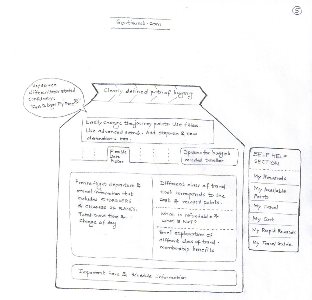
Southwest

Southwest

 Hope you also have your own sketches / visuals of these websites. As said earlier, sketching will help you – it does not matter whether you designed a mind-map, infographic or anything else.

While drawing, I am sure you must have come across these questions:

  1. Home pages of these websites carry tremendous amount of information. What if the home page is designed in non-intuitive way?
  2. How will the users discover information that is not evident on the surface?
  3. How deep-rooted the navigation should be? Will the user get frustrated at 4-level navigation?
  4. Are login paths clearly visible to the user? Is log-out placed intuitively or is it done in the same way as social networking websites (hidden inside a menu)?
  5. What amount of information can user cope up with? What is that threshold / breaking point?

Answering these questions means getting closer to build the information architecture, the content and page layout.

Let’s look into details about creating the information architecture in our next post.

Now that you got attention (after you got curios), let’s sustain that :).

Step 1) Understand the ecosystem – PART 2

“A wise car hears one word and understands two” is a line quoted by one of the characters in Cars 2 movie.

A designer precisely does that 🙂 and comes up with his/her ‘mental model’ of the ecosystem using a visualization technique.

Mind map is a visualization technique that was introduced by Tony Buzan (http://www.tonybuzan.com/). Google “mindmap” and you will get loads of links that explain how to create a mind map. A very detailed explanation of this can be found on Wikipedia: https://en.wikipedia.org/wiki/Mind_map

Mind you, mind map is just one of the techniques of visualization. There are entity-relationship diagrams, time-series data, statistical distributions, maps, hierarchy diagrams, etc. You can use any or combinations of these techniques to create your view of the ecosystem. As discussed in the last post, I am comfortable with mind maps. Sometimes, I create infographics to depict my understanding of the ecosystem.

An advanced mind can refer to Edward Tufte’s books (www.edwardtufte.com) for deeper understanding of visualization methods.

To express the ecosystem in a graphical form, one need not be a great artist. Content is an important as the treatment. The ecosystem infographic is generally designed over a period of time – fine tuned every day as you (designer) get deeper insights on what is happening, who is influencing what, etc.

Engage with stakeholders, development teams, book their calendars. Set up some lock-down sessions with them :). Encourage them to express their wishful thinking using whiteboards. White-boarding activity is a sort-of ice-breaking ceremony between designers and stakeholders, which define the course of product/service design. Sessions like white-boarding activities need to be orchestrated professionally. Stakeholders are short on time and attention – pick their brains that will help you understand what and how they envision the product.

Some examples of the white boarding activities that I participated are shown below:

Whiteboard Sample 1
Whiteboard_1_NEW

Whiteboard Sample 2
Whiteboard_3_NEW

Whiteboard Sample 3
Whiteboard_4_NEW

Whiteboard Sample 4
Whiteboard_5_NEW

In your ‘lock-down’ sessions and white boarding activities perhaps, you may discover key information that is not documented anywhere. Record like a dicta-phone and act like a Sherlock :).

Last year I participated in one of the stakeholder workshops to understand the business requirements. The business goal was to transform the legacy desktop application (serving 13 US geographical states’ telecom professionals) into a portal based solution.

I quickly sketched the following (an infographic) that captured the essence of that meeting:
Migration_NEW

On the left is depiction of PMO (present mode of operation) = old vendor’s engagement model with cost.

On the right is FMO (future mode of operation) = my development team’s engagement model with cost.

The picture was clear to me – My development team had to deliver a tough assignment at a very low cost in a less timeframe. We were at loss. As indicated by the management, we delivered in spite of all the constraints.

While I was on a teleconference call with one of the stakeholders for another project, I quickly drew the following, took a picture of it and shared with him in the call:
eM_NEW
The overall goal of the system design was captured correctly. In the call, we nailed down the granularities of processes represented by numbers.

Lets go back to our earlier thread – the mind map.

Mind-map is your view, how you see things and their relationships with other elements. It’s your ‘mental model’. A mind map starts with a goal (e.g. “reduce the no. of help-desk calls for the company”). This goal could be further broken down into sub-goals and sub-sub goals. Imagine a tree structure with the centralized goal radiating out branches (that represents sub-goals) that reach wide. Every sub-goal paves way for a sub-sub goal and so on. I think Buzan explains this better than me :). Copy-pasting the following 10 steps from Wikipedia, hope this helps.

Buzan suggests the following guidelines for creating mind maps:

  1. Start in the center with an image of the topic, using at least 3 colors.
  2. Use images, symbols, codes, and dimensions throughout your mind map.
  3. Select key words and print using upper or lower case letters.
  4. Each word/image is best alone and sitting on its own line.
  5. The lines should be connected, starting from the central image. The central lines are thicker, organic and thinner as they radiate out from the centre.
  6. Make the lines the same length as the word/image they support.
  7. Use multiple colors throughout the mind map, for visual stimulation and also to encode or group.
  8. Develop your own personal style of mind mapping.
  9. Use emphasis and show associations in your mind map.
  10. Keep the mind map clear by using radial hierarchy, numerical order or outlines to embrace your branches.

This list is itself more concise than a prose version of the same information and the mind map of these guidelines is itself intended to be more memorable and quicker to scan than either the prose or the list.

Too much of information overload? Don’t worry, have a look at the following mind-map I created for a financial software company:
InnovationCulture_2_NEW

Here are some additional mind maps I created for various enterprise portal dashboard assignments:
MigrationPortal_MMAP_NEW

EnterpriseApp_NEW

Practice the mind mapping technique or any other visualization technique that you are comfortable with. Do it on paper first. Spend some time with your visualization, talk to people, refine your visualization based on insights gathered. There is a digital tool too to create mind maps, Mindjet Mindmanager (http://www.mindjet.com).

That brings me my tools for paper prototyping. Here are they:

  1. An A5 size notebook (plain paper). I use notebooks by Nightingale (http://www.nightingale.co.in/Social_Stationery/Hand_Book.htm) – good paper & packaging quality).
  2. Stock of A4 papers
  3. 0.7mm mechanical pencil (I am currently using Camlin Klick Pro pencil – http://www.ithinkstore.com/camlin-klick-pro-0-7mm-mechenical-pencil-pack-of-10-pencils.html) Why 0.7mm? Because you can get thicker lines on paper prototypes :).
  4. Color pencils (any make, no preference).
  5. Eraser (Staedler – http://www.staedtler.com/en/products/pencils-accessories/erasers/tradition-526-t-eraser/#id=250&tx_solr[page]=1)
  6. Post-it notes (3M, of course)

This 1st step (understanding the ecosystem) is a crucial one. This is the foundation of your building. Plan it well.

Get the picture?