Step 2) Create the information architecture – PART 4

“Your story may not have a such a happy beginning. But that does not make you who you are. It is the rest of the story whom you chose to be!” echoes the Soothsayer to the Dragon Warrior Po, in Kung Fu Panda 2.

We all marvel at the way story is being told in a movie, right? How the story is played is nothing but ‘structure’ of the movie.

Start > Flashback > Resume Story > Story moves forward > Dream Sequence > Resume (Audience yawns :D) > Story moves forward  > Climax > The End.

This structure – how a movie is presented to the audience, can be loosely interpreted as information architecture (IA).

You may have visited thousands of sites – look at this site too, there is a defined structure to the overall site – You have main navigation on the top (Home, About, Workshop). The content is posted every week – it carries a date stamp. You can always go and browse the old content using ‘Recent posts’ or jump directly to any topic using ‘tag cloud’. This all is a result of layout + content + information architecture.

How does one create the information architecture of a digital product / service?

  1. Get the ecosystem on paper.
  2. Get the user task flow.
  3. Visualize the ‘paths’ of links and link hierarchy – how the user will navigate the product using different paths.
  • Think of flexibility: Can user achieve the same goal using 2 or 3 different paths?
  • Think of ease of use: Can user intuitively choose the link to pursue a specific task?
  • Think of user efficiency: Can user complete the given task in less time?
  • Think of shortest & longest paths: Will the user browse ‘sitemap’ or directory structure or use the search utility on the website?

If you start thinking on these lines, you will visualize the structure of your digital product. That’s when you have finally created the information architecture.

Here are some examples of information architecture of websites / dashboards:

Example 1: Enterprise Dashboard

We start of with the ecosystem view of the dashboard.

Ecosystem View

Ecosystem View

The following image depicts how the user flow would be:

User flow

User flow

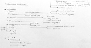
The third image shows the overall information architecture of the dashboard – depicting the ‘content’ heads, the paths / links, the hierarchy of the paths with respect to each other.

IA Dashboard

IA Dashboard

Example 2: Windows 7 Control Panel redesign

This is an attempt to redesign the Windows 7 Control Panel. The first image shows a mash-up of a mind map or decomposition of an action in Windows desktop.

Windows 7 Control Panel Mind Map

Windows 7 Control Panel Mind Map

Windows 7 Control Panel IA

Windows 7 Control Panel IA

The second image is nothing but a raw depiction of IA (the very first draft). The IA always gets improvised with the time.

It is basically a ‘bucketing’ exercise done to arrange most closely associated elements in one category. Exercises like these are often carried out with ‘users’ who are inexperienced designers – they arrange the data elements they perceive to be intuitive. This activity is commonly known as card sorting. Card sorting is a quick way to put a structure around your data elements. The elements are written on cards or post-it notes and arranged in ‘buckets’ or categories defined by the users.

Example 3: IA for a 4G telecom launch portal

4G Telecom Portal IA

4G Telecom Portal IA

4G Telecom Portal IA

4G Telecom Portal IA

4G Telecom Portal IA

4G Telecom Portal IA

4G Telecom Portal IA

4G Telecom Portal IA

The final version of the IA looked like this (designed in Mindjet Mindmanager):

Final IA - 4G Telecom Portal

Final IA – 4G Telecom Portal

So, how does one know whether the IA designed works or not?

Consider the following example:

Let’s assume that your digital product (e.g. an e-commerce site) is designed & launched with fanfare, perhaps with a brand ambassador. The hype generated excites the early adopters; users get registered in great numbers. But the users do not become buyers. Why? Over the months, user registration starts dropping. The stakeholders get the jitters. How can they overcome this?

Well, there is no unique solution to this – assuming that the branding has been great part of the website and there is a trust & safety sentiment of the buyer with the site too. There could be a possibility that the underlying IA of the website is not working.

How can one say this confidently? Yes, you can.

Look at the web analytics data – the click throughs of the user recorded in quantitative data form. Look at the web logs. You will see how users are coming to the website, what paths users are taking to reach to specific content, how they are exiting the website, how much time they are spending on the website.

Get your website dissected completely with web analytics data. You may have a look at the most popular web analytics products – Google Analytics.

The web analytics data will only tell you – what is happening? It is up to the designer to figure out ‘why’ it is happening. So looking at IA will only tell you the half story.

Got the story?

Step 2) Create the information architecture – PART 3

Let’s move away a bit, from the digital world.

What comes to your mind when you come across some daily displays of information, like these?

Nutrition Facts

Nutrition Facts

Nutrition Facts

Nutrition Facts

Pure data treatment, right? What can one do with this type of data presentation – is the nutritional information indicative enough to tell you what’s good for your health?

We need to dig more to make of sense of the data. How about these pictures?

Menu

Menu

Food Menu

Food Menu

Well, the data in these pictures are easy to read. Why? Because there are some “heads” that hold specific data. i.e. categories that classify the data into different buckets. The information that you deduce from the menu card is what type of restaurant it is (the variety of food it offers, the price range, whether it suits your next date :), etc.). Only when you step in the restaurant, eat the food and get out, you have ‘experienced’ the restaurant and you are knowledgeable to praise or rant the restaurant.

Every day you are exposed to vast amount of information. Crucial are also the circumstances / contexts in which you consume the information. And at that time, the entire onus of delivering the information rests on the designer :).

Imagine you are driving your car and you have a flat tire. Never in your life you have had flat tire (there is always the first time for everything :D) and never have you ever serviced your car before. So, human tendency is to pick up the phone and call service center. Self-starters will pick up the ‘car manual’ and put up the spare tire and drive back home. I am narrating a true story, not an inspired one :). One of my friends encountered the flat tire situation in US, he could not deduce how to change the tire from the car manual. He found out that the spare tire was smaller than the regular tire, he felt he was duped by the car seller :). Anyways, he got back to the car manual and could not change the tire. Here is what the car manual looked like:

Car Manual

Car Manual

If you are curious about what happened to the car, here it is what happened: I changed the spare tire of my friend’s car and we reached home safely. If the book was designed intuitively, my friend could have done the job on his own and won himself some credibility :).

The point is that every printed word that you come across may be uniquely represented – it conveys some meaning (in isolation or together with other words), is part of a big ‘category’ – a common bucket of words / data combined together to make some sense.

Information architecture is a structure that holds the data together.  It is a set of data elements that define the hierarchy of data (what data sits on the top, what at the next level and so on, image a tree structure). It is a structure that defines the relationships between the data – e.g. in an electronic store catalogue there will be list of individual items available for sale. The store may also display products that can be sold as “combo” with other products. Or products that were bought by customers after purchasing a product (“Customers who bought this also bought….”).

It is up to the designer to establish the relationships between the data. The designer visualizes the ecosystem, gets the user and stakeholder data – now he/she has to construct a ‘structure’ which will become the IA (that will translate user ‘needs’ to user journeys). This structure will help the end user to consume the content, ‘see’ what is available, and help him/her to reach specific information using controls offered by the design – e.g. on an e-commerce site, the user will use category-wise listing or search utility to find the desired product.

Information architecture alone does not solve the issue of non-intuitive interfaces. It is ONE of the elements that define the interface. The content, the visual treatment also play an important part in the overall design.

At this point, it will be good if you read the  ‘Elements of user experience’ created by Jesse James Garret. He explains the ‘elements’ in a better way – the different stages that make up the entire user experience aspect of any digital product. In this representation, you will find information architecture placed at the center of the system, a third step from surface to strategy.

So all said and done, how does one actually create information architecture?

Let’s do that in our next and final post on IA.

Step 2) Create the information architecture – PART 2

“Gentleman, you had my curiosity. Now you have my attention”, says Leonardo DiCaprio in the movie ‘Django Unchained’.

Drawing parallels – the data just brings in curiosity. The information grabs the attention. What is this all talk about information architecture? What is see is what you get, right? But, what you see is different from what you perceive. Creating information architecture (IA) is a path towards understanding the ‘data’, making sense of the data, the ability to slice & dice the data and make relationships with the data.

Data, in its raw form, e.g. “Today’s temperature is 31 degrees Celsius”, does not really add any value. However, if we impart some additional meaning to the data, e.g. “The daily temperature has risen by 4 degree Celsius over last 2 days”, then it becomes information. Why? Because there is a reference point with the data, there is something preceding/succeeding with the current data and there is a relationship with different data points.

When we stack many data points, we get information. When we stack many deep insights from information, we become ‘knowledgeable’ :).

Let’s go back to our 5 examples discussed in the last post.

1) Things Organized Neatly

Every time I look at this site, it creates a ‘wow’ factor in my mind. Things that seem so nondescript are arranged in a visual form that communicates the shredded ecosystem in tiny parts. My view of this website (what I liked, what makes this website great is depicted below):

Things Organized Neatly

Things Organized Neatly

2) Flipkart

I have been user of this website since 2008. I was one of those Indian buyers who did not trust sharing my credit / debit card information online. Flipkart knew this well and brought in the “cash on delivery” model, which has now become the Indian e-commerce norm. They started with books and now sell almost every lifestyle product. Today, their speedy shipping time marvels many Indian customers, and I am one of them.  Here is how I view Flipkart:

Flipkart

Flipkart

3) Wikipedia’s content on Pune

I am an immigrant to Pune (India), with origins in the pre-Independence industrial town called Kirloskarwadi. I grew up with the internet age and have witnessed web migrate from 0.0 to 1.0 to 2.0 and beyond. Similarly, I have been a resident of Pune for the last 18 years and have seen the city growing by leaps and bounds. I visit Wikipedia often to see the changes in Pune city documented on the site. Wikipedia is a user generated content website – anyone can become author. This is what I view of the Wikipedia’s entry on Pune:

Wikipedia on Pune

Wikipedia on Pune

4) Google Maps

‘Travel’ without the travel – that’s what Google map does :). I feel that Google has superior user experience than Mapquest & Yahoo Maps, the reason it became so popular. It’s the map application that is on top of my mind every time I have to search any location. Being an Android user means it is also the de-facto application to search any location. Here is my view on Google Maps:

Google Maps

Google Maps

5) Southwest.com

I have been a frequent traveler on Southwest for the last 2 years. I think that customer experience is in their DNA – both offline and online. The website’s content, navigation and discoverability of content are positive experiences. “Where should I find this?” questions generally get up answered up on the same page. The following image depicts my view of the ticket-booking journey on Southwest.com:

Southwest

Southwest

 Hope you also have your own sketches / visuals of these websites. As said earlier, sketching will help you – it does not matter whether you designed a mind-map, infographic or anything else.

While drawing, I am sure you must have come across these questions:

  1. Home pages of these websites carry tremendous amount of information. What if the home page is designed in non-intuitive way?
  2. How will the users discover information that is not evident on the surface?
  3. How deep-rooted the navigation should be? Will the user get frustrated at 4-level navigation?
  4. Are login paths clearly visible to the user? Is log-out placed intuitively or is it done in the same way as social networking websites (hidden inside a menu)?
  5. What amount of information can user cope up with? What is that threshold / breaking point?

Answering these questions means getting closer to build the information architecture, the content and page layout.

Let’s look into details about creating the information architecture in our next post.

Now that you got attention (after you got curios), let’s sustain that :).

Step 2) Create the information architecture – PART 1

It is the human tendency to slot things we like & dislike. We often say someone telling “he is not in my good books anymore!” Sometimes this categorization happens unconsciously; sometimes it happens because we want them to be.

How many people organize their desk, their room and their house? Aren’t there any incentives for cleanliness :)?

Some people marvel at the ‘grey area’, while some always look at the extreme whites and blacks.

Great digital designs always have great information architectures. Information architecture (IA) is the soul of the design. On the surface one cannot actually ‘see’ the IA, one can only experience it by the tangible things the product presents – through the clicks, by moving from one section of the application to other.

Before we get into the specifics on what is IA and all, lets look at the some of the examples:

  1. A photo blog curated by Curated by Austin Radcliffe – brilliant compilations on http://thingsorganizedneatly.tumblr.com – This blog gives great visual pleasure in seeing things neatly organized various visual forms – to achieve a symmetry & categorization effect. Importantly, it presents the granular view / exploded view of things that make up an ecosystem.
  2. Check out India’s answer to Amazon.com: www.flipkart.com – Look at the way products are displayed, the product search option and the filters to narrow down the product catalogue.
  3. How can one forget the gigantic Wikipedia content :)? Check out this URL too: http://en.wikipedia.org/wiki/Pune
  4. Locate your home using Google Maps, https://maps.google.com/ – dive from country level to the state level to the granularity of the streets next to your home.
  5. Go through the flight ticket-booking journey on Southwest (www.southwest.com). Look at the way information is presented to you, the flexible controls that make ticket booking a cakewalk.

When you are done with these websites, take a piece of paper and write down things that make these websites appear great.

There are many other examples, which we can refer to. But let’s focus now on these examples.

Through these examples we will understand the “behind the camera” / the making of these websites. This will lead us to understanding the IA – the structure or the blueprint of these websites.