Imagine catching a red-eye flight to your destination. Accompanying you on this trip is your spouse & your kids – a 5-year-old one and a toddler. You have flown from Dallas to San Francisco on the eve of a long weekend. While your flight is making the descent, you make a mental check of all things you need to do as soon as you land. And you pray that all things work out seamlessly – getting the luggage, renting car and reaching hotel safe and sound.
What if the hotel you were heading to, did all the heavy lifting of all your activities, informed you at regular intervals and delighted you in an unexpected way? All things you need, bundled in a secure hotel app. The hotel app not just helps you with hotel comforts but understands you as a person.
The hotel app is your digital concierge – ready to answer any questions you probably felt odd to ask the front desk – e.g. where I can get the power extension for my extra electronic devices? The hotel app recommends places to eat, shop & entertain. It keeps your paper receipts archived in the app. The app is the digital incarnation of the ever-reliant Alfred, who not just is a butler to Bruce Wayne but knows Bruce thoroughly as a person.
This digital app, Alfred precisely does that – it understands your needs as a traveler, anticipates your needs, nudges you to make better choices and makes your hotel stay enjoyable.
Travel may not be on everybody’s mind right now. That was not the case last year when everyone was either en route or already relaxed at their dream destination at this time of the year.
“I want my customers to ‘dream’ about my hotel property” was the design brief given to me by a client. It was odd and challenging at the same time. How can someone influence travelers and make them dream? Unless you are Christopher Nolan! The realms of “inception” are best suited to fiction. However, there could be a way to make a traveler aspire about destinations, thereby leading to make one dream.
I started off by interviewing users for the travel app – individuals who have been planning their annual vacation, backpackers, hikers, roadtrippers, etc. Through them, I discovered what things these travelers do to their homework – what apps they use, what sites they browse, whom do they talk to, how do they zero down to a single location, etc.
The MVP (minimal viable product) of the travel app was to design an iPad app. The grand scale vision was to design an ecosystem – a platform with end-to-end touchpoints integrated with every step of a traveler journey – right from a coffee table book to invoke interest, to a website & digital apps to sustain excitement and notifications to guide the traveler what to do, what to expect before embarking on travel.
The iPad app that I sketched was one of the most exciting projects for me. In addition to sketching, I used paper cutouts to show how the app pages would look like. In addition to the iPad app, I also designed the hotel experience iPhone app (I will share that in my next post).
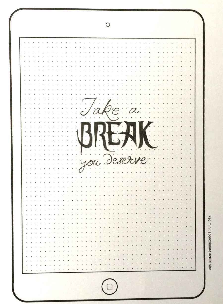
When the app is launched, messages like these (full page images with good lettering design) will kindle the user interest. These messages will do the “inception” – they stay on the screen long enough to transition to the next page automatically.
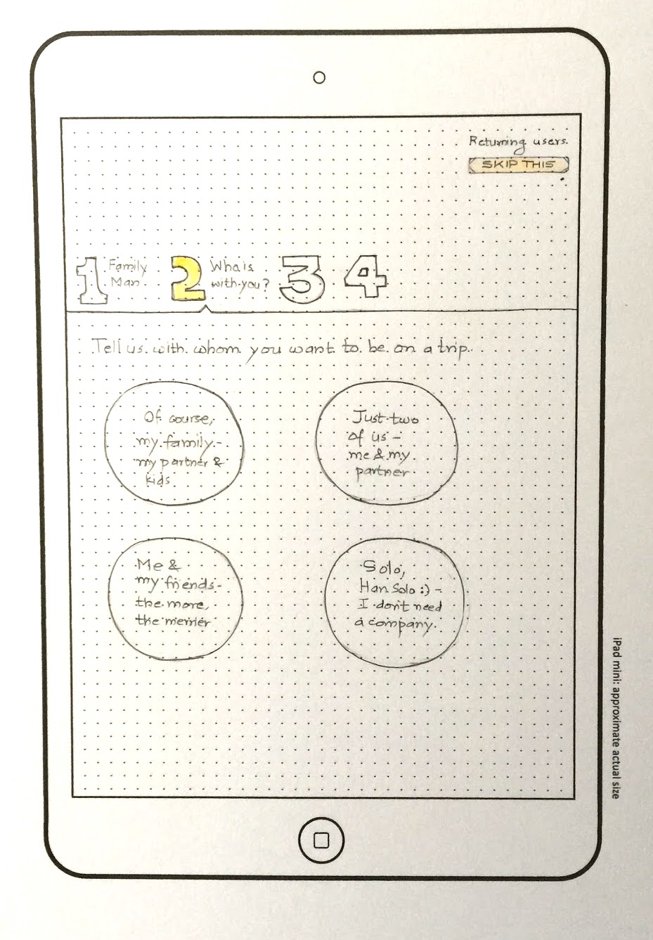
A first-time user will be guided through steps that will help the traveler to zero in on a location, on the basis of questions. A returning user can skip these steps and land up directly on the recommendations page. The recommendations page is built upon users’ browsing history, likes / dislikes and social interactions.
All the interests “pinned” by the user will be presented on the pinboard. The app will curate the “day-travels” and let the user choose anything that matches one’s interest. The user can also customize no. of days and the activities corresponding to the destination will change.
The user can browse detailed information of day-trips. The app will create a travel plan based on the user’s selection and topical data (e.g. “if it rains that day, the best places to visit are….”).
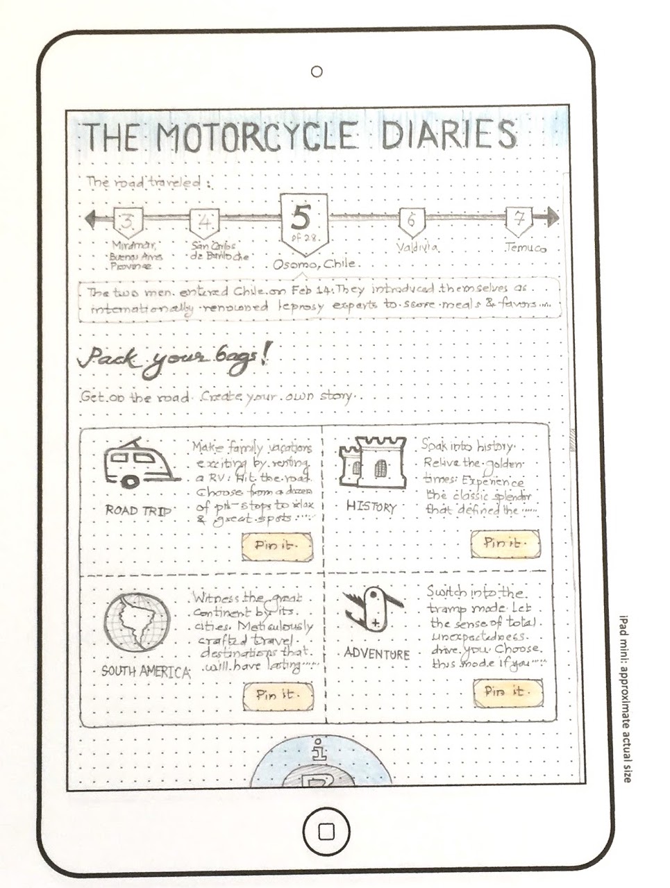
Every destination is presented as a form of a story that suits the traveler’s persona. If the traveler finds anything appealing, that trip is pinned to the pinboard.
Curated content engages the user about the place by introducing the user about the history, the culture, people, etc. Notice how the destination is told through movies & books. The movie trailers & the books kindle the interest in the minds of the traveler. Long vertical page scrolls and the magazine format of the content builds curiosity about the destination.
The idea is to keep the traveler engaged and not to hard-sell the destination hotels at this point. Once the user has decided to pick up a destination (after deliberation), then present the choice of hotels.
It is a wise call for now too. Take all time you need to bookmark the places you want to go next year. We may not travel now, but then the time to pack your bags will be on the horizon soon.
Raise your hand if you love to travel :). Both for work and pleasure.
Being a designer has taken me to new places like US, UK, Malaysia and India. I love to travel.
Its easy to travel in India, my native country. The modes of transport are easy to understand and arrange. Same is the case with UK – great country for public transit. Malaysia is good too. It is in US where I struggled with – by using public transit. The fault was entirely mine.
I was in California after a good gap of 7 years. I should have started driving the car in US by now. It was my second visit to the country, longer than the previous one. The right-to-left wheel transition was a bit baffling to me, initially. I tried driving once and then gave up the thought. I relied on friends to tag along in their cars on weekend outings and sometimes choosing the VTA trains to roam around.
Weekend agenda was simple – explore new places. The downside of using the public transit was time – a simple journey from San Jose (CA) to Gilroy (CA) is a 40 min drive. A public transit journey (combining train and bus) taken around 2 hrs.
Back then, we did not have smartphones. The iPhone was 1yr old. Google was touted to release its first Android device. There was no blazing internet on the phone that we have now. No question of maps on phone.It was July 2008.
On one of the weekend trips back to home, I missed a bus. Me and my friend waited for the next bus to come, which did not arrive as per schedule. The printed bus time-table at the stop told a grim story of weekend bus gaps. There were relatively less number of buses plying on the roads on weekends.
I thought, we are in the one of the most advanced places on earth, i.e. California. How come we do not have any service / tool / application that helps me travel with public transport? Mobile apps were just beginning to appear on devices. What I was thinking as a concept was a mashup of public transit data, mobile phone capabilities and real time information.
In 2009, I sketched a concept – a public transit app that any tourist, or any city dweller can use to travel. The app is called ‘Ghumiyo’ – a slang in Hindi language, which translated means “travel”. Notice the template I used 🙂 – The Nexus One and the HTC Sense skin used as the Android launcher.
Here is the app I designed:
Ghumiyo_1
Ghumiyo_2
Ghumiyo_3
Ghumiyo_4
Ghumiyo_5
Fast forward to today – I now live in Texas and I drive a car :).