The Hotel App

Imagine catching a red-eye flight to your destination. Accompanying you on this trip is your spouse & your kids – a 5-year-old one and a toddler. You have flown from Dallas to San Francisco on the eve of a long weekend. While your flight is making the descent, you make a mental check of all things you need to do as soon as you land. And you pray that all things work out seamlessly – getting the luggage, renting car and reaching hotel safe and sound.

What if the hotel you were heading to, did all the heavy lifting of all your activities, informed you at regular intervals and delighted you in an unexpected way? All things you need, bundled in a secure hotel app. The hotel app not just helps you with hotel comforts but understands you as a person.

The hotel app is your digital concierge – ready to answer any questions you probably felt odd to ask the front desk – e.g. where I can get the power extension for my extra electronic devices? The hotel app recommends places to eat, shop & entertain. It keeps your paper receipts archived in the app. The app is the digital incarnation of the ever-reliant Alfred, who not just is a butler to Bruce Wayne but knows Bruce thoroughly as a person.

This digital app, Alfred precisely does that – it understands your needs as a traveler, anticipates your needs, nudges you to make better choices and makes your hotel stay enjoyable.

The futuristic hotel awaits you.

The Travel App

Travel may not be on everybody’s mind right now. That was not the case last year when everyone was either en route or already relaxed at their dream destination at this time of the year.

“I want my customers to ‘dream’ about my hotel property” was the design brief given to me by a client. It was odd and challenging at the same time. How can someone influence travelers and make them dream? Unless you are Christopher Nolan! The realms of “inception” are best suited to fiction. However, there could be a way to make a traveler aspire about destinations, thereby leading to make one dream.

I started off by interviewing users for the travel app – individuals who have been planning their annual vacation, backpackers, hikers, roadtrippers, etc. Through them, I discovered what things these travelers do to their homework – what apps they use, what sites they browse, whom do they talk to, how do they zero down to a single location, etc.

The MVP (minimal viable product) of the travel app was to design an iPad app. The grand scale vision was to design an ecosystem – a platform with end-to-end touchpoints integrated with every step of a traveler journey – right from a coffee table book to invoke interest, to a website & digital apps to sustain excitement and notifications to guide the traveler what to do, what to expect before embarking on travel.

The iPad app that I sketched was one of the most exciting projects for me. In addition to sketching, I used paper cutouts to show how the app pages would look like. In addition to the iPad app, I also designed the hotel experience iPhone app (I will share that in my next post).

When the app is launched, messages like these (full page images with good lettering design) will kindle the user interest. These messages will do the “inception” – they stay on the screen long enough to transition to the next page automatically.

A first-time user will be guided through steps that will help the traveler to zero in on a location, on the basis of questions. A returning user can skip these steps and land up directly on the recommendations page. The recommendations page is built upon users’ browsing history, likes / dislikes and social interactions.

All the interests “pinned” by the user will be presented on the pinboard. The app will curate the “day-travels” and let the user choose anything that matches one’s interest. The user can also customize no. of days and the activities corresponding to the destination will change.

The user can browse detailed information of day-trips. The app will create a travel plan based on the user’s selection and topical data (e.g. “if it rains that day, the best places to visit are….”).

Every destination is presented as a form of a story that suits the traveler’s persona. If the traveler finds anything appealing, that trip is pinned to the pinboard.

Curated content engages the user about the place by introducing the user about the history, the culture, people, etc. Notice how the destination is told through movies & books. The movie trailers & the books kindle the interest in the minds of the traveler. Long vertical page scrolls and the magazine format of the content builds curiosity about the destination.

The idea is to keep the traveler engaged and not to hard-sell the destination hotels at this point. Once the user has decided to pick up a destination (after deliberation), then present the choice of hotels.

It is a wise call for now too. Take all time you need to bookmark the places you want to go next year. We may not travel now, but then the time to pack your bags will be on the horizon soon.

Here we go…..again!

We now live in a world where the iPhone has no home button, the iPad has a pencil & NASA has started sending back the astronauts from the US soil. To cut a long story short, it is time to revive the blog after a gap of 5 years :).

Starting this month, I will post new examples of paper prototypes. Stay tuned!

The Time Warriors

Your mobile phone is your savior. It tells you the time (and now you have a Watch to do that :D), it helps you plan your day and schedule your meetings for weeks in advance. Mash up this with cool tools that take away the pains from joining conference calls (the conference call app) and you will glide through your calendar effortlessly.

The ‘Up in the air’ personas expect more from their mobile / apps – they are on the road, have their calendars already planned days in advance and have to carefully accommodate the last-minute calls or meetings. Their productivity is defined by the time wisely used, and by the time wisely planned.

Here is a concept in the making – an app which gives anyone who wants to manage their work day efficiently. Right from the daily overview, to the weeks of business-as-usual, to the grinding monthly travels. The app syncs with your inbox and calendars on the device + in the cloud, reads your travel schedules and gives a unique view of your time.

Whether you are a CxO or a busy parent, this app will help the time warriors – on the road or off it.

The Time Warriors - Page1

The Time Warriors – Page1

The Time Warriors - Page2

The Time Warriors – Page2

Time is the essence

Bill Gates wrote a book called “Business @ The Speed of Thought”. I don’t remember exactly when I read that book, but it did impart me the sense of urgency one needs in business, and in design.

Fast forward to recent times when I was working in an agile software development project. User stories are the holy grail for design & development. People revolved around stories, epics, acceptance criteria and got the work done in sprints.

In one of my projects for a telecom operator, I was designing the reports module. I sketched two explorations of the UI.

Here is how the UI is supposed to work – It is a progressive disclosure (step wise reveal).

1) On the page, only Data Source choice is seen first. User starts with a selection of data source.

2) Report selector is then shown to the user. User chooses a report name.

3) The page shows up the report columns to build the query.

4) The user clicks “Generate Report” button and the report is shown to the user.

Exploration #1

Exploration #1

Exploration #1

Exploration #2

Exploration #2

Exploration #2

Notice the differences in the approach – in Exploration#1 report column selection can be done by drag-n-drop of column names. In Exploration#2, there are additional filters for reports, “Save as Favorite” action to the report, contextual data presented to the user as “related reports”.

Exploration#2 was finally chosen by the development team.

Time to create these two explorations, discuss and select was 1 hour.

Time is the essence.

“We want new concepts”

How often you hear these words from the bean counters? No need to dwell on the count. Just get the work done :).

The example I am presenting here is an enterprise dashboard application of a telecom operator. Dashboard gives a summary view of its enterprise customers – what contracts are expiring, no. of sales opportunities, escalations, ticketing reports, etc. It also gives the ability to dive down and see the granular details of enterprise customer data.

This was a legacy application created by mashups – typical scenario of multiple heads managing volumes of data with disparate technology platforms talking to each other. End result was a ‘patch-work’ application that suffered experience issues of the data (incomplete data, irrelevant data) and performance.

Imagine I am the user, a sales executive. If I log in to the dashboard application I see partial data on the CSAT, sluggish data on the contracts that are expiring and incomplete data on the new opportunities.

If I am a program manager and want to see escalations of a particular customer, selection of 1 year ticketing records would generate 11 million table rows. This would slow down the performance and hamper the user experience. Now imagine this scenario both in the web browser on your computer and on an iPad native application.

You might be thinking now, where are the user experience issues? Hang on to that thought.

This is what you are told –

1) You cannot contact users.

2) You can play around with the existing application. But remember, don’t break it.

3) We know user experience is not the problem. The real issues are data binding and performance.

4) “We want new concepts”.

Here is the concept #1 – Zoomable Interface

Zoomable Interface - 1

Zoomable Interface – 1

Zoomable Interface - 2

Zoomable Interface – 2

Zoomable Interface - 3

Zoomable Interface – 3

Zoomable Interface - 4

Zoomable Interface – 4

Zoomable Interface - 5

Zoomable Interface – 5

Zoomable Interface - 6

Zoomable Interface – 6

Zoomable Interface - 7

Zoomable Interface – 7

Here is the concept #2 – Spider Chart Interface

Spider Chart Interface - 1

Spider Chart Interface – 1

Spider Chart Interface - 2

Spider Chart Interface – 2

Spider Chart Interface - 3

Spider Chart Interface – 3

Spider Chart Interface - 4

Spider Chart Interface – 4

Here is the concept #3 – Data Visualization Interface (not a fully designed user journey).

Data Visualization Interface - 1

Data Visualization Interface – 1

Data Visualization Interface - 2

Data Visualization Interface – 2

Data Visualization Interface - 3

Data Visualization Interface – 3

So what concept was finally chosen? None. The development team cited issues related to time and tweaked the existing UI. Even the low hanging fruits in the UI turned out be sore.

Infographics – Resource Utilization Summary

When you are part of a corporate ladder, you are bound to do things you do NOT want to. If you are a designer acting like a design manager in a software services organization, then brace yourself for challenges ahead.

One of the duties that you assume in this role happens to be team management. Imagine there are 5-6 designers report to you and you need to ensure that they are 100% billable. Services organization needs granular data of employees like utilization of employees, what business any employee is accountable for, how much back-dated billing has happened for an employee, etc.

Team management was one of my duties in my earlier job. The tool used to track my team members was not helpful at all. It did not give me any idea about RUS (Resource Utilization Summary). Confused navigation and inappropriate content of the RUS tool drove me to maintain my own spreadsheets of data. But something was still missing.

As always, necessity is the mother of invention. Getting lost and landing up on wrong floors of the TechMahindra building through elevators had made me design infographics for elevators. This time, I took the same approach for team management and created an infographic.

This is how it looks:

Infographics : Resource Utilization Summary

Infographics : Resource Utilization Summary

The header section shows summary of the team member. The 5 columns show the overall utilization of the team member across 5 months. “RUS” means Resource Utilization Summary generated by team management tool (a customized tool in TechMahindra). PMTs are project codes assigned to the team member.

As always, sketching on paper helps :).

STEP 4) UNDERSTANDING THE TARGET DEVICES /PLATFORMS – PART 4 OF 4

“Sell this pen to me…” says Jordan Belfort in the movie “Wolf of Wall Street”. Let’s put aside the personality profile of Jordan for the moment, and concentrate on the “selling” aspect.

“Designing a solution is 30% of your job. Communicating and selling your design is 70%” were the wise words of my mentor.

You can be a great designer, doodling in isolation and toying the product with great tools. Your design will never make it to the market if you are not able to showcase your designs with a story.

That’s right. You have to orchestrate your story about the design to your audience – who are willing to guide it, nurture it with their money and resources.

Let’s say that you have quickly sketched out user journeys for key user tasks. You might be working in a agile model of software development. You want to validate the designs created – e.g. iPhone app for banking consumers. There are 3 key tasks in your sketches – view balance, bill payment, add a new credit card.

This is how I would present the paper prototypes to the audience and get their feedback:

1) I will invite all key decision makers & influencers (product manager, development lead, business analysts, system engineers, etc) in a conference room with a 30 minutes time slot.

2) On the soft board, I will pin up paper sketches in a sequence.

3) I will have another design team member, preferably UX researcher – to take the notes of the discussion. It is important that one talks (me) and the other (UX researcher) jots down the points as design inputs.

4) I will summarize what the session is all about to the audience. I will set a context first, when and how the user is going to use the app – what time of day, what place, and what is the trigger point of launching the app.

Since we are talking about a mobile app, I will use specific usage behaviors to weave the story and the sketches – e.g. how users people are motivated to finish a goal, how users prefer shortcuts, how the content takes precedence over navigation in mobile apps, how users’ mind wander 30% of the time, how users make mistakes, etc.

When you cite these examples, it is good to have a workable solution in your sketch. The audience is there to hear you narrate different scenarios they have NOT visualized. As a designer, it’s your job to make them VISUALIZE and give their inputs.

Do not just restrict your presentation to pinned up sketches. Take out the phone from your pocket and show your audience some noteworthy examples. If needed have another photo-essay running that connects the sketches with the user context. You may also compile and get some user research data and quote. Get anything in terms of products / examples / packaging designs / tools / applications that connects with your sketches and triggers the audience’s reaction.

So what do you once you have gathered inputs from your audience?

Tweak. Tinker. Iterate.

Build a story, and sell.

Once you have a feeling that design on paper is great, step into Axure, Adobe Fireworks, Sketch and iRise to create digital wireframes.

That concludes all the segments of how to create paper prototypes. In the following posts, I will share the actual sketches I have designed for some projects.

The anatomy of paper prototyping

Over the years, I have witnessed the change in how I approach any design problem. And create design explorations for the problem.

The change could be credited to factors like new tools being available, understanding the deeper sense of design, adding more granularity to the design deliverables, interconnecting the relationships between different variables, etc. This is an ongoing process and the learning never stops :).

There are different ways to start off and design for any context. End to end user experience design lifecycle is expressed in different forms by different design agencies – the sub processes change a bit, but the essence remains the same. On a high level, any user experience design project will fall into four distinct buckets – (a) requirements understanding (b) conceptualization (c) prototyping (d) implementation / deliver.

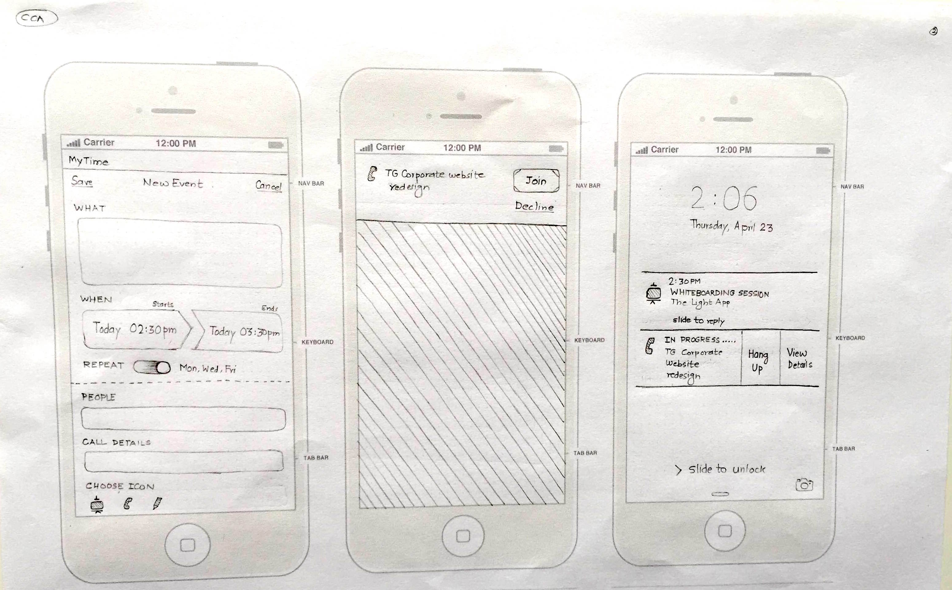
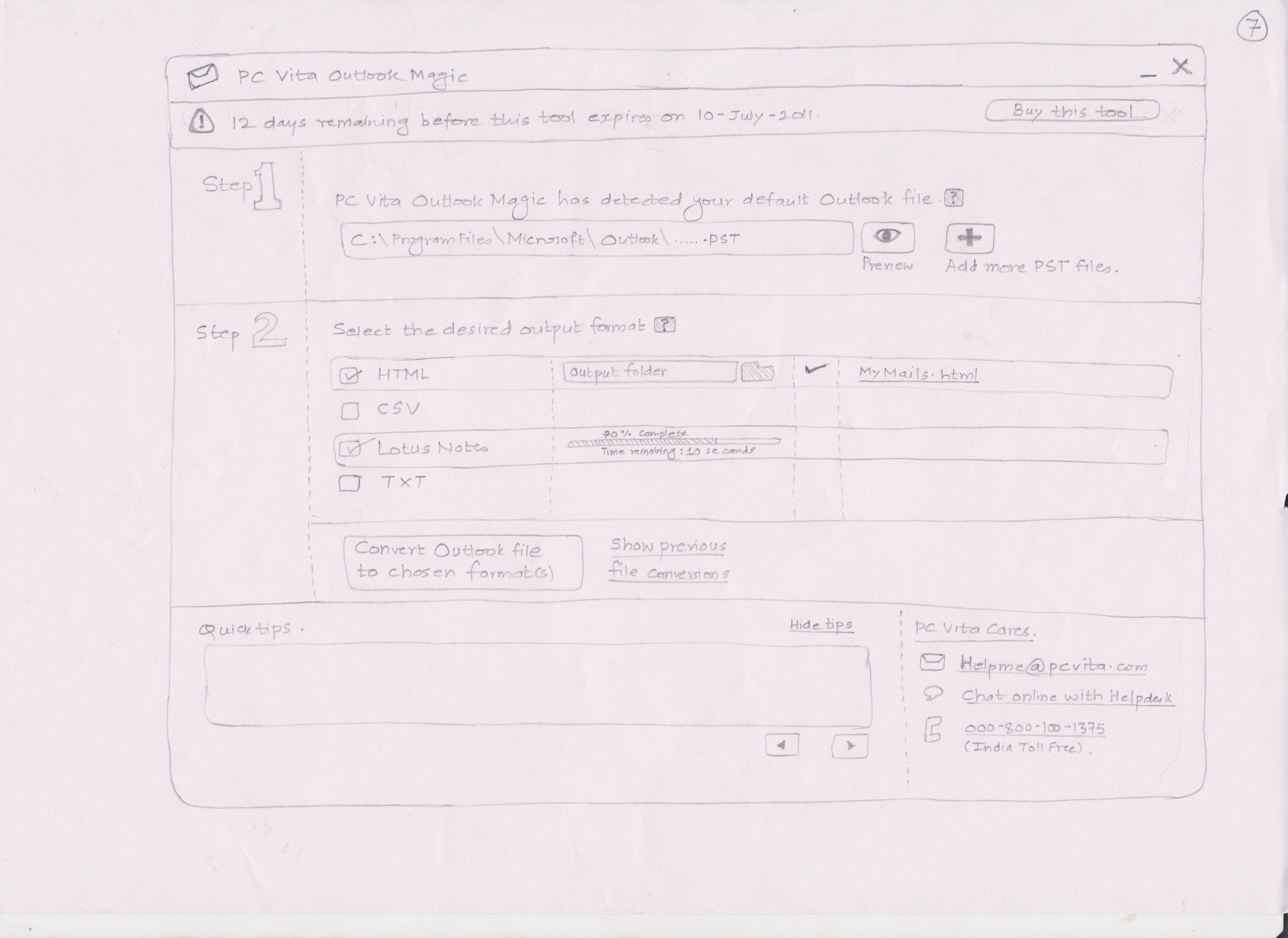
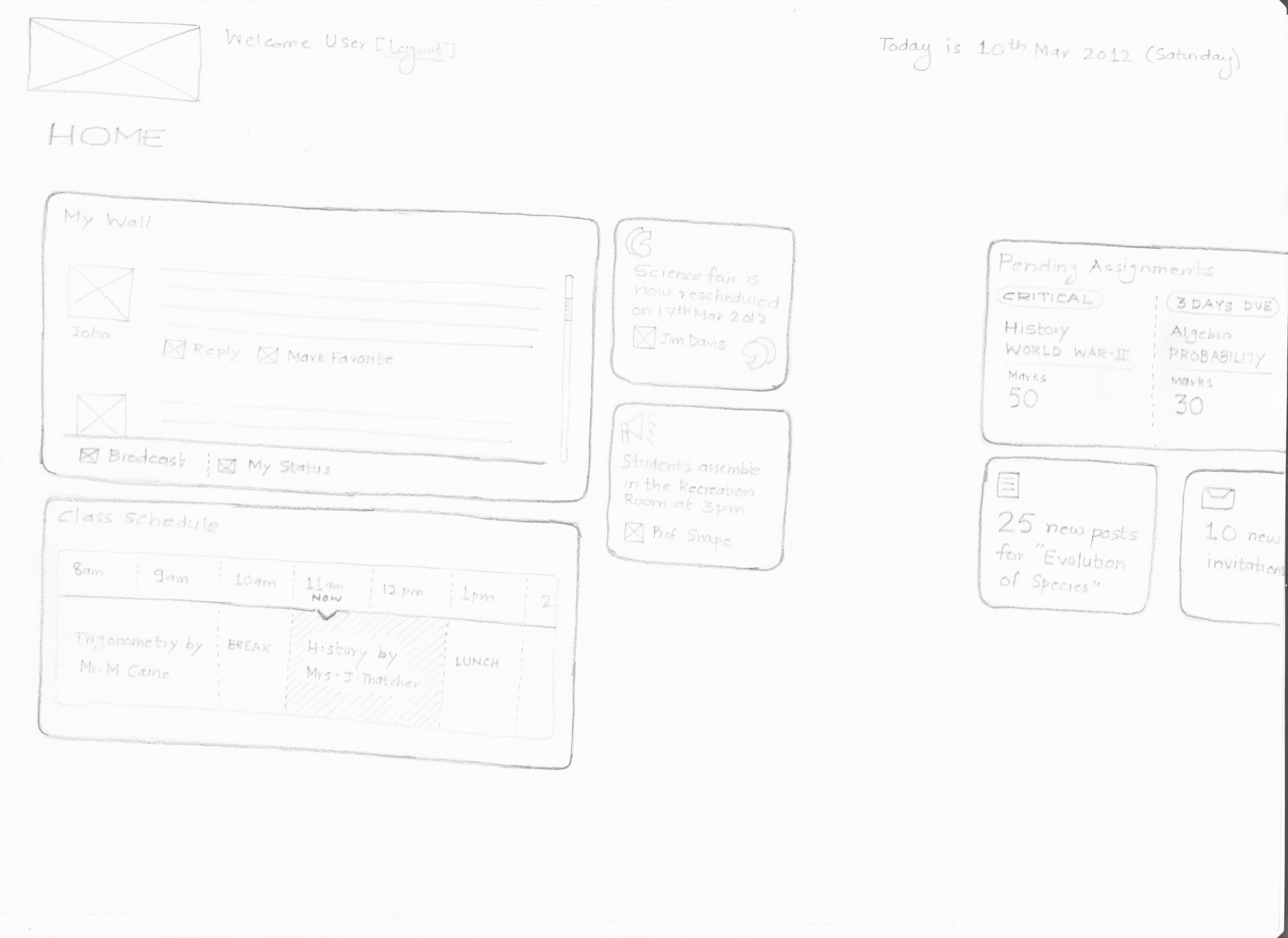
Paper prototyping falls into activity (c). Some might be inclined to slot into (b) as well, its acceptable. May be it falls in both areas. Purists will never stop arguing, pragmatists will get the paper, sketch it out and pitch the design :).

I have used paper prototyping technique most of the times in presales process. It helped me a lot. While I do this step in the detailed design activity (low and high fidelity prototyping), it’s the pre-sales paper prototypes that have garnered the customer ‘wow’. Once you go past that stage and enter the delivery cycle, wow is replaced by ‘now’ (“I want this to be designed now”). Nevertheless, paper prototypes will never let you down.

So how does one go about designing the paper prototypes?

Here’s a 4-step approach.

Step 1) Understand the ecosystem
Get answers to these questions – Who is the real user of the product / service? What are the dependencies? What is the overall goal? What are the controllable and uncontrollable variables involved? Who are the stakeholders? What are the different business processes?

Once you get the answers, be as visual as you can. Create mind-maps, information graphics or any other graphical form that expresses “the big picture”. Yes, the big picture.

Step 2) Create the information architecture
Understand the different “information buckets”, the hierarchy of information and create information architecture. Some might be comfortable to see and depict the relationships among data, which serves well too.

Information architecture will help you understand the length and depth of the information the product / service holds. Having information architecture ready is like having a blueprint ready of your product.

Step 3) Create the user task matrix
Write down these questions – How many times a user is going to perform a specific task? What is the input user needs to perform this task? Will the product / service break down if the user does not do the task? What are the dependencies of this task with other tasks?

Some designers might consider skipping this step and creating “task flow” – its perfectly fine. The idea is to understand the nuances of user tasks – who does it, when and how.

Step 4) Understand the target device considerations
Is it an iPhone app? Or an enterprise dashboard seen on a tablet? A good-old fashioned desktop application used by legacy users whose keyboards squeak every time they press any key?

Of course, connect this point with real-life usage context too. E.g. this is a point-of-sales application to be used by a sales agent in a crowded grocery store on a monitor with screen resolution 640×480.

You are welcome to add your steps in between or skip some of these steps. Whatever works for you, works better. These 4 steps have worked for me, so far. And as I said earlier, I may refine these steps as I learn new things down the line.

We will expand these 4 steps in coming posts.

Examples of paper prototypes

Before we get down to the actual process of creating paper prototypes for the digital products, I would like to share some samples. These samples gives the spectrum of the different domains that we can apply paper prototypes to. As a matter of fact, paper prototype is one of the de facto steps of user experience design process.

Here are some sketches I did for different design problems:

Example #1

Cricket based iPad application

Cricket based iPad application

Example #2

File format convertor desktop application

File format convertor desktop application

Example #3

Enterprise portal for interaction design pattern library.

Enterprise portal for interaction design pattern library

Example #4

Enterprise portal application for payment cards industry

Enterprise portal application for payment cards industry

Example#5

Windows tablet application for educational repository

Windows tablet application for educational repository

Check out the way these prototypes are done – the elements that make up these prototypes. What is the starting point? How to visualize the flow? What things need to be taken care of before building the prototype? What is in scope / out of scope?

Let’s discuss this in our next post.