How often you hear these words from the bean counters? No need to dwell on the count. Just get the work done :).
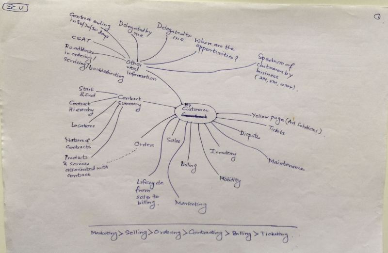
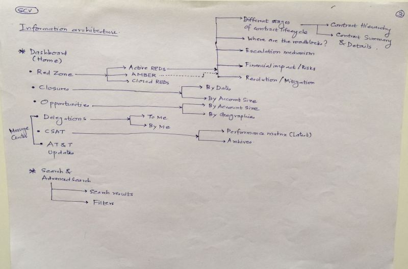
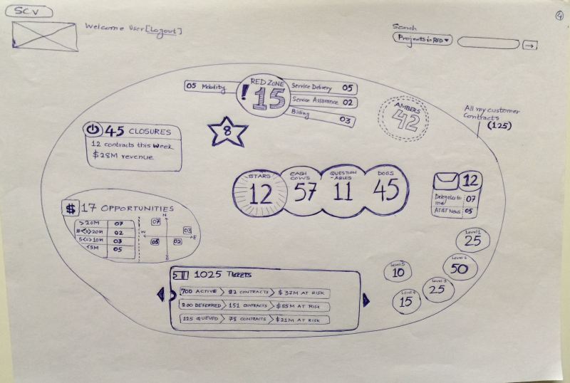
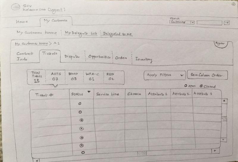
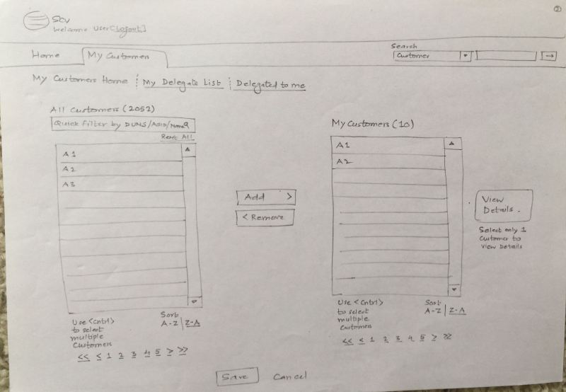
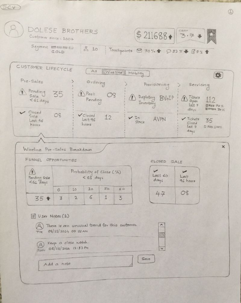
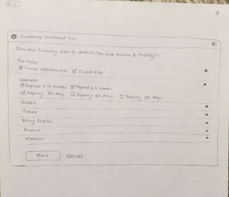
The example I am presenting here is an enterprise dashboard application of a telecom operator. Dashboard gives a summary view of its enterprise customers – what contracts are expiring, no. of sales opportunities, escalations, ticketing reports, etc. It also gives the ability to dive down and see the granular details of enterprise customer data.
This was a legacy application created by mashups – typical scenario of multiple heads managing volumes of data with disparate technology platforms talking to each other. End result was a ‘patch-work’ application that suffered experience issues of the data (incomplete data, irrelevant data) and performance.
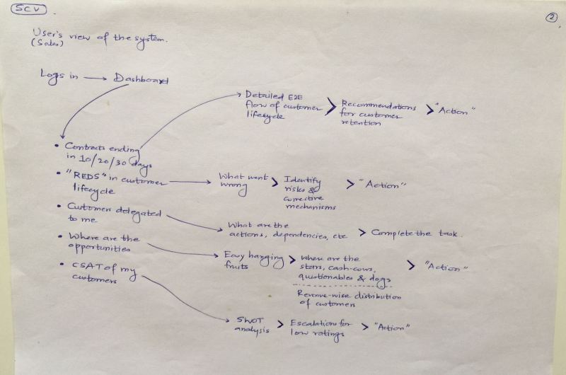
Imagine I am the user, a sales executive. If I log in to the dashboard application I see partial data on the CSAT, sluggish data on the contracts that are expiring and incomplete data on the new opportunities.
If I am a program manager and want to see escalations of a particular customer, selection of 1 year ticketing records would generate 11 million table rows. This would slow down the performance and hamper the user experience. Now imagine this scenario both in the web browser on your computer and on an iPad native application.
You might be thinking now, where are the user experience issues? Hang on to that thought.
This is what you are told –
1) You cannot contact users.
2) You can play around with the existing application. But remember, don’t break it.
3) We know user experience is not the problem. The real issues are data binding and performance.
4) “We want new concepts”.
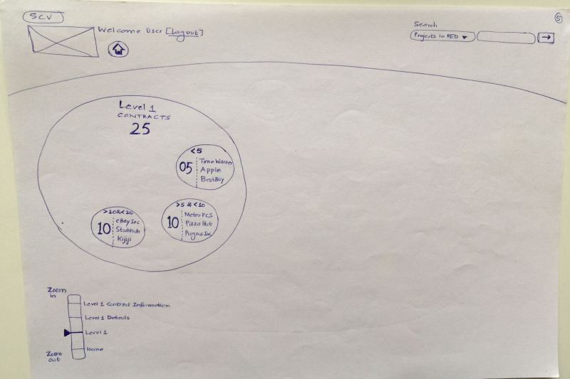
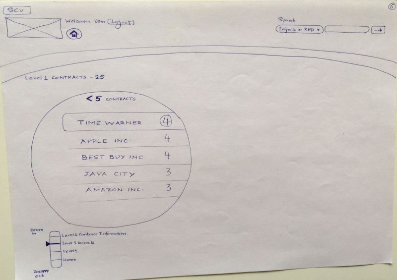
Here is the concept #1 – Zoomable Interface
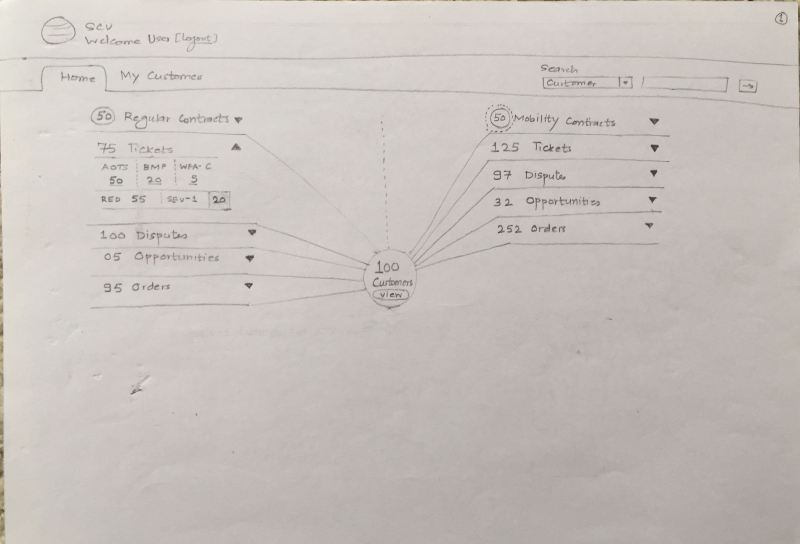
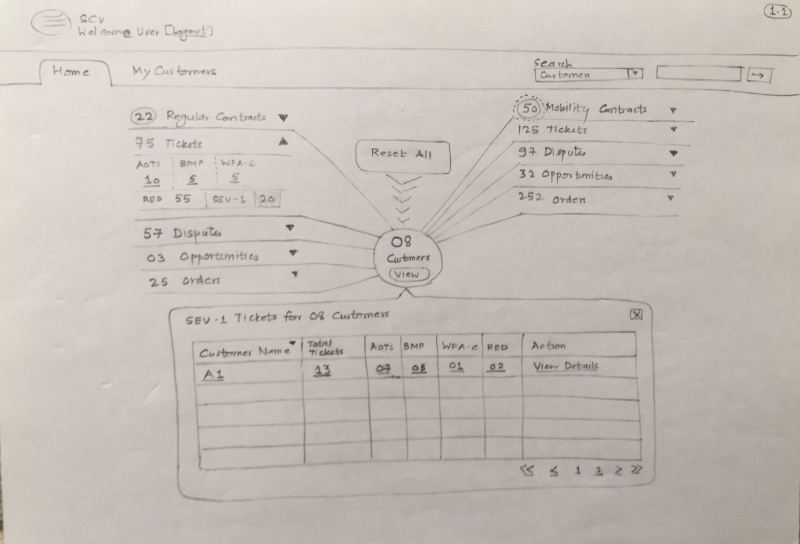
Here is the concept #2 – Spider Chart Interface
Here is the concept #3 – Data Visualization Interface (not a fully designed user journey).
So what concept was finally chosen? None. The development team cited issues related to time and tweaked the existing UI. Even the low hanging fruits in the UI turned out be sore.
