“Is this your best design solution?” my mentor asked me, staring in my eyes.
“Yes” was my confident answer :).
He said, “I bet that!”
This was eight years ago. I went back to the blank canvas and created 4 different design solutions for a portal solution. The notion of creating multiple design explorations has stayed with me for many years; it has helped me to design better.
I remember when I was at National Institute of Design (NID); I took a two-week coursework in photography. We were handed manual SLR cameras and told to shoot 6 rolls of pictures. My faculty member, Dr. Deepak John Matthew, shared a story about he understood the basics of photography (composition, balance, symmetry, framing, etc). When Deepak himself was a student he was told by his instructor to go to Gateway of India and shoot pictures. He came back and showed the 1st camera roll. The instructor asked Deepak to redo this exercise, 2nd time with a specific instruction ‘get the pictures from the spots & angles that you have not taken in your previous exercise’. Deepak showed the round 2 photos to the instructor. History repeated – he was told to do the same thing 3rd time. Frustrated, he went back to Gateway of India and took photos that he had not thought of in the first and the second attempt. On the third presentation of his photos, the instructor told Deepak that he was happy with the result. Curious, Deepak asked the instructor what was the need for all those 3 trips. The instructor said, “ Only when you are working with constraints, you will think differently and come up with different solutions. With every trip, your constraints multiplied and it forced you to chose spots & angles which could capture a better picture”.
There is no better story to drive home the point that design explorations is all about understanding your constraints, having multiple point of views (spots / angles) and having a different approach towards design solution.
Legendary designer Charles Eames quoted, “I have never been forced to accept compromises but I have willingly accepted constraints.”
Working with constraints is one of the ways to think & conceptualize. It forces you to perceive things differently. There are several other techniques that will help you to conceptualize.
Luke Wroblewski presents a different viewpoint in his book ‘Mobile First’ about how should one design for a mobile device. The principles presented here are applicable for non-mobile platforms too.
There are other methods like lateral thinking, which might suit someone.
A concept is made when you bring together all your methods of thinking, ideation, points of reference, your design inputs, context information and create a design solution that resonates with the real-world needs.
A concept can be an abstract idea. As a designer, you have to sketch out your ‘mental representation’ of what could be a design solution. It may not be a great design solution in the first attempt. Conceptualization is a process of creating multiple design solutions, improvising the same, and arriving towards a mature design solution.
Conceptualization is about having different points of reference and deriving the different meanings, accordingly.
As you may recall in our older blog post – the design explorations / sketches that you create, will depend upon various data points. Now you have all the information you need from the stakeholders and users, you got the tools and the blank paper is staring at you :). How do you start? Just take a paper and pencil and start sketching :). Capture all the concepts that come to your mind.
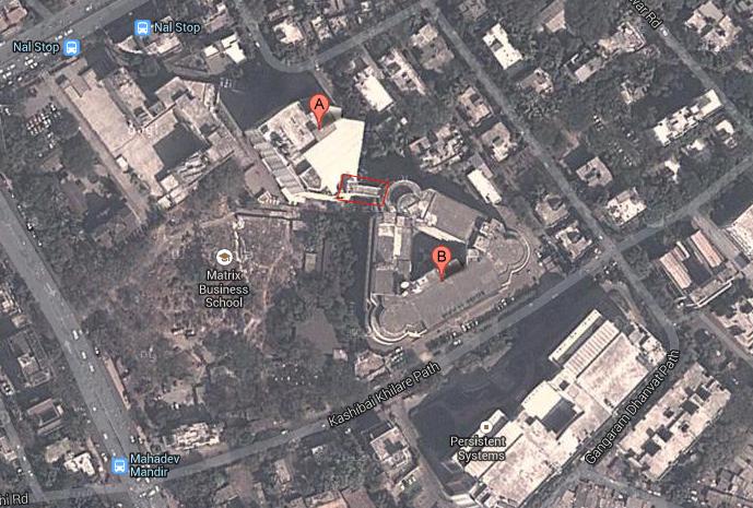
Let me present an example here – I was working with TechMahindra till Apr’13. Here is the ariel view of it’s offices in Pune (courtesy – Google Maps).

TechMahindra Office in Pune City
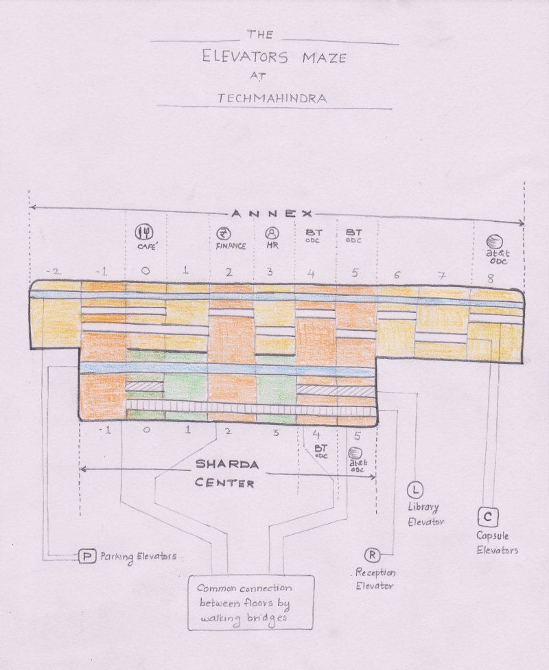
Marker A represents the building I was located in – Annex, 2nd floor. I was told to relocate to the adjacent building named Sharda Center 5th floor, indicated in the picture by marker B. The highlighted box in the photo shows walking bridges that connects two buildings.
The architecture of these two building presented food for thought – what was supposed to become a routine activity (moving around from one building to another) suddenly became a need to ‘learn’ 🙂 – the way the buildings are connected, where the elevators are located and how the elevators operate :).
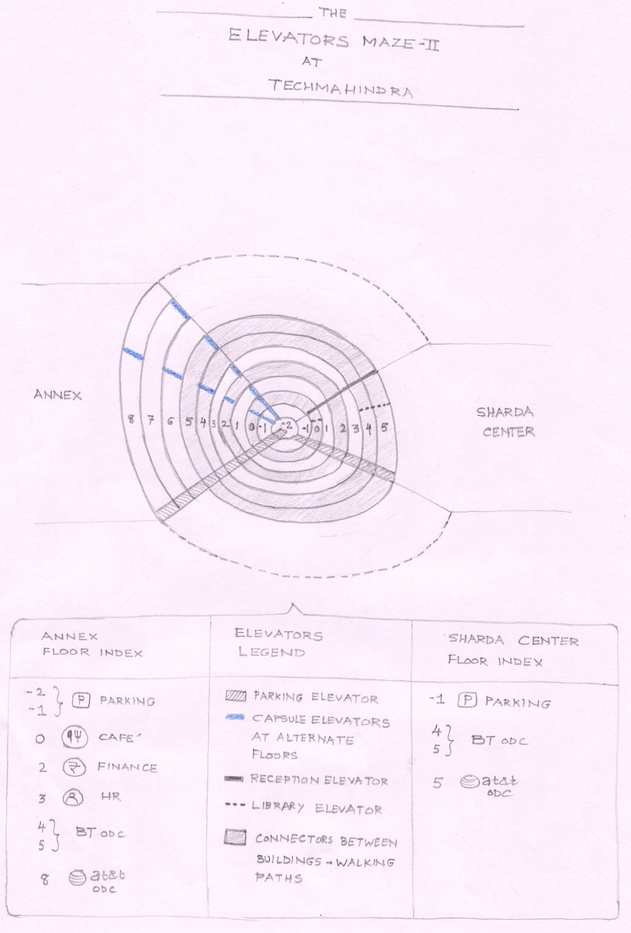
This is how the buildings were connected to each other, via the walking bridges:
- 1st and 2nd floor of Annex were jointly connected to 2nd floor of Sharda Center
- 4th and 5th floor of Annex to 4th and 5th floor of Sharda Center
The Annex had three elevators – a parking elevator that stopped on every floor. Two capsule lifts/elevators that stopped at alternate floors only (i.e Capsule lift#1 will stop at floors 0, 2, 4, 6 and 8. Lift#2 will stop on floors 1, 3, 5 and 7).
Sharda Centre had 3 elevators and none of the elevators stopped on 1st floor – the 1st floor was not rented by TechMahindra. In contrast to the Annex, these elevators stopped on every floor.
So here I was looking at a design problem – how to ensure that there is a ‘smooth passage’ from one building to another?
I took this opportunity of chaotic architecture and elevators to come up with information graphics. I experienced the confusion first-hand to move from one building to another. My peers (15 designers) were also in the same boat :), who had been told to relocate from the Annex to Sharda Center.
I made an assumption that visually I will show only one of the floors (between 1st and 2nd floor of Annex) to be connected to 2nd floor of Sharda Center – to avoid further complications. The concepts that I created can be termed as ‘explorations’ – I experimented on different orientations, visual forms to present the ‘chaos’ in a lucid manner. For some concepts, I succeeded and for some, I did not :).
I created the following six concepts / sketches addressing this unique design problem:
Sketch#1:
Elevator1
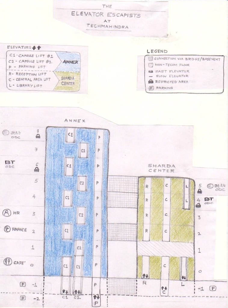
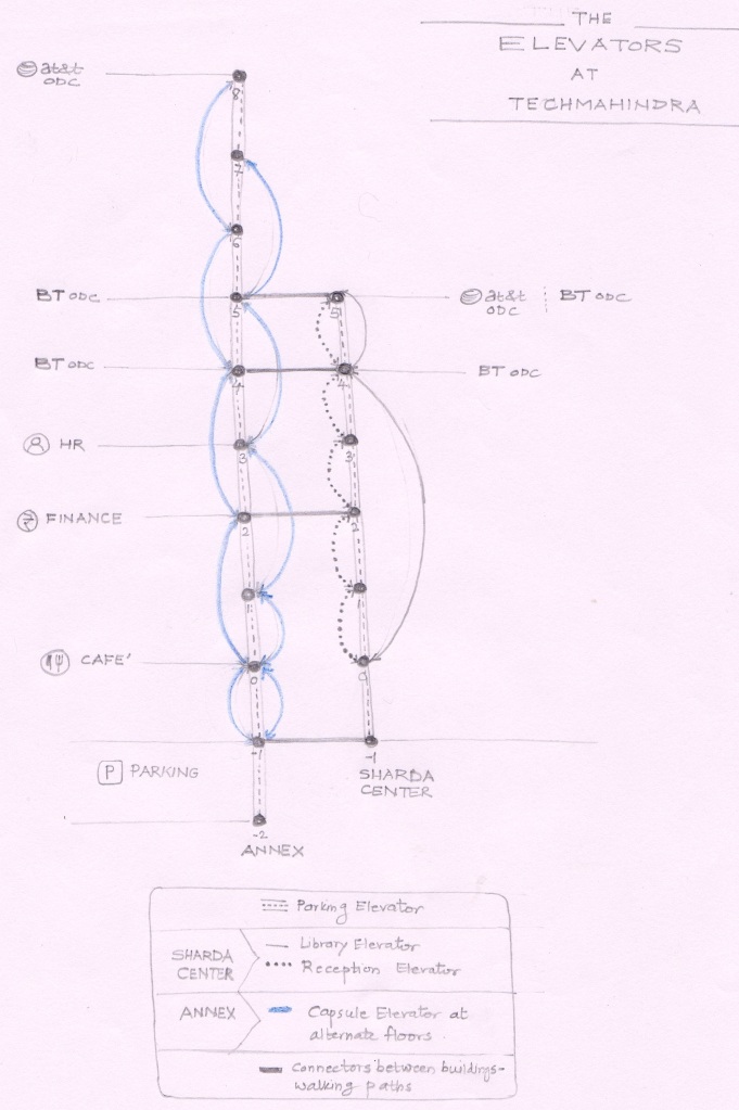
Sketch#2:
Elevator2
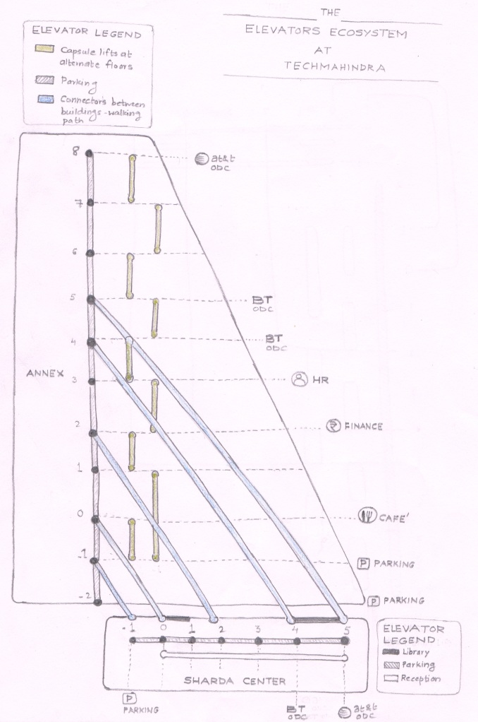
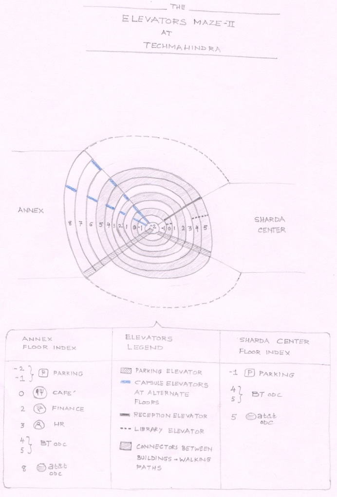
Sketch#3:
Elevator3
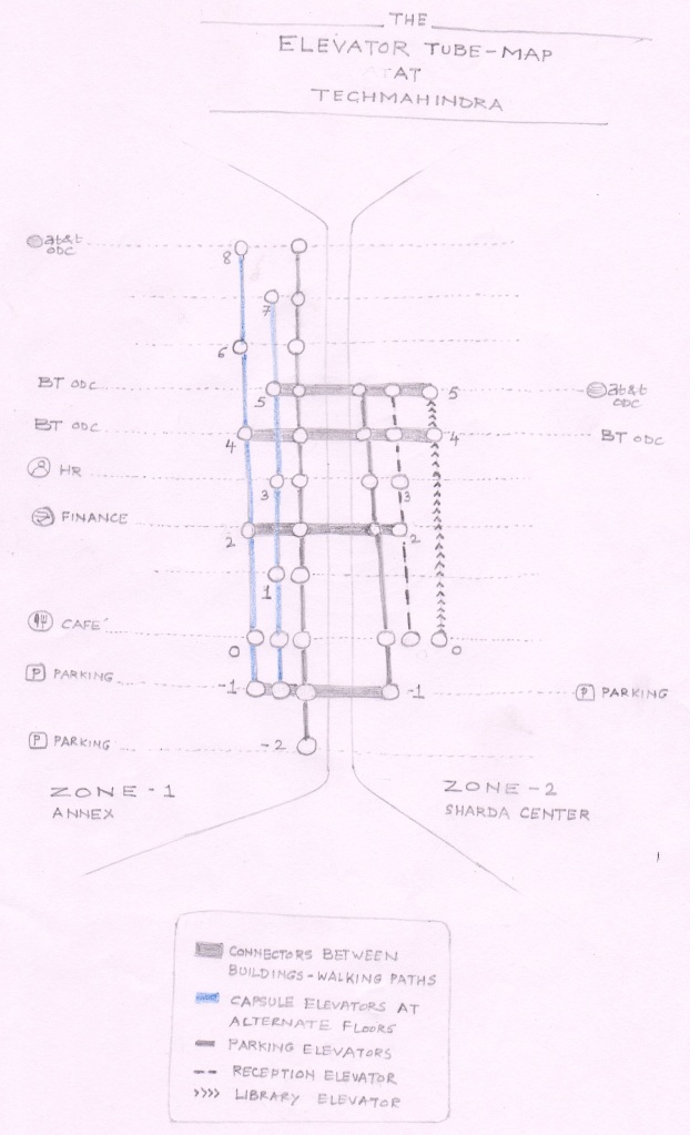
Sketch#4:
Elevator4
Sketch#5:
Elevator5
Sketch#6:
Elevator6
Of course, there could be more visual representations of the same problem. May be #1and #6 and be combined and something new can emerge. It’s all about putting down your mental representations on the paper and trying to achieve different points of view :).
Going back to the first story, I came back to present my 4 new design explorations and presented it my mentor. He was glad to see the variations in thinking. Talking about the design constraints, he concluded, “Do what you can…..where you are & with what you have”. I responded to his advice and I hope I have responded well :).
We have almost reached to the end of 4-step journey of paper prototyping. In our next and last post (Step 4 of 4), let’s look at paper prototypes’ validation techniques and activities conducted after paper prototyping.