The Electric Generation

We are indebted to the scientific society of the 1900s who invented technologies we take for granted.

One of the inventors happens to be Nikola Tesla. Elon Musk is redefining the electric cars through his venture Tesla Motors. Major automobile manufacturers have taken their steps building electric cars – Nissan, Chevrolet, Toyota. Those who are genuinely interested in understanding the electric car history can read about Better Place (started by Shai Agassi, now closed) and watch the documentary “Revenge of the Electric Car” on Netflix.

While the electric cars’ evolution is on, it has not stopped the automobile world to leverage their technology to the most ubiquitous form of transportation in most countries – the bike. One of the companies that is manufacturing an electric bike in US happens to be Mahindra, naming its electric bike as “GenZe”. If you happen to be in Bay Area or Los Angeles, chances are that you might have seen that bike on the road.

I designed a mobile app concept for GenZe. The users of the mobile app are students, pizza delivery guys. The idea of the app was simple – know the bike’s essential parameters before turning the engine on. 100+ parameters of the bike are up in the cloud. There are sensors on the bike that give crucial data about the bike’s mechanics, electrical, tire pressure, etc.

The iOS and Android app offer the similar experience, with one exception. Android phones have a desktop widget of the App – no need to launch the app. There is also a micro-website that gives detailed analysis of bike’s usage.

GenZe iPhone app

GenZe iPhone app

GenZe iPhone app

GenZe iPhone app

GenZe Android app

GenZe Android app

GenZe Micro Website

GenZe Micro Website

Those cricketing ideas…..

At the moment, India is the ICC Cricket World Cup Champion defending its title in the 2015 edition. As I write, India has started off the defense campaign by a win over Pakistan. Online media, social networks and messengers are loaded with anecdotes, videos, game analysis, predictions and player trivia.

Indians are passionate about two things – Cricket and Bollywood. I have grown up on other sports in India too – tennis and football (soccer). But when it comes to the World Cup of cricket, other sports take a backseat. This will be the first time in 20 years, Indian cricket team will be playing without Sachin Tendulkar. He had been a regular figure in last 5 world cups, garnering maximum accolades to the team.

Over the years, the data visualization aspect of the game has improved. Nowadays, a cricket match analysis is replete with infographics and tools like wagon wheel, projection deliveries, momentum, hawk-eye, snickometer, etc.

There are multiple cameras that capture the action on the pitch and ground through different angles and get the granular data. From the sports data scientists’ point of view, the golden age of sports data (or rather cricketing data) is about to come. We now hear about the video analytics tools deployed by respective cricket teams to gauge the weakness and strengths of players.

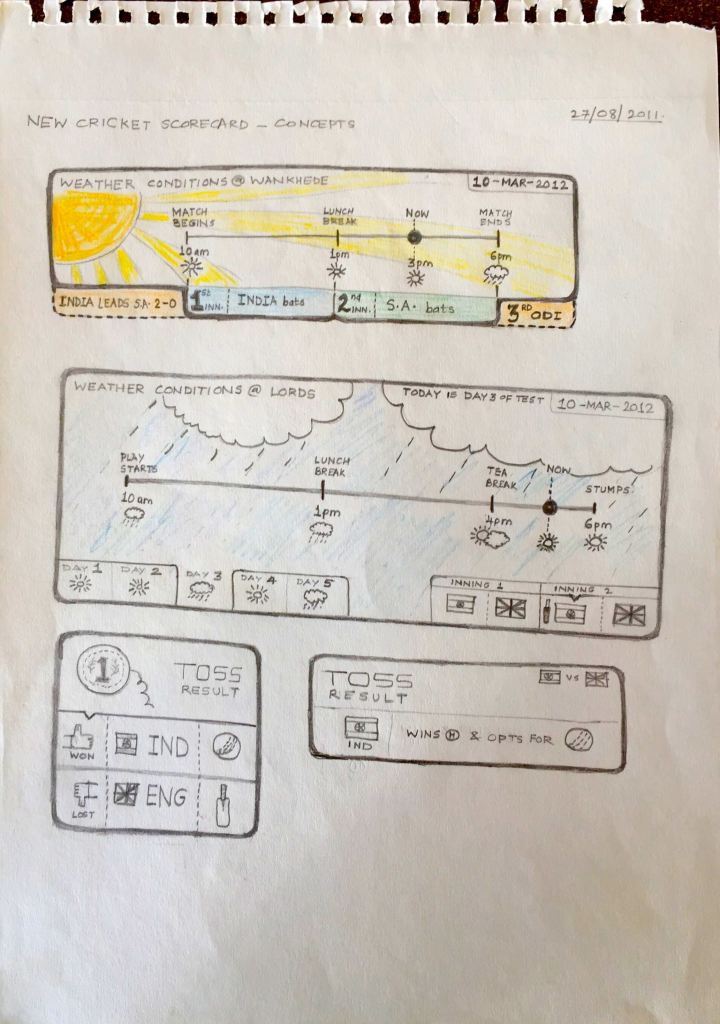
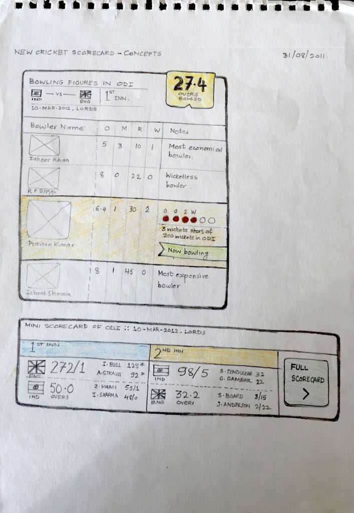
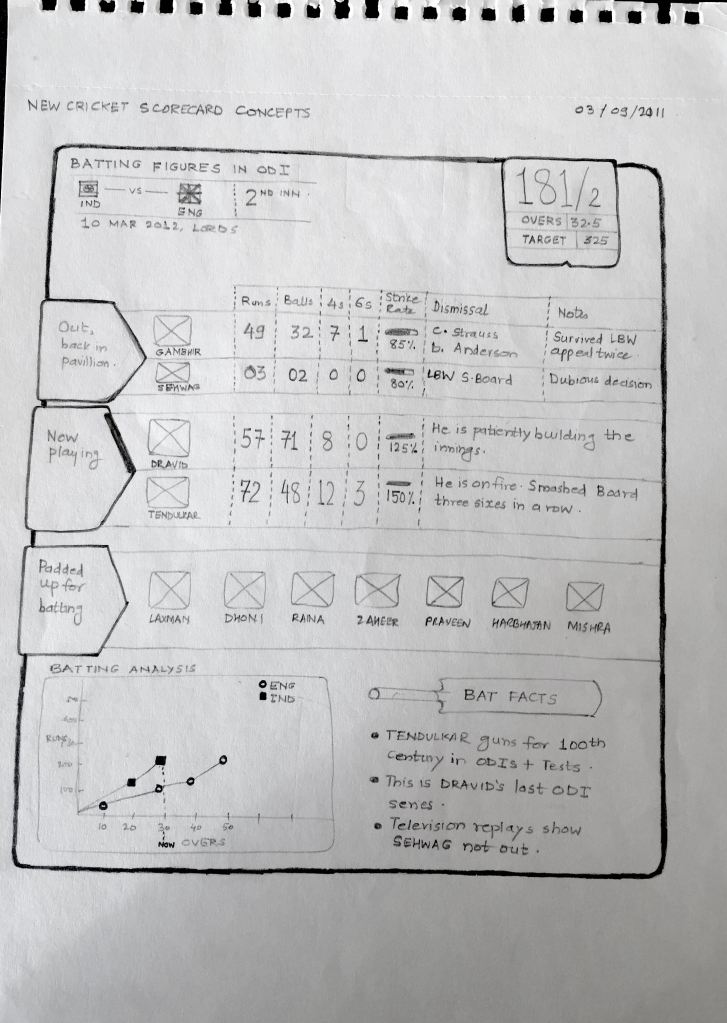
Four years ago, I worked on two concepts related to cricket. One is the cricket scorecard and second is an iPad application.

I wanted to change the way cricket scorecards were presented to the users on television and websites. I wanted to give a new feel to it. This was my humble creation as I was just entering into the world of infographics design. Now, I look back and wonder at these designs and think they can be designed better :).

Scorecard - 1

Scorecard – 1

Scorecard - 2

Scorecard – 2

Scorecard - 3

Scorecard – 3

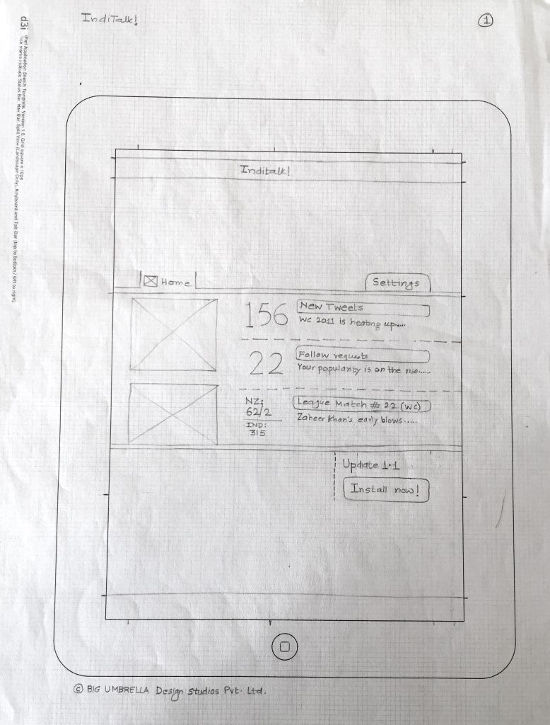
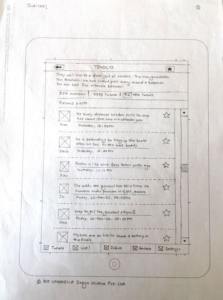
The second concept I did was a Twitter based cricket application called “IndiTalk!”. The premise is simple – talk, talk and talk about cricket. iPad was just launched, back then. The app UI bears good resemblance to the first generation iPad apps. This app, if designed today will probably have a different character to it.

IndiTalk_1

IndiTalk_1

IndiTalk_2

IndiTalk_2

IndiTalk_3

IndiTalk_3

Design for food

Let’s step away a while from the telecom domain :). I am going to present sketches I did for a pizza restaurant in Pune (India), Greens & Olives.

A brief history of Greens & Olives (G&O) should be told here. G&O was started in a place that was perceived as jinxed. The earlier occupant was a restaurant too. Before that, there was a retail outlet. The locality is brimming with 70+ restaurants. Moving to an already crowded competitive space was necessity. G&O decided that the food menu will be vegetarian, no liquor will be served. With odds stacked against it, it was going to be swimming with the sharks for G&O.

In the last two years Aditya Nilangekar, Pavan Iyengar and their team has excelled in creating G&O an exciting restaurant in Aundh, Pune.

Food and ambience is great. Chef’s recommendations are superb too.

The mobile app I designed complements the customer experience G&O team has created in 2 years. The iOS app and Android apps are being designed.

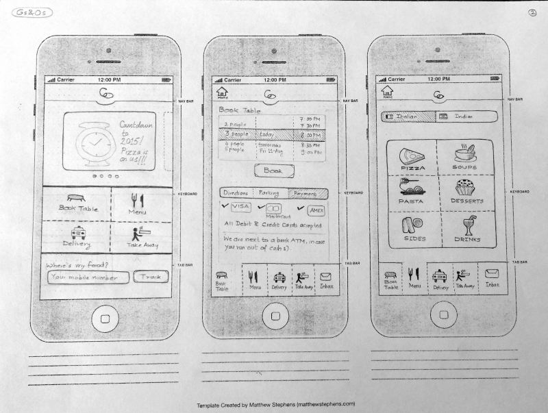
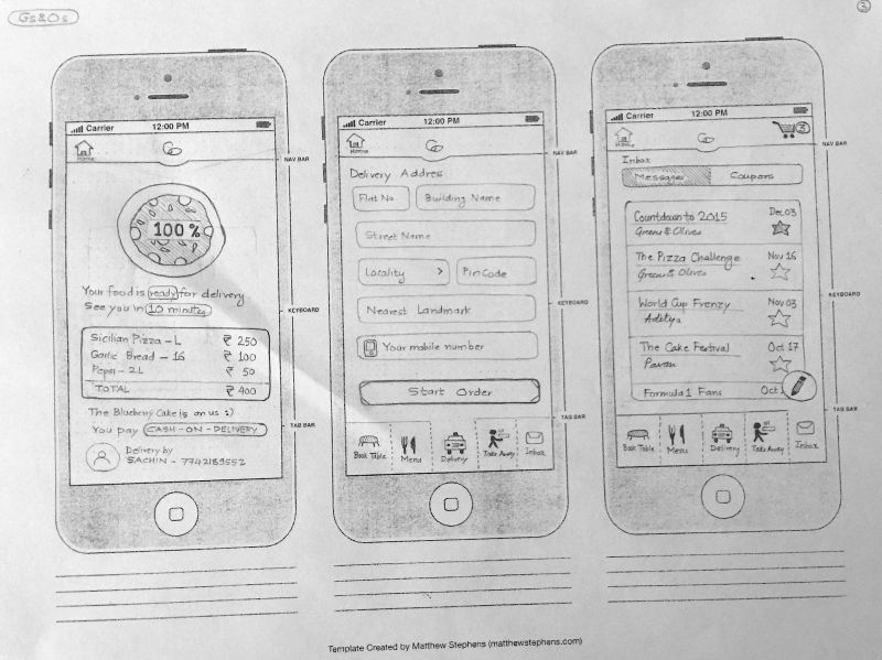
Here are the sketches of the mobile app (mind map and app UI):

Mindmap

Mindmap

Mobile App Concept - Page 1

Mobile App Concept – Page 1

Mobile App Concept - Page 2

Mobile App Concept – Page 2

If you are living in Pune, head to Aundh. Here is the address (opens a new Google Maps window) – Opposite Tangent Furniture Mall, Nagras road, Aundh Pune, Maharashtra. Call: +91 20 3267 3030

Time is the essence

Bill Gates wrote a book called “Business @ The Speed of Thought”. I don’t remember exactly when I read that book, but it did impart me the sense of urgency one needs in business, and in design.

Fast forward to recent times when I was working in an agile software development project. User stories are the holy grail for design & development. People revolved around stories, epics, acceptance criteria and got the work done in sprints.

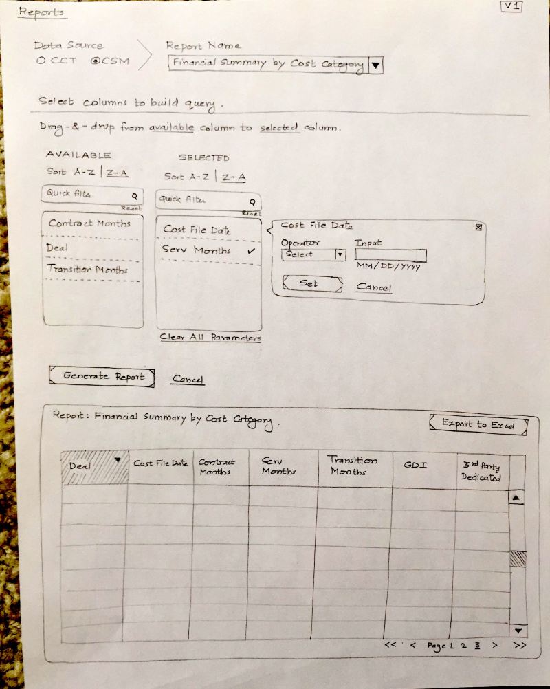
In one of my projects for a telecom operator, I was designing the reports module. I sketched two explorations of the UI.

Here is how the UI is supposed to work – It is a progressive disclosure (step wise reveal).

1) On the page, only Data Source choice is seen first. User starts with a selection of data source.

2) Report selector is then shown to the user. User chooses a report name.

3) The page shows up the report columns to build the query.

4) The user clicks “Generate Report” button and the report is shown to the user.

Exploration #1

Exploration #1

Exploration #1

Exploration #2

Exploration #2

Exploration #2

Notice the differences in the approach – in Exploration#1 report column selection can be done by drag-n-drop of column names. In Exploration#2, there are additional filters for reports, “Save as Favorite” action to the report, contextual data presented to the user as “related reports”.

Exploration#2 was finally chosen by the development team.

Time to create these two explorations, discuss and select was 1 hour.

Time is the essence.

“We want new concepts”

How often you hear these words from the bean counters? No need to dwell on the count. Just get the work done :).

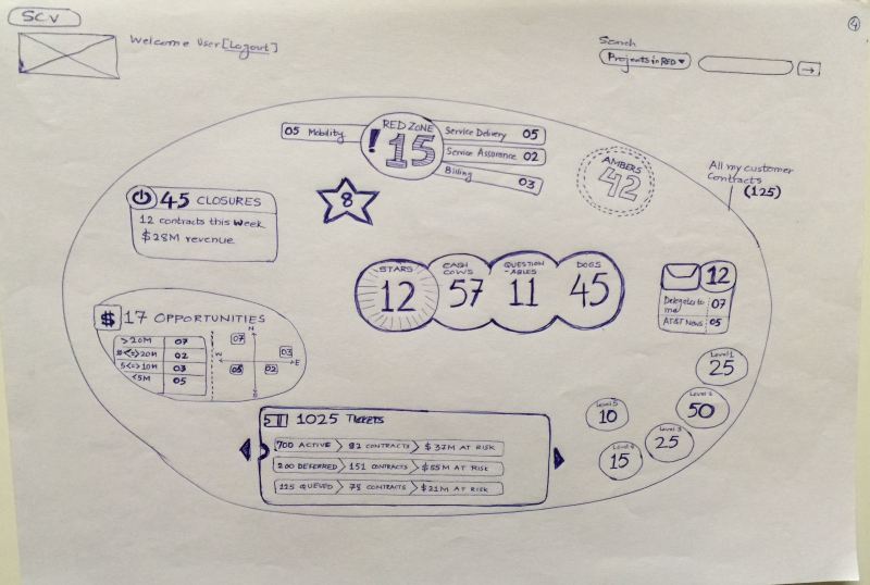
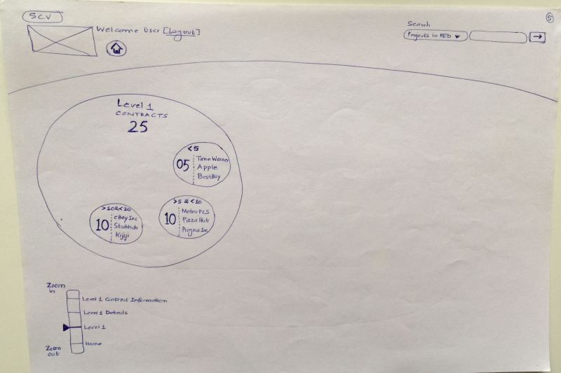
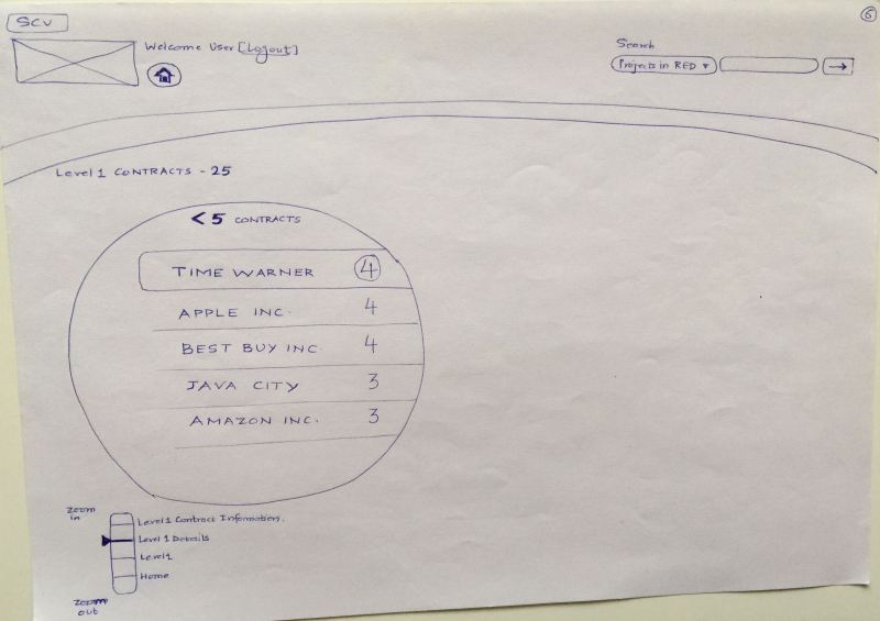
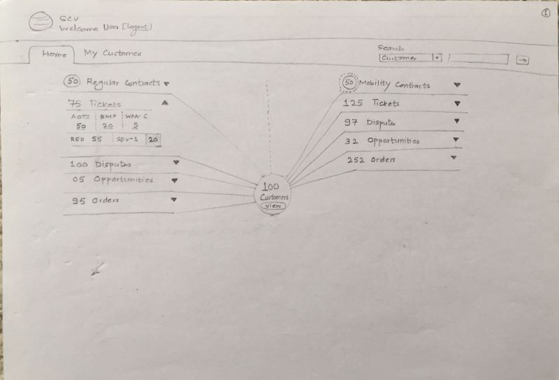
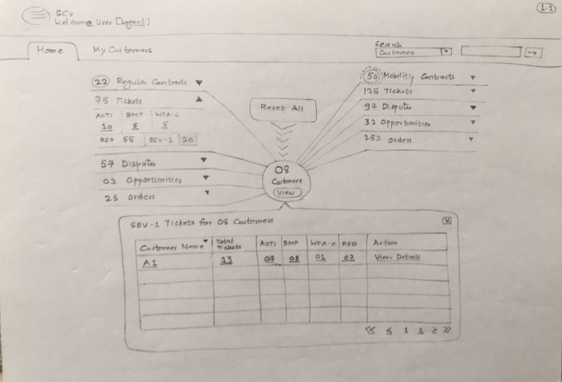
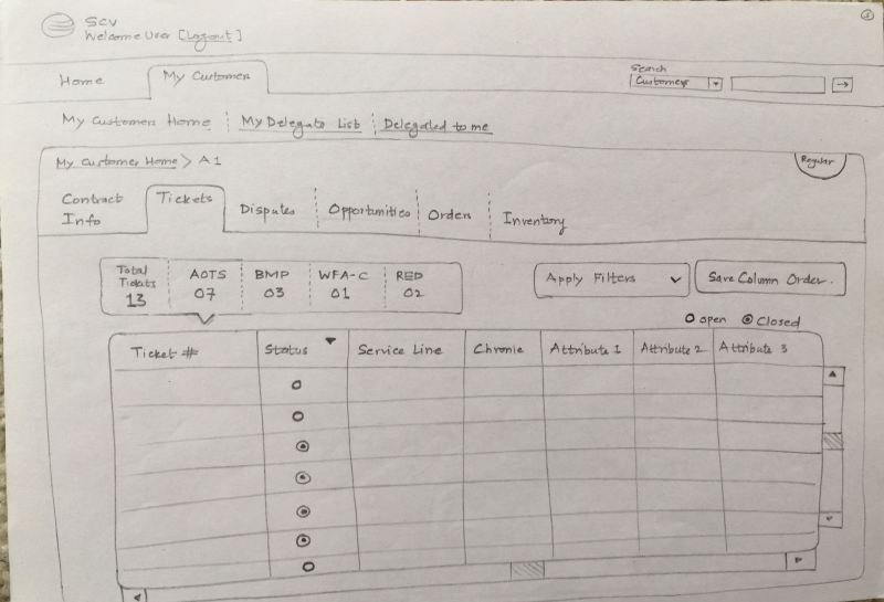
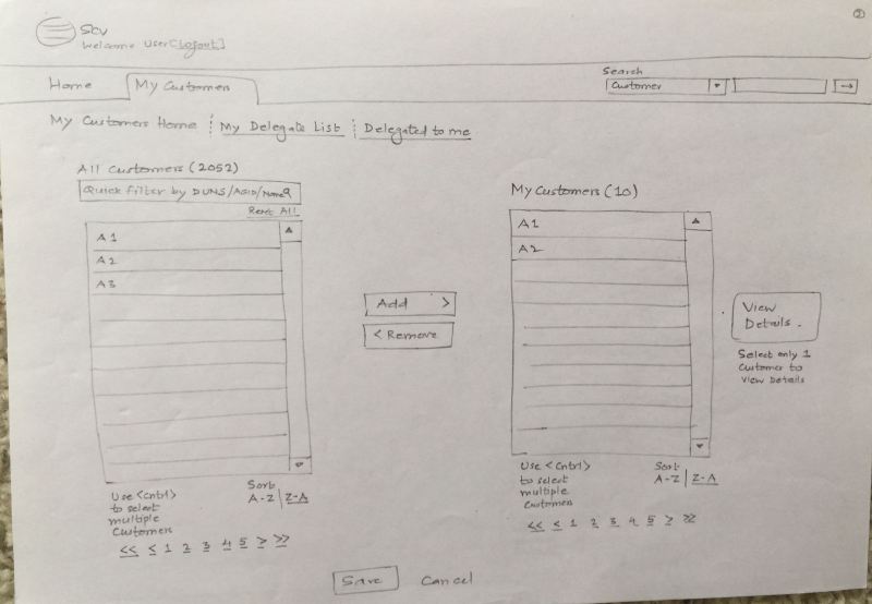
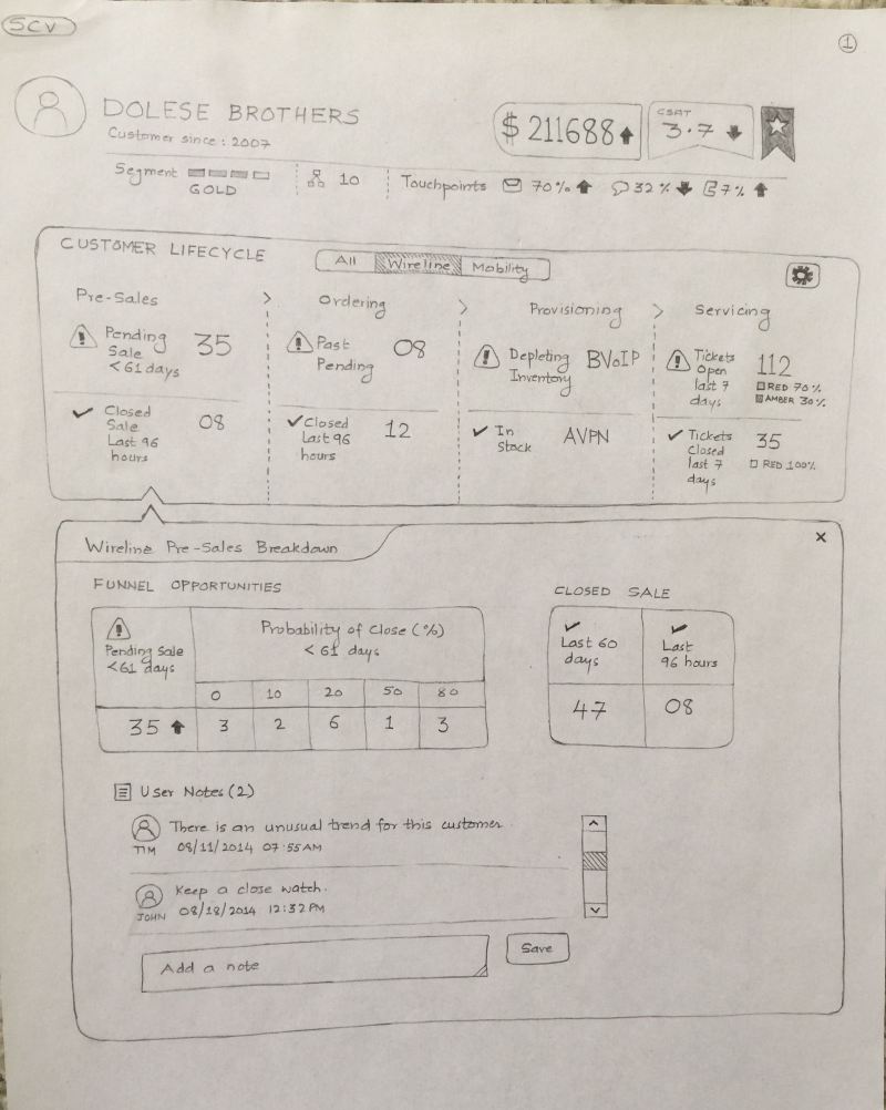
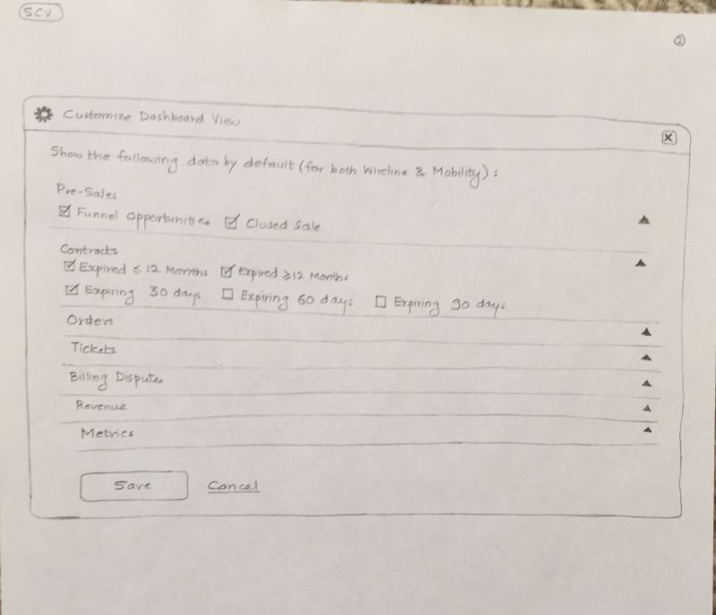
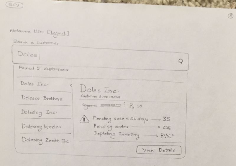
The example I am presenting here is an enterprise dashboard application of a telecom operator. Dashboard gives a summary view of its enterprise customers – what contracts are expiring, no. of sales opportunities, escalations, ticketing reports, etc. It also gives the ability to dive down and see the granular details of enterprise customer data.

This was a legacy application created by mashups – typical scenario of multiple heads managing volumes of data with disparate technology platforms talking to each other. End result was a ‘patch-work’ application that suffered experience issues of the data (incomplete data, irrelevant data) and performance.

Imagine I am the user, a sales executive. If I log in to the dashboard application I see partial data on the CSAT, sluggish data on the contracts that are expiring and incomplete data on the new opportunities.

If I am a program manager and want to see escalations of a particular customer, selection of 1 year ticketing records would generate 11 million table rows. This would slow down the performance and hamper the user experience. Now imagine this scenario both in the web browser on your computer and on an iPad native application.

You might be thinking now, where are the user experience issues? Hang on to that thought.

This is what you are told –

1) You cannot contact users.

2) You can play around with the existing application. But remember, don’t break it.

3) We know user experience is not the problem. The real issues are data binding and performance.

4) “We want new concepts”.

Here is the concept #1 – Zoomable Interface

Zoomable Interface - 1

Zoomable Interface – 1

Zoomable Interface - 2

Zoomable Interface – 2

Zoomable Interface - 3

Zoomable Interface – 3

Zoomable Interface - 4

Zoomable Interface – 4

Zoomable Interface - 5

Zoomable Interface – 5

Zoomable Interface - 6

Zoomable Interface – 6

Zoomable Interface - 7

Zoomable Interface – 7

Here is the concept #2 – Spider Chart Interface

Spider Chart Interface - 1

Spider Chart Interface – 1

Spider Chart Interface - 2

Spider Chart Interface – 2

Spider Chart Interface - 3

Spider Chart Interface – 3

Spider Chart Interface - 4

Spider Chart Interface – 4

Here is the concept #3 – Data Visualization Interface (not a fully designed user journey).

Data Visualization Interface - 1

Data Visualization Interface – 1

Data Visualization Interface - 2

Data Visualization Interface – 2

Data Visualization Interface - 3

Data Visualization Interface – 3

So what concept was finally chosen? None. The development team cited issues related to time and tweaked the existing UI. Even the low hanging fruits in the UI turned out be sore.

The anatomy of paper prototyping

Over the years, I have witnessed the change in how I approach any design problem. And create design explorations for the problem.

The change could be credited to factors like new tools being available, understanding the deeper sense of design, adding more granularity to the design deliverables, interconnecting the relationships between different variables, etc. This is an ongoing process and the learning never stops :).

There are different ways to start off and design for any context. End to end user experience design lifecycle is expressed in different forms by different design agencies – the sub processes change a bit, but the essence remains the same. On a high level, any user experience design project will fall into four distinct buckets – (a) requirements understanding (b) conceptualization (c) prototyping (d) implementation / deliver.

Paper prototyping falls into activity (c). Some might be inclined to slot into (b) as well, its acceptable. May be it falls in both areas. Purists will never stop arguing, pragmatists will get the paper, sketch it out and pitch the design :).

I have used paper prototyping technique most of the times in presales process. It helped me a lot. While I do this step in the detailed design activity (low and high fidelity prototyping), it’s the pre-sales paper prototypes that have garnered the customer ‘wow’. Once you go past that stage and enter the delivery cycle, wow is replaced by ‘now’ (“I want this to be designed now”). Nevertheless, paper prototypes will never let you down.

So how does one go about designing the paper prototypes?

Here’s a 4-step approach.

Step 1) Understand the ecosystem
Get answers to these questions – Who is the real user of the product / service? What are the dependencies? What is the overall goal? What are the controllable and uncontrollable variables involved? Who are the stakeholders? What are the different business processes?

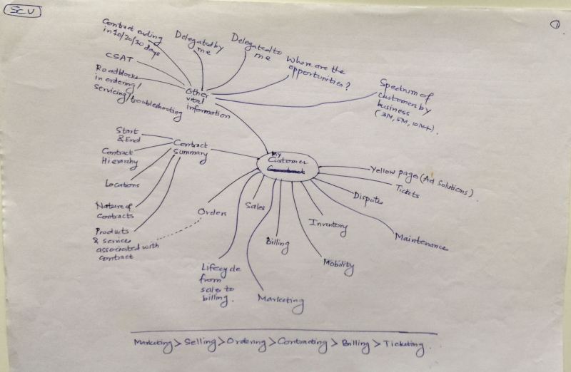
Once you get the answers, be as visual as you can. Create mind-maps, information graphics or any other graphical form that expresses “the big picture”. Yes, the big picture.

Step 2) Create the information architecture
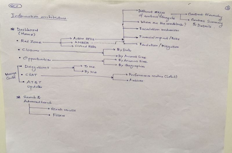
Understand the different “information buckets”, the hierarchy of information and create information architecture. Some might be comfortable to see and depict the relationships among data, which serves well too.

Information architecture will help you understand the length and depth of the information the product / service holds. Having information architecture ready is like having a blueprint ready of your product.

Step 3) Create the user task matrix
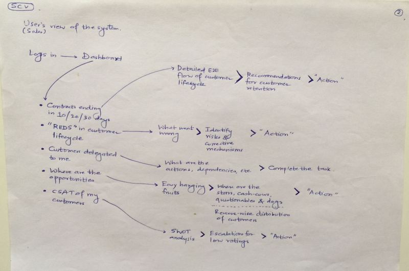
Write down these questions – How many times a user is going to perform a specific task? What is the input user needs to perform this task? Will the product / service break down if the user does not do the task? What are the dependencies of this task with other tasks?

Some designers might consider skipping this step and creating “task flow” – its perfectly fine. The idea is to understand the nuances of user tasks – who does it, when and how.

Step 4) Understand the target device considerations
Is it an iPhone app? Or an enterprise dashboard seen on a tablet? A good-old fashioned desktop application used by legacy users whose keyboards squeak every time they press any key?

Of course, connect this point with real-life usage context too. E.g. this is a point-of-sales application to be used by a sales agent in a crowded grocery store on a monitor with screen resolution 640×480.

You are welcome to add your steps in between or skip some of these steps. Whatever works for you, works better. These 4 steps have worked for me, so far. And as I said earlier, I may refine these steps as I learn new things down the line.

We will expand these 4 steps in coming posts.

Before you start…..

Paper prototype does have its advantages over other visualization techniques. It is a carefully crafted activity that transforms all the “blah blah blah” into concrete form.

I have been the proponent of paper prototyping for many years. Though this design tool helps you to design technology-agnostic solutions (enterprise portals, dashboard, mobile apps, interactive television program, etc.) there are some aspects of this process which you want to consider before you start sketching.

1) A mature customer
User experience activities are generally driven by user experience practice managers or product managers or the CxOs of the organization who really care about product they want to design for mass consumption. A mature customer is the one who will encourage to go deeper down the fundamentals of requirements (talk about user psyche and cultural memetics), sit down with the designers in brainstorming activities (.e.g. card sorting, quick and dirty concepts, etc.) and help UE designers understand the big picture (ecosystem, processes, inputs and outputs). Its fair to assume that in practical scenarios all these tasks are divided between different team members and you rarely come across a customer who will provide you inputs at one go. The bottom-line – revealing key information to UE designers is a must. Some nuances of user information directly determine what you are going to put on the paper.

2) Technology is a magic box
We are familiar with all types of UI patterns around us. The ubiquitous widgets, controls, patterns have made us wiser in picking and applying those UI patterns in familiar situations. E.g. we will not choose art cover pattern for address book. Sometimes it does help to take out these patterns from your library, print them and take them with you.

Even its good to have data visualizations with you. iOS, Android, Windows mobile and other OS-specific UI controls will be handy too. The idea is that you can create a fusion of available patterns that justifies the user journeys. If you are that brilliant, you can even invent one :).

When you put down these patterns on a paper you are creating a technology-agnostic solution. You don’t care about whether its going to work or not (that will be done after you put things on paper, by the development team). For you, technology is a magic box. And you are the magician.

3) Time keeping & granularity
Regardless of the software development life cycles that you are participating in, paper prototypes are designed in a very fast and effective manner.
It may be good to go with a team size of at least 2 UE designers who can divide the user journey amongst themselves. What level of details you incorporate in your paper prototypes will directly determine the overall timeline of your work.

While designing the paper prototypes, keep in mind the verbiage/content/user vocabulary. Its better to draw granular details on paper – it removes abstraction, helps in exploring design options (if you want to chose from UI patterns) and makes the design believable. You are the best judge of what will go on to the paper. Aid paper prototypes with your comments, Post-it notes, etc.

It is possible to compact the paper prototyping activity in 3/4 days or a week. It depends upon how much time your customer is willing to put in this activity. For all the ideas that are emerged in these days, take a judicious call about what you want to sketch.

4) Tools of the trade
Papers, pencils (0.7mm is my preferred choice), color pencils/pens, highlighters, markers, Post-it notes, scales, cutters/scissors (to cut papers), push-pins, soft-boards (to put your paper prototypes for discussions), cello tapes, double-sided tapes, camera (to capture white boarding activities) and a scanner (for scanning the paper prototypes).

5) Beyond paper prototyping
Paper prototypes are generally throw-away prototypes. Meaning, that these prototypes will get mature over discussions and time. One should not get too much attached with these paper prototypes. Their existence and usage is limited. One has to churn many iterations of the same prototype over weeks before latching on to a concrete idea.

Involve development team from the start – they also have a say in what we design. But don’t kill your ideas on paper. Paper prototypes that survive and mature over the time are finally taken to the wireframing stage – you digitize everything that has been recorded on paper. One of the pitfalls of paper prototyping is that it does not have interactivity. Wireframe design is the next logical step once you are done with paper prototypes.

It all starts on paper…..

During my design school days (8 yrs ago) when I was working on interaction design projects, paper prototyping helped me a lot in giving the concrete shapes to my abstract ideas. Paper prototyping cleared a lot of ambiguity. I was able to demonstrate how the digital product would look like and how it will behave.

Since then, I have been an ardent follower and practitioner of paper prototyping. I have seen that some interaction designers have an inclination to skip this step and jump directly to tools like Axure, iRise, Visio, etc. The interaction design students too have tendency to disregard the power of paper prototyping and the possibilities that it opens up.

Paper prototype helps you to give concrete form to the user task flows. It is a starting point of everything related to your digital product design. A social app, an iPad app, a desktop widget, enterprise applications or dashboard – everything can be designed on paper.

I was designing an astrology portal four years ago. The product manager did not have any clue of what design process I followed. I did exhaustive sessions with his development team to arrive at the information architecture. When the first sketches (paper prototypes) of the portal started to emerge, the manager got curious. Subsequent discussions on the paper prototype ensured that all the “requirements” had been addressed and we finalized the user journeys. Only after that visual design mockups were produced. The development team harnessed the utility of paper prototypes and saved a lot of development cost, in this process.

Known web entities too champion for the need of prototyping (some root for paper prototyping & some for iterative prototyping). 37signals recommends to prototype fast and often. I have worked as a consultant to eBay and eBay gives thumbs up for paper prototyping. So does AT&T.

Whenever in doubt, go back to paper. It will help you a lot. Just take out the paper and pencil, sketch it out. If you are convinced, you will convince others about the next ground breaking product. And paper prototype will help you to just do that.