“This appears to be a great plan. Unfortunately, we do not have time & budget to do this. You know, we are running against the time. Moreover, what you intend to find, we already know it, right?” are the sentiments echoed by majority of the stakeholders who are in no mood to green-light the user research.
“What’s wrong with a phone call with users?” the designers fight back. This draws a blank response :). Working with constraints opens up new possibilities.
Forrester Research too understood the constraints of user experience designers in conducting user research and they have published a whitepaper based on this – “Low-Cost User Research And Usability Testing Techniques”by Vidya L. Drego, Andrew McInnes, Harley Manning, and Rachel Zinser.
It starts with an interesting premise – ‘User research and testing don’t need to break the bank’ – it goes on to elaborate on low-cost user research techniques like desk research, connecting with online users, talking to subject matter experts, conducting user experience reviews, creating quick paper prototypes and testing with ‘surrogate users’, etc.
There are many techniques (time saving, deep probing, activities driven, etc) which will get you to the roots of user needs. Rotterdam University of Applied Sciences has come up with a toolkit – created by Bas Leurs, Peter Conradie, Joel Laumans, Rosalieke Verboom.
Here is the URL: http://project.cmd.hro.nl/cmi/hci/toolkit/index2.php.
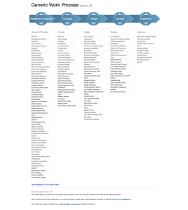
Rotterdam University of Applied Sciences UX Toolkit
Do not get overwhelmed by this list – the ‘Research & analysis’ step. You have to always be in ‘improvisation’ mode :).
I go through the predicament of ‘no-budget’ many a times in my projects. I use combination of different techniques – conducting user experience review, analyzing the web traffic, creating the competitive benchmarking matrix, quick paper prototyping and creating a case to quantify business benefits.
Whatever your technique is or combination of techniques used, you have to discover the following things:
1. How many users are currently using the product? Understand the volumetric data – how many users will be impacted with design changes.
2. What are the different types of users using the product? E.g. The HR executive might be accessing the corporate portal to get CVs of prospective employees. The potential employees might be interested in ‘careers’ section of the website. An investor might directly go to ‘news’ section of the portal. Understand the width and depth of users.
3. When do they use this product? E.g. Luke Wroblewski presents a great insight in his book ‘Mobile First’ on three scenarios in which users access their mobiles –
- Micro tasking: e.g. scenarios like the latest football /basketball match score that I want to know, which is updated every minute.
- I need to find something urgent local info – e.g. where is the nearest ATM? Where can I find drive-in restaurants?
- I am bored – I have to kill time and not sure what to do, may be play a game, or watch a video or look at the photos on my phone, or listen to a song while I am standing in a queue.
4. How do they use the product? Why do they use the product? – Is it being used the way it should be or the users have ‘re-engineered’ the product / tailor made the product to their daily usage? E.g. the immensely popular story in product design was washing machine being used to churn ‘lassi’ – the buttermilk in Punjab. Perhaps, it is stretching your imagination about the product’s intended usage. Great insights can open up a new product design idea altogether. LinkedIn, which started off as business networking site is now being used by recruitment site by many companies.
5. The previous point actually brings us to a very important question – What do the users really want to do? What are their goals? – e .g. if you are designing a bike, the overall user goal could be safety while driving. Another goal could be easy troubleshooting of the bike. If you are designing a restaurant app for mobile, one of the user goals could get the table booked. For airline booking, the user goal could be booking a seat. If we break this goal into smaller steps i.e. user tasks the tasks could be booking a seat of user preference, checking in online, download the flight boarding pass, etc.
6. What are the users’ immediate needs? – In some cases, users use the product in spite of the pain points – the product might cause them discomfort, it might irritate them a bit, perhaps leading them to anger management issues :). These users may have found a way to ‘deal with it’ – compromising the product shortcoming and using it in different way that impacts the efficiency. E.g. Android phone users missed the screen capture functionality on the mobile, when the mobile OS was launched – they had to actually capture the screenshot by clicking a photo of the phone screen. In later releases of Android OS, Google introduced the screen capture functionality with hardware controls (power button + volume down buttons pressed together).Designers will notice these kinds of issues when they meet the users, looking at the product usage and incorporate these changes in the new product release.
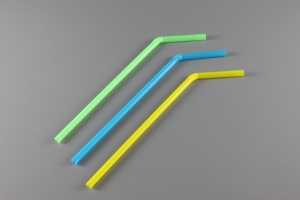
Flexible Straw
Another example is of the flexible straw, which was invented by Joseph Friedman – he saw his daughter having a tough time with the straight straw while drinking. He created corrugations in the paper straw using a screw and made a prototype of it, patented it and made a career out of it. The flexible straw is one of the distinguished products that finds itself in the list of ‘Design for All’ products list – a product that is used by many people, as possible without the need for adaptation.
7. What are users’ specific needs? E.g. Most ecommerce websites in India have adopted the model of ‘cash-on-delivery’, which was made popular by Flipkart. Unlike US, you do not have to pay upfront on the website to buy. Specific needs always go hand in hand with the culture of the target users, the ‘context’ in which users interact with the product – e.g. What’s the use if the user is not able to print a photo from the photo-blogging application on iPad? Users will abandon the product immediately.
8. The user aspirations: “read between the lines” i.e. users’ hidden needs– There are some things that the users won’t disclose in your conversations. You need to be probed deeper. Buying a car or bike might elevate the ‘status’ of the user. Perhaps the product can enhance the ‘socio-economic’ image of the user. Some people will buy a certain brand that sets them apart from the mass. There are always mass products and class products. Some products always exude desirability – think of all Apple products. The reason Apple products are popular is not only because of their finesse in industrial design & user experience – there is a factor of “I want to get it because it’s the best thing to have” which is attached to all its products.

Cadbury Bournville
Marketing professionals rely on this aspect to position their product. In India, Cadbury’s Bournville is positioned very intelligently – their tag line says “You don’t buy a Bournville you earn it”
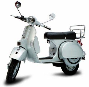
LML Vespa
In 1980s, LML Vespa (now Vespa India) introduced one significant feature to its scooter, which its archrival company, Bajaj Auto could not. Guess what that product feature could be :)? It was single-key operation. Yes, one key for all the users tasks – starting the scooter, unlocking the front and side compartments, removing the spare tire from the back, etc – all with just one key. The Bajaj scooters had at least 3 keys to do all those operations. That’s a great insight that was captured in user research, which was ‘discovered’ as aspiration and perhaps as the pain point of users too.
9. Do users’ say what they mean and do they mean what they say? – Re-iterating one of the quotes in earlier post “A wise car hears one word and understands two” 🙂 – a designer has to carefully observe the circumstances / contexts in which users give inputs. Users may say something which they do not necessarily mean to use / buy / aspire to buy.

Xerox Star
Bill Moggridge, in his book ‘Designing Interactions’ summarizes the user research done by Xerox before it launched Star: User interviews were conducted on Star’s predecessor machine Alto and Smalltalk to sense if people will buy a machine which had superior experience as compared to cheap and inferior hardware. Star was launched and IBM PC was launched after Star – IBM was cheap and had inferior experience. But, the users opted for IBM PC. Time, context and needs of the users change over time.
10. Of course, there will be people like Agent J in ‘Men In Black‘, who puts on the dark glasses and says “I make this thing look good”, adding value to the product than its original use :). That line comes at 0:55 in the movie.
Men In Black trailer


