Infographics : Day 1 @ TechMahindra

Pune is a city in Western India, often referred to as Oxford of the East. In lies Pune, the growth roots of many software organizations that have survived all the booms and busts of western markets. One of them is TechMahindra, which has offices in as many as 3 locations in Pune. The office that I am talking about is in the heart of the city, on the bustling Karve Road.

TechMahindra has always been inspiring designers like me to express their “solution mindset” to the problems no one cares about.

I took in my stride the necessity to design my own solutions that will help me on the job – two examples have already been shared through the blog posts – the Elevators infographics and the RUS infographic.

To a new employee, the first day in Karve Road office is memorable in many ways. The credit goes to the architecture of the connected TechMahindra buildings – the Sharda Center and Annex. The day starts with “no parking” in the designated office parking to accidentally landing up in parking by stairs, losing the way from Sharda Center to Annex and vice versa during lunch time, the orientation program on first day, etc are all too much too imbibe on the joining day.

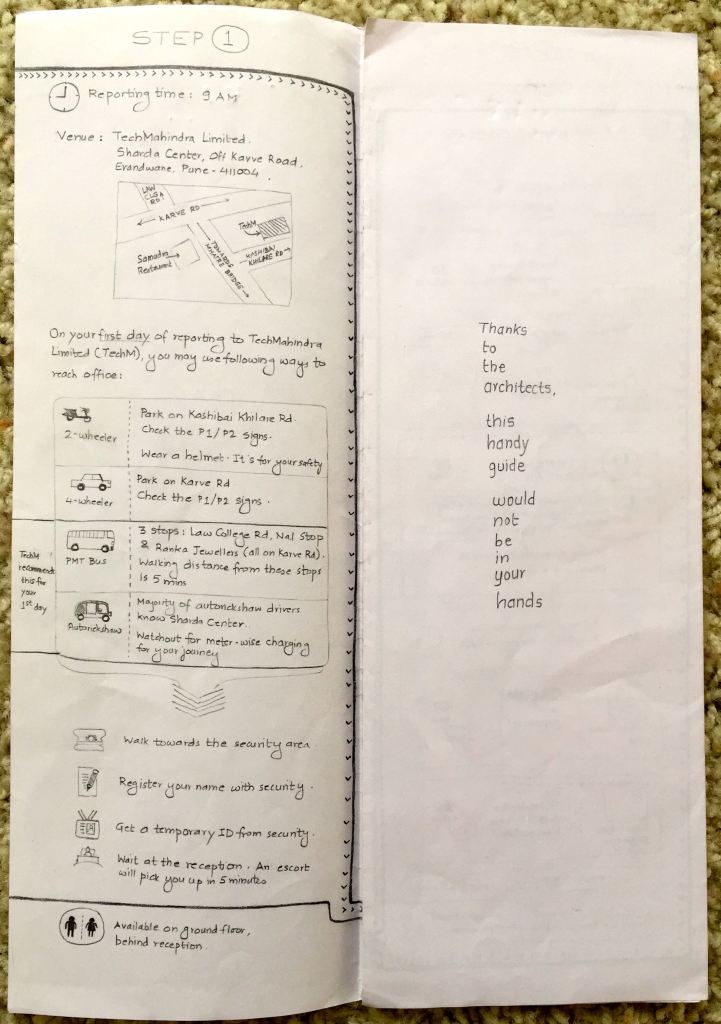
I created an infographic – 4 column fold-out that explains the various activities that happen on 1st day in TechMahindra. There is a visual path that directs the reader / user to understand what they are supposed to do.

I submitted this design to the HR in 2013.

First Page of the Infographic Brochure

First Page of the Infographic Brochure

First Fold of the Infographic Brochure

First Fold of the Infographic Brochure

Second Fold of the Infographic Brochure

Second Fold of the Infographic Brochure

Third Fold of the Infographic Brochure

Third Fold of the Infographic Brochure

Closure of the Infographic Brochure

Closure of the Infographic Brochure

Infographics – Resource Utilization Summary

When you are part of a corporate ladder, you are bound to do things you do NOT want to. If you are a designer acting like a design manager in a software services organization, then brace yourself for challenges ahead.

One of the duties that you assume in this role happens to be team management. Imagine there are 5-6 designers report to you and you need to ensure that they are 100% billable. Services organization needs granular data of employees like utilization of employees, what business any employee is accountable for, how much back-dated billing has happened for an employee, etc.

Team management was one of my duties in my earlier job. The tool used to track my team members was not helpful at all. It did not give me any idea about RUS (Resource Utilization Summary). Confused navigation and inappropriate content of the RUS tool drove me to maintain my own spreadsheets of data. But something was still missing.

As always, necessity is the mother of invention. Getting lost and landing up on wrong floors of the TechMahindra building through elevators had made me design infographics for elevators. This time, I took the same approach for team management and created an infographic.

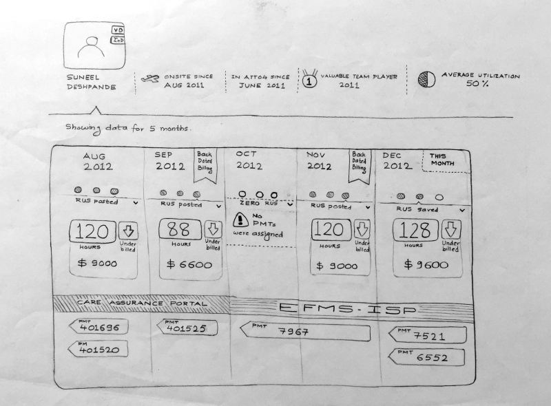
This is how it looks:

Infographics : Resource Utilization Summary

Infographics : Resource Utilization Summary

The header section shows summary of the team member. The 5 columns show the overall utilization of the team member across 5 months. “RUS” means Resource Utilization Summary generated by team management tool (a customized tool in TechMahindra). PMTs are project codes assigned to the team member.

As always, sketching on paper helps :).

STEP 4) UNDERSTANDING THE TARGET DEVICES /PLATFORMS – PART 4 OF 4

“Sell this pen to me…” says Jordan Belfort in the movie “Wolf of Wall Street”. Let’s put aside the personality profile of Jordan for the moment, and concentrate on the “selling” aspect.

“Designing a solution is 30% of your job. Communicating and selling your design is 70%” were the wise words of my mentor.

You can be a great designer, doodling in isolation and toying the product with great tools. Your design will never make it to the market if you are not able to showcase your designs with a story.

That’s right. You have to orchestrate your story about the design to your audience – who are willing to guide it, nurture it with their money and resources.

Let’s say that you have quickly sketched out user journeys for key user tasks. You might be working in a agile model of software development. You want to validate the designs created – e.g. iPhone app for banking consumers. There are 3 key tasks in your sketches – view balance, bill payment, add a new credit card.

This is how I would present the paper prototypes to the audience and get their feedback:

1) I will invite all key decision makers & influencers (product manager, development lead, business analysts, system engineers, etc) in a conference room with a 30 minutes time slot.

2) On the soft board, I will pin up paper sketches in a sequence.

3) I will have another design team member, preferably UX researcher – to take the notes of the discussion. It is important that one talks (me) and the other (UX researcher) jots down the points as design inputs.

4) I will summarize what the session is all about to the audience. I will set a context first, when and how the user is going to use the app – what time of day, what place, and what is the trigger point of launching the app.

Since we are talking about a mobile app, I will use specific usage behaviors to weave the story and the sketches – e.g. how users people are motivated to finish a goal, how users prefer shortcuts, how the content takes precedence over navigation in mobile apps, how users’ mind wander 30% of the time, how users make mistakes, etc.

When you cite these examples, it is good to have a workable solution in your sketch. The audience is there to hear you narrate different scenarios they have NOT visualized. As a designer, it’s your job to make them VISUALIZE and give their inputs.

Do not just restrict your presentation to pinned up sketches. Take out the phone from your pocket and show your audience some noteworthy examples. If needed have another photo-essay running that connects the sketches with the user context. You may also compile and get some user research data and quote. Get anything in terms of products / examples / packaging designs / tools / applications that connects with your sketches and triggers the audience’s reaction.

So what do you once you have gathered inputs from your audience?

Tweak. Tinker. Iterate.

Build a story, and sell.

Once you have a feeling that design on paper is great, step into Axure, Adobe Fireworks, Sketch and iRise to create digital wireframes.

That concludes all the segments of how to create paper prototypes. In the following posts, I will share the actual sketches I have designed for some projects.