Step 3) Create the user task matrix – PART 2

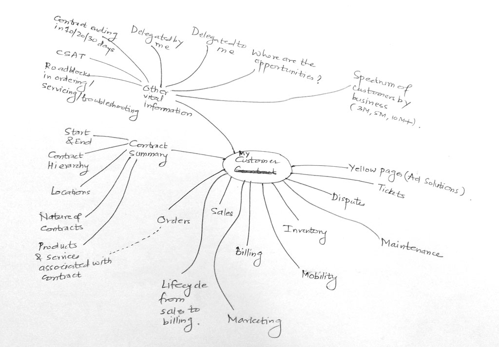
Couple of days back, I read that Flipkart’s online music service Flyte is shutting down. Flipkart is the biggest e-commerce website in India. Flyte was supposed to cash in on Flipkart’s brand equity and sell music. So what went wrong?

Flipkart_Flyte

Flipkart Flyte

……………………………………………………………………………..

Google Wave

Google Wave

Remember this logo? It’s Google Wave – The revolutionary internet tool that was supposed to replace email, the de-facto communication tool of every person. Google thought that users would ride the wave and make it their first choice tool for messaging. It had a great start, but soon Google had to rework their strategy and discontinue the product.

It was little bit of email, little bit of chat and little bit of everything else. The curiosity value it had, made the users adoption easy. When Google announced that they were discontinuing the tool, thousands of users’ protested for discontinuing the tool. Was Google wrong in gauging users’ needs? Were the users not ready for this tool – was the product way ahead of its time? Can this be a case of Google making assumptions about user behavior and extrapolating the test results? Perhaps, there were business reasons too to discontinue the service.

……………………………………………………………………………..

Kelloggs Corn Flakes

Kelloggs Corn Flakes

Consider the case of Battle Creek (MI) based company, the brand we all are familiar with – Kelloggs. The cereal giant’s focus on Indian breakfast table has not generated enthusiastic response. It is a difficult proposition to enter into Indian food market for any American brand, that too in the breakfast category. It’s not just the ‘Indian-ness’ that is crucial to the brand adoption, the consumer / user needs to be probed deeper. India is a complex geography for business; anyone entering this market new or anew often takes cautious steps. Curious minds can refer to these books – ‘We are like that only‘ by Rama Bijapurkar & ‘It happened in India‘ by Kishore Biyani.

……………………………………………………………………………..

Hero Honda Street

Hero Honda Street

The Indo-Japanese automotive venture, Hero Honda (now Hero Motors) slowly gained traction in India with its 4-stroke bikes. Thirteen years after it started (in 1984) and gaining great insights, it launched a rotary-gear 4-stroke motorcycle named Street. It was truly a revolutionary technology for urban commuters, the ease of riding, low maintenance and the Hero Honda trust factor – all these points stacked up to make it a success. I was one of the enthusiastic buyers :). I still drive one to this day. But the bike did not excite larger audience. Positioning of the product was not that great. The company discontinued the production in few years.

Aren’t consumers ready to experiment? Do they really know what they want?  Equations like these are difficult to comprehend – there could be insights gathered from market research. But this research (user research) can also be done before the product is designed, right?

So what makes users buy any product? Their association of the brand is important. The ‘status’ the product imparts, may be important – having an iPhone or any cutting edge smart-phone may matter to some users. Some users may be looking only for the utilitarian value of the product. For many years, Hero Honda’s slogan for the bikes was “Fill it. Shut it. Forget it”. That was indeed sensing the pulse of Indian urban commuters.

Buying cars & bikes is different from shopping online. Buying apps is different from renting movies. Netflix, Facebook, Amazon, eBay care about your online presence and try to construct what you want based on your browsing history – looking at the activities, products you bought, things you recommended to your friends. There are massive data engines that slice and dice your online data to produce a unique persona – your persona that is marketable to other brands. Your persona defines what you buy, when you buy, for whom you buy, what do you do at the day time, what apps do you download, do you listen to the music in transit, etc.

This book might be a good reference to understand the psyche of buyers-  ‘Buy.ology’ by Martin Lindstorm.

Steve Portigal of Portigal consulting has just released his new book – ‘Interviewing Users: How to Uncover Compelling Insights’. It is a great starting point for anyone who wants to understand the nuances and benefits of conducting user interviews.

Does gathering user insights really help? Yes.

Can you base line your decisions based on the gathered insights. May be.

Yes, may be. A decision maker may be of two types – one who wants to take a decision with a hint of data and one who go by the data. Gut-feel is always complemented with varying levels of data.

India’s mobile telephony market began its journey in 1994/95. Many operators were planning to enter the market and resorted to user and market research. One of the leading telecom operators did an exhaustive study covering many metros and arrived at one greatest insight that give them sleepless nights – ‘India is not ready for mobile service’.

Users did not feel the need to carry a phone everywhere they went. It was more of a distraction in their personal lives. Pagers were popular and sufficed the need for urgent communications. Carphones never made it to the Indian market. So what would a mobile make a difference?

The telecom operator decided to put aside the research report and launched the service. BPL Mobile (now branded as Loop Mobile) launched its mobile service in 1995 and became the first mobile service provider in India.

In 2004, I was undergoing certification from IDC IIT Mumbai in Human Computer Interaction (HCI). One of the subjects was contextual study – going to the users’ place of work, observing them, interviewing them and gathering insights. Our instructor told us that not to underestimate the power of ‘observation’ & ‘questioning’. His mantra was simple and I admired it – if you ask garbage questions you will get garbage answers :).

My friend Ninad and I chose to interview the laundry owner. Our objective was to understand how he conducted his business and see an opportunity of designing any product / service for him. We were surprised to see that the laundry owner was using the Nokia 3310 mobile (one of the most popular mobile at that time).

A little background about mobile – in 2004, mobile phone was not ubiquitous as it is now in India. The incoming and outgoing call charges were huge and the mobile usage was limited to very few.

Nokia 3310

Nokia 3310

While talking to the laundry owner, we discovered his daily activities, how he managed the business, etc. He was a literate person but he did not understand English (being native of Pune and Marathi being the first language). He then stumped us – he actually demonstrated how he used the mobile – Nokia 3310, which had English as the only language of operation.

He opened the texting application (Messages), went to the drafts folder, selected a message “Your clothes are ready for pickup”, typed in a customer mobile number and sent the message :).

He had learnt this from his son; a teenager and he understood that technology can do wonders to his business :).

Step 3) Create the user task matrix – PART 1

“I don’t know who I am!” screams Jason Bourne in the first installment of the Bourne series, who is struggling to recall his memories, forgotten his name and forgotten his identity.

We don’t go through the same circumstances as Bourne does :). Strange but true, we can have opinions about our friends and family members. But when it comes to defining your self, it is not an easy thing to do. There might be an inherent feeling about your abilities, your emotions and your actions, but we often rely on others to define our persona.

When I was at NID (National Institute of Design), the first semester involved many exercises centered around discovering me as a person – what I like & dislike, what are things I cherish the most, what are my escape routes, what do I value and don’t value, etc. Most of my student friends had given up these kinds of exercises – their argument was that they already know how they are as a person and there was little delight they were deriving from the exercises.

The faculty member presented us this rationale– unless you don’t know who you are, you will find it difficult to understand who / what/ why / how the other person is. The objective of those exercises was to probe deeper into yourself and understand the person you are – your background, your value system, your aspirations and perhaps your fears too.

If someone told you that are emotional person, take it in your stride. Perhaps that’s a compliment someone paid you, free of cost :).Being a designer you need that skill, to imbibe the world around you and come out with the best possible design.

As you may recall in our older posts, you can understand another person (i.e. a user of any product or service) by employing various techniques – observing the user, talking to the user, doing desk research, seeking opinions of the experts, etc. There are always different schools of thought – is it user-centered design or is it user-inspired design or is it user-assisted design or is it business-centered design? Very rarely will be products designed in a genius-driven mode, as Dan Saffer explains in his book “Designing For Interaction”.

Without getting into the debate – let’s stick to a stand: every product that is designed has users’ needs reference. Let’s not worry over the semantics.

Having a keen eye to capture context data (where the user works, how he works, what time he/she has lunch, etc.) will help you a lot. Examples of keen eye: Hope you recall the chase sequence in the movie ‘The Dark Knight’ where the Joker is aiming for Harvey Dent’s bulletproof car with a bazooka gun – the Joker is riding a trailer and he slides the trailer door to reveal something written in big typo on the door. It says “Slaughter is the best medicine” :). One who understands the psyche of the Joker has done a great job – the production designer.

One more example: The last minutes of the movie ‘Despicable Me’- the Minions are arranging the dance performance of Margo, Edith and Agnes. In a very short frame of time, you might notice the Blu ray player to be named as “Gru-ray player” :). An animator / designer who has imbibed the ‘ecosystem’ around him/her can only create this kind of work.

So you might have found out who you are, for some it’s still work-in-progress.

Ultimately, it is all about the discovery.

Step 2) Create the information architecture – PART 4

“Your story may not have a such a happy beginning. But that does not make you who you are. It is the rest of the story whom you chose to be!” echoes the Soothsayer to the Dragon Warrior Po, in Kung Fu Panda 2.

We all marvel at the way story is being told in a movie, right? How the story is played is nothing but ‘structure’ of the movie.

Start > Flashback > Resume Story > Story moves forward > Dream Sequence > Resume (Audience yawns :D) > Story moves forward  > Climax > The End.

This structure – how a movie is presented to the audience, can be loosely interpreted as information architecture (IA).

You may have visited thousands of sites – look at this site too, there is a defined structure to the overall site – You have main navigation on the top (Home, About, Workshop). The content is posted every week – it carries a date stamp. You can always go and browse the old content using ‘Recent posts’ or jump directly to any topic using ‘tag cloud’. This all is a result of layout + content + information architecture.

How does one create the information architecture of a digital product / service?

  1. Get the ecosystem on paper.
  2. Get the user task flow.
  3. Visualize the ‘paths’ of links and link hierarchy – how the user will navigate the product using different paths.
  • Think of flexibility: Can user achieve the same goal using 2 or 3 different paths?
  • Think of ease of use: Can user intuitively choose the link to pursue a specific task?
  • Think of user efficiency: Can user complete the given task in less time?
  • Think of shortest & longest paths: Will the user browse ‘sitemap’ or directory structure or use the search utility on the website?

If you start thinking on these lines, you will visualize the structure of your digital product. That’s when you have finally created the information architecture.

Here are some examples of information architecture of websites / dashboards:

Example 1: Enterprise Dashboard

We start of with the ecosystem view of the dashboard.

Ecosystem View

Ecosystem View

The following image depicts how the user flow would be:

User flow

User flow

The third image shows the overall information architecture of the dashboard – depicting the ‘content’ heads, the paths / links, the hierarchy of the paths with respect to each other.

IA Dashboard

IA Dashboard

Example 2: Windows 7 Control Panel redesign

This is an attempt to redesign the Windows 7 Control Panel. The first image shows a mash-up of a mind map or decomposition of an action in Windows desktop.

Windows 7 Control Panel Mind Map

Windows 7 Control Panel Mind Map

Windows 7 Control Panel IA

Windows 7 Control Panel IA

The second image is nothing but a raw depiction of IA (the very first draft). The IA always gets improvised with the time.

It is basically a ‘bucketing’ exercise done to arrange most closely associated elements in one category. Exercises like these are often carried out with ‘users’ who are inexperienced designers – they arrange the data elements they perceive to be intuitive. This activity is commonly known as card sorting. Card sorting is a quick way to put a structure around your data elements. The elements are written on cards or post-it notes and arranged in ‘buckets’ or categories defined by the users.

Example 3: IA for a 4G telecom launch portal

4G Telecom Portal IA

4G Telecom Portal IA

4G Telecom Portal IA

4G Telecom Portal IA

4G Telecom Portal IA

4G Telecom Portal IA

4G Telecom Portal IA

4G Telecom Portal IA

The final version of the IA looked like this (designed in Mindjet Mindmanager):

Final IA - 4G Telecom Portal

Final IA – 4G Telecom Portal

So, how does one know whether the IA designed works or not?

Consider the following example:

Let’s assume that your digital product (e.g. an e-commerce site) is designed & launched with fanfare, perhaps with a brand ambassador. The hype generated excites the early adopters; users get registered in great numbers. But the users do not become buyers. Why? Over the months, user registration starts dropping. The stakeholders get the jitters. How can they overcome this?

Well, there is no unique solution to this – assuming that the branding has been great part of the website and there is a trust & safety sentiment of the buyer with the site too. There could be a possibility that the underlying IA of the website is not working.

How can one say this confidently? Yes, you can.

Look at the web analytics data – the click throughs of the user recorded in quantitative data form. Look at the web logs. You will see how users are coming to the website, what paths users are taking to reach to specific content, how they are exiting the website, how much time they are spending on the website.

Get your website dissected completely with web analytics data. You may have a look at the most popular web analytics products – Google Analytics.

The web analytics data will only tell you – what is happening? It is up to the designer to figure out ‘why’ it is happening. So looking at IA will only tell you the half story.

Got the story?

Step 2) Create the information architecture – PART 3

Let’s move away a bit, from the digital world.

What comes to your mind when you come across some daily displays of information, like these?

Nutrition Facts

Nutrition Facts

Nutrition Facts

Nutrition Facts

Pure data treatment, right? What can one do with this type of data presentation – is the nutritional information indicative enough to tell you what’s good for your health?

We need to dig more to make of sense of the data. How about these pictures?

Menu

Menu

Food Menu

Food Menu

Well, the data in these pictures are easy to read. Why? Because there are some “heads” that hold specific data. i.e. categories that classify the data into different buckets. The information that you deduce from the menu card is what type of restaurant it is (the variety of food it offers, the price range, whether it suits your next date :), etc.). Only when you step in the restaurant, eat the food and get out, you have ‘experienced’ the restaurant and you are knowledgeable to praise or rant the restaurant.

Every day you are exposed to vast amount of information. Crucial are also the circumstances / contexts in which you consume the information. And at that time, the entire onus of delivering the information rests on the designer :).

Imagine you are driving your car and you have a flat tire. Never in your life you have had flat tire (there is always the first time for everything :D) and never have you ever serviced your car before. So, human tendency is to pick up the phone and call service center. Self-starters will pick up the ‘car manual’ and put up the spare tire and drive back home. I am narrating a true story, not an inspired one :). One of my friends encountered the flat tire situation in US, he could not deduce how to change the tire from the car manual. He found out that the spare tire was smaller than the regular tire, he felt he was duped by the car seller :). Anyways, he got back to the car manual and could not change the tire. Here is what the car manual looked like:

Car Manual

Car Manual

If you are curious about what happened to the car, here it is what happened: I changed the spare tire of my friend’s car and we reached home safely. If the book was designed intuitively, my friend could have done the job on his own and won himself some credibility :).

The point is that every printed word that you come across may be uniquely represented – it conveys some meaning (in isolation or together with other words), is part of a big ‘category’ – a common bucket of words / data combined together to make some sense.

Information architecture is a structure that holds the data together.  It is a set of data elements that define the hierarchy of data (what data sits on the top, what at the next level and so on, image a tree structure). It is a structure that defines the relationships between the data – e.g. in an electronic store catalogue there will be list of individual items available for sale. The store may also display products that can be sold as “combo” with other products. Or products that were bought by customers after purchasing a product (“Customers who bought this also bought….”).

It is up to the designer to establish the relationships between the data. The designer visualizes the ecosystem, gets the user and stakeholder data – now he/she has to construct a ‘structure’ which will become the IA (that will translate user ‘needs’ to user journeys). This structure will help the end user to consume the content, ‘see’ what is available, and help him/her to reach specific information using controls offered by the design – e.g. on an e-commerce site, the user will use category-wise listing or search utility to find the desired product.

Information architecture alone does not solve the issue of non-intuitive interfaces. It is ONE of the elements that define the interface. The content, the visual treatment also play an important part in the overall design.

At this point, it will be good if you read the  ‘Elements of user experience’ created by Jesse James Garret. He explains the ‘elements’ in a better way – the different stages that make up the entire user experience aspect of any digital product. In this representation, you will find information architecture placed at the center of the system, a third step from surface to strategy.

So all said and done, how does one actually create information architecture?

Let’s do that in our next and final post on IA.

Step 2) Create the information architecture – PART 2

“Gentleman, you had my curiosity. Now you have my attention”, says Leonardo DiCaprio in the movie ‘Django Unchained’.

Drawing parallels – the data just brings in curiosity. The information grabs the attention. What is this all talk about information architecture? What is see is what you get, right? But, what you see is different from what you perceive. Creating information architecture (IA) is a path towards understanding the ‘data’, making sense of the data, the ability to slice & dice the data and make relationships with the data.

Data, in its raw form, e.g. “Today’s temperature is 31 degrees Celsius”, does not really add any value. However, if we impart some additional meaning to the data, e.g. “The daily temperature has risen by 4 degree Celsius over last 2 days”, then it becomes information. Why? Because there is a reference point with the data, there is something preceding/succeeding with the current data and there is a relationship with different data points.

When we stack many data points, we get information. When we stack many deep insights from information, we become ‘knowledgeable’ :).

Let’s go back to our 5 examples discussed in the last post.

1) Things Organized Neatly

Every time I look at this site, it creates a ‘wow’ factor in my mind. Things that seem so nondescript are arranged in a visual form that communicates the shredded ecosystem in tiny parts. My view of this website (what I liked, what makes this website great is depicted below):

Things Organized Neatly

Things Organized Neatly

2) Flipkart

I have been user of this website since 2008. I was one of those Indian buyers who did not trust sharing my credit / debit card information online. Flipkart knew this well and brought in the “cash on delivery” model, which has now become the Indian e-commerce norm. They started with books and now sell almost every lifestyle product. Today, their speedy shipping time marvels many Indian customers, and I am one of them.  Here is how I view Flipkart:

Flipkart

Flipkart

3) Wikipedia’s content on Pune

I am an immigrant to Pune (India), with origins in the pre-Independence industrial town called Kirloskarwadi. I grew up with the internet age and have witnessed web migrate from 0.0 to 1.0 to 2.0 and beyond. Similarly, I have been a resident of Pune for the last 18 years and have seen the city growing by leaps and bounds. I visit Wikipedia often to see the changes in Pune city documented on the site. Wikipedia is a user generated content website – anyone can become author. This is what I view of the Wikipedia’s entry on Pune:

Wikipedia on Pune

Wikipedia on Pune

4) Google Maps

‘Travel’ without the travel – that’s what Google map does :). I feel that Google has superior user experience than Mapquest & Yahoo Maps, the reason it became so popular. It’s the map application that is on top of my mind every time I have to search any location. Being an Android user means it is also the de-facto application to search any location. Here is my view on Google Maps:

Google Maps

Google Maps

5) Southwest.com

I have been a frequent traveler on Southwest for the last 2 years. I think that customer experience is in their DNA – both offline and online. The website’s content, navigation and discoverability of content are positive experiences. “Where should I find this?” questions generally get up answered up on the same page. The following image depicts my view of the ticket-booking journey on Southwest.com:

Southwest

Southwest

 Hope you also have your own sketches / visuals of these websites. As said earlier, sketching will help you – it does not matter whether you designed a mind-map, infographic or anything else.

While drawing, I am sure you must have come across these questions:

  1. Home pages of these websites carry tremendous amount of information. What if the home page is designed in non-intuitive way?
  2. How will the users discover information that is not evident on the surface?
  3. How deep-rooted the navigation should be? Will the user get frustrated at 4-level navigation?
  4. Are login paths clearly visible to the user? Is log-out placed intuitively or is it done in the same way as social networking websites (hidden inside a menu)?
  5. What amount of information can user cope up with? What is that threshold / breaking point?

Answering these questions means getting closer to build the information architecture, the content and page layout.

Let’s look into details about creating the information architecture in our next post.

Now that you got attention (after you got curios), let’s sustain that :).

Step 2) Create the information architecture – PART 1

It is the human tendency to slot things we like & dislike. We often say someone telling “he is not in my good books anymore!” Sometimes this categorization happens unconsciously; sometimes it happens because we want them to be.

How many people organize their desk, their room and their house? Aren’t there any incentives for cleanliness :)?

Some people marvel at the ‘grey area’, while some always look at the extreme whites and blacks.

Great digital designs always have great information architectures. Information architecture (IA) is the soul of the design. On the surface one cannot actually ‘see’ the IA, one can only experience it by the tangible things the product presents – through the clicks, by moving from one section of the application to other.

Before we get into the specifics on what is IA and all, lets look at the some of the examples:

  1. A photo blog curated by Curated by Austin Radcliffe – brilliant compilations on http://thingsorganizedneatly.tumblr.com – This blog gives great visual pleasure in seeing things neatly organized various visual forms – to achieve a symmetry & categorization effect. Importantly, it presents the granular view / exploded view of things that make up an ecosystem.
  2. Check out India’s answer to Amazon.com: www.flipkart.com – Look at the way products are displayed, the product search option and the filters to narrow down the product catalogue.
  3. How can one forget the gigantic Wikipedia content :)? Check out this URL too: http://en.wikipedia.org/wiki/Pune
  4. Locate your home using Google Maps, https://maps.google.com/ – dive from country level to the state level to the granularity of the streets next to your home.
  5. Go through the flight ticket-booking journey on Southwest (www.southwest.com). Look at the way information is presented to you, the flexible controls that make ticket booking a cakewalk.

When you are done with these websites, take a piece of paper and write down things that make these websites appear great.

There are many other examples, which we can refer to. But let’s focus now on these examples.

Through these examples we will understand the “behind the camera” / the making of these websites. This will lead us to understanding the IA – the structure or the blueprint of these websites.

Step 1) Understand the ecosystem – PART 2

“A wise car hears one word and understands two” is a line quoted by one of the characters in Cars 2 movie.

A designer precisely does that 🙂 and comes up with his/her ‘mental model’ of the ecosystem using a visualization technique.

Mind map is a visualization technique that was introduced by Tony Buzan (http://www.tonybuzan.com/). Google “mindmap” and you will get loads of links that explain how to create a mind map. A very detailed explanation of this can be found on Wikipedia: https://en.wikipedia.org/wiki/Mind_map

Mind you, mind map is just one of the techniques of visualization. There are entity-relationship diagrams, time-series data, statistical distributions, maps, hierarchy diagrams, etc. You can use any or combinations of these techniques to create your view of the ecosystem. As discussed in the last post, I am comfortable with mind maps. Sometimes, I create infographics to depict my understanding of the ecosystem.

An advanced mind can refer to Edward Tufte’s books (www.edwardtufte.com) for deeper understanding of visualization methods.

To express the ecosystem in a graphical form, one need not be a great artist. Content is an important as the treatment. The ecosystem infographic is generally designed over a period of time – fine tuned every day as you (designer) get deeper insights on what is happening, who is influencing what, etc.

Engage with stakeholders, development teams, book their calendars. Set up some lock-down sessions with them :). Encourage them to express their wishful thinking using whiteboards. White-boarding activity is a sort-of ice-breaking ceremony between designers and stakeholders, which define the course of product/service design. Sessions like white-boarding activities need to be orchestrated professionally. Stakeholders are short on time and attention – pick their brains that will help you understand what and how they envision the product.

Some examples of the white boarding activities that I participated are shown below:

Whiteboard Sample 1
Whiteboard_1_NEW

Whiteboard Sample 2
Whiteboard_3_NEW

Whiteboard Sample 3
Whiteboard_4_NEW

Whiteboard Sample 4
Whiteboard_5_NEW

In your ‘lock-down’ sessions and white boarding activities perhaps, you may discover key information that is not documented anywhere. Record like a dicta-phone and act like a Sherlock :).

Last year I participated in one of the stakeholder workshops to understand the business requirements. The business goal was to transform the legacy desktop application (serving 13 US geographical states’ telecom professionals) into a portal based solution.

I quickly sketched the following (an infographic) that captured the essence of that meeting:
Migration_NEW

On the left is depiction of PMO (present mode of operation) = old vendor’s engagement model with cost.

On the right is FMO (future mode of operation) = my development team’s engagement model with cost.

The picture was clear to me – My development team had to deliver a tough assignment at a very low cost in a less timeframe. We were at loss. As indicated by the management, we delivered in spite of all the constraints.

While I was on a teleconference call with one of the stakeholders for another project, I quickly drew the following, took a picture of it and shared with him in the call:
eM_NEW
The overall goal of the system design was captured correctly. In the call, we nailed down the granularities of processes represented by numbers.

Lets go back to our earlier thread – the mind map.

Mind-map is your view, how you see things and their relationships with other elements. It’s your ‘mental model’. A mind map starts with a goal (e.g. “reduce the no. of help-desk calls for the company”). This goal could be further broken down into sub-goals and sub-sub goals. Imagine a tree structure with the centralized goal radiating out branches (that represents sub-goals) that reach wide. Every sub-goal paves way for a sub-sub goal and so on. I think Buzan explains this better than me :). Copy-pasting the following 10 steps from Wikipedia, hope this helps.

Buzan suggests the following guidelines for creating mind maps:

  1. Start in the center with an image of the topic, using at least 3 colors.
  2. Use images, symbols, codes, and dimensions throughout your mind map.
  3. Select key words and print using upper or lower case letters.
  4. Each word/image is best alone and sitting on its own line.
  5. The lines should be connected, starting from the central image. The central lines are thicker, organic and thinner as they radiate out from the centre.
  6. Make the lines the same length as the word/image they support.
  7. Use multiple colors throughout the mind map, for visual stimulation and also to encode or group.
  8. Develop your own personal style of mind mapping.
  9. Use emphasis and show associations in your mind map.
  10. Keep the mind map clear by using radial hierarchy, numerical order or outlines to embrace your branches.

This list is itself more concise than a prose version of the same information and the mind map of these guidelines is itself intended to be more memorable and quicker to scan than either the prose or the list.

Too much of information overload? Don’t worry, have a look at the following mind-map I created for a financial software company:
InnovationCulture_2_NEW

Here are some additional mind maps I created for various enterprise portal dashboard assignments:
MigrationPortal_MMAP_NEW

EnterpriseApp_NEW

Practice the mind mapping technique or any other visualization technique that you are comfortable with. Do it on paper first. Spend some time with your visualization, talk to people, refine your visualization based on insights gathered. There is a digital tool too to create mind maps, Mindjet Mindmanager (http://www.mindjet.com).

That brings me my tools for paper prototyping. Here are they:

  1. An A5 size notebook (plain paper). I use notebooks by Nightingale (http://www.nightingale.co.in/Social_Stationery/Hand_Book.htm) – good paper & packaging quality).
  2. Stock of A4 papers
  3. 0.7mm mechanical pencil (I am currently using Camlin Klick Pro pencil – http://www.ithinkstore.com/camlin-klick-pro-0-7mm-mechenical-pencil-pack-of-10-pencils.html) Why 0.7mm? Because you can get thicker lines on paper prototypes :).
  4. Color pencils (any make, no preference).
  5. Eraser (Staedler – http://www.staedtler.com/en/products/pencils-accessories/erasers/tradition-526-t-eraser/#id=250&tx_solr[page]=1)
  6. Post-it notes (3M, of course)

This 1st step (understanding the ecosystem) is a crucial one. This is the foundation of your building. Plan it well.

Get the picture?